WORDS Gina Dionisio
Pantone has unveiled its much-anticipated ‘Color of the Year’ for 2025, an organic and neutral hue that captures the essence of global culture, creativity and a greater shift towards sustainability.
With its comforting warmth and understated elegance, the Pantone Color of the Year for 2025 captures the spirit of the times and promises to influence creative expression across industries.
The Colour That Captures the Spirit of 2025
Despite speculation over bolder shades like neon green, the “it” hue of 2025 is an earthy, organic tone. Mocha Mousse is “a mellow brown hue whose inherent richness and sensorial warmth extends into our desire for comfort and the indulgence of simple pleasures,” says Laurie Pressman, Vice President of the Pantone Color Institute. The thoughtfully chosen colour connects a sense of luxury with a down-to-earth, approachable style. “The overriding theme as we went into looking for this year’s color was harmony,” she adds.
What Makes the Pantone Color of the Year 2025 Significant
The 2025 selection reflects an increasing societal shift towards slower trends, timeless palettes, and eco-conscious living.

The Meaning Behind the Colour
”Underpinned by our desire for everyday pleasures, PANTONE 17-1230 Mocha Mousse expresses a level of thoughtful indulgence. Sophisticated and lush, yet at the same time an unpretentious classic, PANTONE 17-1230 Mocha Mousse extends our perceptions of the browns from being humble and grounded to embrace aspirational and luxe,” says Leatrice Eiseman, Executive Director Pantone Color Institute.
How the Pantone Color of the Year Shapes Global Trends
The Pantone Color of the Year is chosen through a meticulous global research process, drawing inspiration from industries such as fashion, interior design, technology, and even culinary arts.
Since 2000, Pantone’s annual colour announcement has profoundly influenced global design trends. ‘Living Coral‘, 2019’s go-to hue was instrumental in inspiring bold, energetic palettes in fashion and interior design, while 2020’s shade ‘Classic Blue‘ influenced branding in uncertain times. ‘Peach Fuzz‘, 2024’s Pantone Color of the Year inspired several big brand collaborations proving that Pantone’s colour selection has some serious cachet.

PANTONE 17-1230 Mocha Mousse’s versatility allows it to enhance a variety of palettes and applications across different fields of design and colour-sensitive industries.
Influence on Design and Interiors
Appealing to those who desire a sense of calm in a busy, tech-heavy world, this year’s earthy hue offers a sensory experience that indulges and awakens the senses.
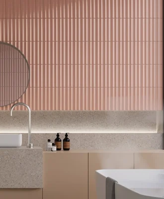
For interiors, the shade delivers comfort with a hint of luxe as it leans into natural materials like wood, polished stone, rattan, wicker, linens and leather.

PANTONE 17-1230 Mocha Mousse’s versatility means it will compliment various hues. It works effectively as a standout accent among other rich neutrals, offers a refreshing touch when paired with vibrant colours, and makes a strong impact when used alone. And when combined with deeper toasted browns or richly saturated navy shades, it achieves a more sophisticated appearance.
”I couldn’t lust more over the mouthwatering Pantone Color of the Year,” says interior designer Dani Gottschalk (she is responsible for the bold interiors of this Camps Bay villa). “The heavy but comforting darkness of mocha is lifted by the airy texture of mousse, adding a lighthearted sparkle to a moody tale of desire, loss, and temptation. I imagine it poured as an epoxy floor with a boucle kidney-shaped sofa, velvet curtains, vases and flowerpots,” she adds.
The Perfect Shade for 2025?
Love it or hate it, according to research PANTONE 17-1230 Mocha Mousse is a reflection of where we are as a society, mirroring our collective desire for connection and balance. | pantone.com
Don’t forget to sign up to our weekly newsletter for the latest architecture and design news.