-

The exterior bricks have been laid specifically to create patterns and break up the mass of the façade. Standard stock bricks were used throughout because of their colour variations. “I also liked that they were full-bodied with no holes, so they could be used vertically on corners,” explains architect Michael Lumby. To soften the yellow tint, the bricks were whitewashed. “It was an experiment inspired by Christiaan van Aswegen, an architect friend of mine, who had done a similar thing on a house he designed,” adds Michael. -

Seating in the living room is by Sofacompany, with the coffee table sourced from Lim. The shelving was designed by ML-A and built by Holz Cabinetry. -

Simplicity reigns in Robyn and Clinton Campbell’s kitchen, with Carrara marble from Cannata and oak cabinets, designed by ML-A and built by Holz Cabinetry. The AAS 38 HAY stools are from Créma. -

The exterior bricks have been laid specifically to create patterns and break up the mass of the façade. Standard stock bricks were used throughout because of their colour variations. “I also liked that they were full-bodied with no holes, so they could be used vertically on corners,” explains architect Michael Lumby. To soften the yellow tint, the bricks were whitewashed. “It was an experiment inspired by Christiaan van Aswegen, an architect friend of mine, who had done a similar thing on a house he designed,” adds Michael. -
Owner Robyn Campbell in the spacious living area, where custom-made windows create a feeling of height. The floors are a standard Grano screed that has been polished down to reveal the aggregate. -

In the elevated dining area, a banquette designed by ML-A and built by Holz Cabinetry creates space-saving seating. The Hee dining chairs by HAY are from Créma, the vintage sideboard is from Space for Life, and the Perspex dome pendant light is from Arc Lighting. The Rocal fireplace, which marks out the living room, was supplied by MacD. -

The exterior bricks have been laid specifically to create patterns and break up the mass of the façade. Standard stock bricks were used throughout because of their colour variations. “I also liked that they were full-bodied with no holes, so they could be used vertically on corners,” explains architect Michael Lumby. To soften the yellow tint, the bricks were whitewashed. “It was an experiment inspired by Christiaan van Aswegen, an architect friend of mine, who had done a similar thing on a house he designed,” adds Michael. -

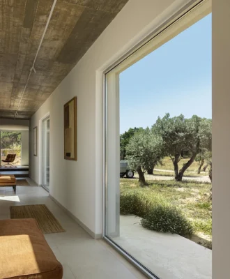
Opening up the sliding doors makes the courtyard part of the living area. -

The exterior bricks have been laid specifically to create patterns and break up the mass of the façade. Standard stock bricks were used throughout because of their colour variations. “I also liked that they were full-bodied with no holes, so they could be used vertically on corners,” explains architect Michael Lumby. To soften the yellow tint, the bricks were whitewashed. “It was an experiment inspired by Christiaan van Aswegen, an architect friend of mine, who had done a similar thing on a house he designed,” adds Michael. -

In the main bedroom, light from the skinny window plays on the stipple walls, oak cabinets and polished-concrete floors. The exposed flue allows for radiant heating from the fireplace in the living area below. -

As the dining and lounge banquette seating are essentially back to- back, Michael designed the area on a split level – a clever, space saving trick. -
The statuesque ceiling height transforms the shower area, which was custom-made by Still Bathrooms, into an extraordinary space.Standard 200x200 white tiles were cut into quarters here, creating textural variation. -

The exterior bricks have been laid specifically to create patterns and break up the mass of the façade. Standard stock bricks were used throughout because of their colour variations. “I also liked that they were full-bodied with no holes, so they could be used vertically on corners,” explains architect Michael Lumby. To soften the yellow tint, the bricks were whitewashed. “It was an experiment inspired by Christiaan van Aswegen, an architect friend of mine, who had done a similar thing on a house he designed,” adds Michael. -

The exterior bricks have been laid specifically to create patterns and break up the mass of the façade. Standard stock bricks were used throughout because of their colour variations. “I also liked that they were full-bodied with no holes, so they could be used vertically on corners,” explains architect Michael Lumby. To soften the yellow tint, the bricks were whitewashed. “It was an experiment inspired by Christiaan van Aswegen, an architect friend of mine, who had done a similar thing on a house he designed,” adds Michael. -
The exterior bricks have been laid specifically to create patterns and break up the mass of the façade. Standard stock bricks were used throughout because of their colour variations. “I also liked that they were full-bodied with no holes, so they could be used vertically on corners,” explains architect Michael Lumby. To soften the yellow tint, the bricks were whitewashed. “It was an experiment inspired by Christiaan van Aswegen, an architect friend of mine, who had done a similar thing on a house he designed,” adds Michael. -

The exterior bricks have been laid specifically to create patterns and break up the mass of the façade. Standard stock bricks were used throughout because of their colour variations. “I also liked that they were full-bodied with no holes, so they could be used vertically on corners,” explains architect Michael Lumby. To soften the yellow tint, the bricks were whitewashed. “It was an experiment inspired by Christiaan van Aswegen, an architect friend of mine, who had done a similar thing on a house he designed,” adds Michael. -

Inspired by the staircase, the skylight illuminates its curved shape in a nod to Vredehoek’s Art Deco heritage. -
The elegant curved staircase leads to the bedrooms and the roof terrace.


WORDS Kerryn Fischer PHOTOS Elsa Young/Frank Features PRODUCTION Luanne Toms
This inner-city space is clever, functional and highly original, and designed to get the most out of a small property.
When Robyn and Clinton Campbell took the plunge and bought their first stand-alone property in Cape Town’s Vredehoek four years ago, they settled on 235m² with an existing house on it. Their initial plan was to keep some of the original house and go up by way of a major renovation, but that was thwarted when the foundations were found to be wanting.
Having to get their heads around a full demolition, the couple fortunately had a friend in architect Michael Lumby of ML-A, whose bold and honest use of materials was an aesthetic they both loved. “Our brief was pretty open,” says Clinton, “but budget was a major consideration, and we knew that the challenge would be to find simple and cost-effective solutions that wouldn’t compromise the creative vision.”
READ MORE: Bold Contemporary Johannesburg Home
Known for his contextual cleverness and innovative approach to well-planned, efficient spaces, Michael came up with a design of unexpectedly generous spaces for such a small home. “My idea was to step the house down in sync with the slope, thus allowing the spaces to open up as you move through it,” he explains.
Laid out over three floors, the building has spatial tricks aplenty to keep you on your toes. You enter from the parking space, which delivers you into an open-plan entrance hall and dining area that leads down to a split-level lounge/kitchen a metre below it.

Here, the north-facing orientation of the house, together with skylights in the stairwell and the use of custom-made, skinny, floor-to-ceiling vertical windows, creates a sense of volume that belies the limitations of the floor area.
The living areas open out to the main garden, making for dual-purpose spaces. “I love the flexibility of the living spaces for entertaining – the sliding door retreats entirely into the cavity wall, allowing the lounge/dining and garden areas to merge,” says Robyn. “The same space can serve as an intimate retreat in which Clinton and I can relax, cook and spend time together.”
READ MORE: About Face: Contemporary Face Brick Buildings
A sculptural staircase leads upstairs to the bedroom floor, where Michael has managed to fit two sizeable guest rooms (with a shared bathroom), and a master with a cathedral-esque en-suite bathroom that is fast becoming a signature of his work. “To have such a large volume of space above you in the shower makes the bathroom feel more generous than the floor meterage allows,” says Clint. “And naturally, it’s a joy to shower with the sky above you.”
Thanks to the use of concrete, brick, stipple walls and polished concrete floors, the materiality of the house keeps things interesting and is the perfect foil for Clinton and Robyn’s eye for detail and beauty. While Michael is drawn to the roughness and intrinsic honesty of exposed brick and concrete soffits and floors – for their ability to deliver another layer of texture and tactility – Robyn and Clinton also love their interplay with more luxurious materials, such as marble and oak.
And when pushed to give their favourite aspect of the house, in addition to the roof terrace and the lofty shower, they cite the tap in the guest toilet downstairs that pours onto an angled steel plate, which goes through a gap in the glass and onto the green courtyard outside. For Michael, there’s nothing gimmicky about it. “It was born out of a need to be clever with space – and as the house was designed during the city’s water crisis, it seemed like a nice idea to let waste water drain directly into the water-starved garden rather than run through kilometres of pipes to a treatment plant.”
And therein lies but one of the many delights inherent in Michael’s particular design process.
Looking for more architectural inspiration? Sign up to our weekly newsletter, here.