-

Is It Okay to Use Neons? Debbie Field Pushes Colour in Cape Town Show -
Is It Okay to Use Neons? Debbie Field Pushes Colour in Cape Town Show -

Is It Okay to Use Neons? Debbie Field Pushes Colour in Cape Town Show -

Is It Okay to Use Neons? Debbie Field Pushes Colour in Cape Town Show


What happens when colour speaks louder than words? At Sisonke Gallery, artist Debbie Field invites audiences to feel before they interpret. Her latest exhibition, Is it ok to use neons?, uses jolts of neon pink, metallic gold and electric blue to spark immediate, emotional responses.
INTERVIEWED BY Neyani Mphephu PHOTOS Supplied
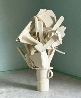
Cape Town-based artist Debbie Field brings colour to life – both emotionally and psychologically in her latest solo exhibition, Is it ok to use neons?. Known for her expressive use of neon and fluorescent pigments, Debbie layers bold hues across canvas, board, and paper to create work that resonates on a visceral level. Her work invites an immediate, almost instinctual response from the viewer before drawing them into a slower, more reflective encounter.
Selected for the Nando’s Creative Exchange 2025, Debbie’s approach dissolves the divide between audience and artwork in favour of a pure immersive experience of colour. We spoke with the artist about the emotional weight of colour in her solo exhibition.
Your exhibition invites viewers to consider how certain colour combinations affect them emotionally. Can you share a moment in your own life when colour had a profound impact on you?
All the time! When I serve a bowl of strawberries in a lime-coloured bowl to my family, when I glance into the garden and catch sight of the sun highlighting a red rose next to a cerise geranium, when the pink sunset sky is reflected off the wet, silver beach, sand… There is however one very particular moment that changed the way I perceived the possibility of pure colour as a painter.
Many years ago, I saw a painting by Jill Trappler. The whole canvas was almost purely and totally yellow. It was a large piece, and I literally felt the visceral power and impact it had on me immediately as I saw it. I was transfixed and captivated. I could not leave it! At the time I had never before experienced this mysterious allure, created simply by being swamped by a single colour. It was a hugely affecting moment for me – as a person and as an artist. Close to 30 years later, I am still being impacted by that memory it sparked my curiosity, imagination, delight, and heart, and planted many questions in my mind. I feel that I feed off that moment to this day.
The title, Is it ok to use neons?, feels both playful and provocative. What inspired that question, and how do you see it reflecting wider tensions in the art world or within your own practice?
The question is playful, but also I hope to spark some more serious possibilities concerning the conscious and exploratory use of these powerful contemporary pigments.
I think these “new” colours offer some new challenges. As a painter, I feel excited to freely embrace and exploit these pigments, using them alongside the more known colours and finding ways to let all available paints live together. In a strictly traditional sense, there is sometimes a feeling that it is a little bit of a cop-out to resort to these newer pigments to create quick visual impact rather than, maybe, to only work with colour theory and use more classic, well-known colours. It’s a kind of unspoken stigma, which can make an artist feel somewhat self-conscious about using these products. I feel a contemporary world offers contemporary options and it is part of an artist’s job to work with materials of their time. It is a challenge to find how or where a Lumo, or a metallic will find its place alongside cadmium red or ultramarine blue. That is what I am working with. It feels like a metaphor for these times: technology snuggling up next to tradition. A kind of image depicting this time where constant change affronts us all the time, in all aspects of life.
Much of your work explores the emotional impact of colour. How do you know when a piece is ‘finished’ – when the interplay between emotion, texture and colour feels just right?
I don’t presume to encourage viewers to experience anything – that’s the whole point. How can I know that you are even seeing the same colour that I am seeing? Emotional response is just that – a response that comes particularly from each individual based on all that they are. That is why colour is so magical. What I can do is to create combinations that authentically and deeply affect me and then offer that creation to others… And then the painting does its work. I trust that if I feel honestly moved by a composition, it will have some effect on others.
For me, the key is that it must truly resonate with me first, as the one who has created it, and then I have faith that it can speak to others. As I go deeper and longer into a painting, it starts to feel more whole. I sense more of what I want from it. Once I start thinking that it is nearing completion, I slow down and take more time to look and look again and again, sometimes over days or months. I leave it alone. A painting will niggle at me in this stage until I spot something that needs attention. These stages can be repeated many times. Eventually, I come to a point where I can’t find anything more that needs adjustment. Not to be mystical or obscure, but the painting tells me when it’s done.
You’ve worked across many disciplines – from ceramics to movement through the MovingArts programme. How have those practices informed this current body of work, particularly in terms of your use of texture and surface?
This question makes me realise that texture and surface, together with form and colour, are essential aspects that can be explored across many disciplines. In this exhibition, there is evidence of love for all of these things. I feel I can use the painting surface to create all of these aspects of art.
Maybe one of those that has affected my painting more obviously is my love of movement and dance. I approach painting with a very physical sense, I use my whole body. I never sit down. I always stand to paint, and I walk back and forth a lot. I often begin with a large canvas on the floor, and I use large tools, which also require much physical interaction, to create the shapes, lines and textures. This exploration of movement and the possibilities of it by responding to music as well as colour, has very much impacted these paintings, especially the works on canvas. These pieces are bigger and have allowed me to use my whole body in making large spaces of smooth, clean, single colours that take up huge areas of the canvas which are dancing next to more complicated, slightly linear aspects in the composition creating a certain sense of movement.
So, texture and surface allow for play with the pigments, a place for exploring and pushing, finding unexpected possibilities. For example, the largest piece, big, huge, is titled that because, quite literally my intention in making it was to evoke in myself, as I worked, the sense of a child who wants to paint something “big, huge”!
As someone deeply involved in teaching and running workshops, how do you see the relationship between your own evolving practice and what you offer to students or participants?
What I learn, I immediately pass on to my students. A major motivation for my passion for expanding my knowledge is the intention I always have to pass it all on. In this way the learning is compounded: the boundary between teacher and student dissolving. I aspire to keep learning and because of that, I have never given the same class twice – not in close to 40 years of teaching. Each week I have learned something new, and each week I pass it on!
Your palette – from neon pinks and muted greens to metallic golds and electronic blues – feels both deliberate and emotionally charged. What guided your choice of these particular colours, and what emotional responses are you hoping to evoke most powerfully in viewers?
The colours choose me (mostly), and then I respond. As I work with one colour in relation to another, I am conscious of keeping a particular feeling. But that feeling only arises as I work. For example, if I start with a neon pink, and then work with a red next to it, I can begin to feel a sense of something glamorous, and then I will go with that. In my exploration, if I do something that distracts from, or that adds to, that glamour I respond and that’s how I know how to adjust it. It’s quite a loose approach, that gradually becomes more focused. I am always responding to how the work develops in front of me, while also narrowing into a clear intention. The tightrope of knowing and not knowing!
Which traditional perceptions or conventions around the relationship between colour and emotion in abstract art are you hoping to challenge or reframe through this body of work?
None. I am not comfortable calling my paintings abstract: I feel that they are not abstracted from something. I am responding to the actual paint and to the colours as I work with them. My only challenge if one could call that a challenge, in this exhibition, is to simply find a way to totally embrace these newer, more chemical pigments and to find a way to use them and incorporate them happily alongside the more traditional ones.
Given your deep involvement in teaching and creative workshops, what is one piece of guidance you consistently offer – a lesson or insight you hope stays with those you mentor long after the session ends?
I would say to be informed, to look around and find what it is that truly inspires you, not only as far as art goes. Everything in your life and your world can be a source of inspiration. And then, whatever creative work you do will be based on that inspiration. Don’t try to paint like anyone else. Be sure that you are cultivating an honest, authentic expression of what makes YOUR heart sing.
Is it okay to use neons? runs from 3 April to 4 June 2025 at Sisonke Gallery. Make sure to check it out. | capeheritage.co.za
Don’t forget to sign up to our weekly newsletter for the latest architecture and design news.