-

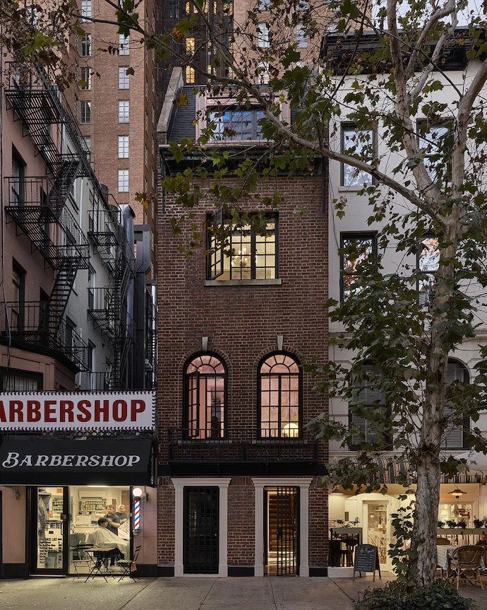
While researching archival images of the townhouse, interior designer Greg Natale discovered that the building originally had two street-level doors. The homeowners wanted a grander entrance, so he replaced the shopfront window with a second door, adding limestone portals to both. -
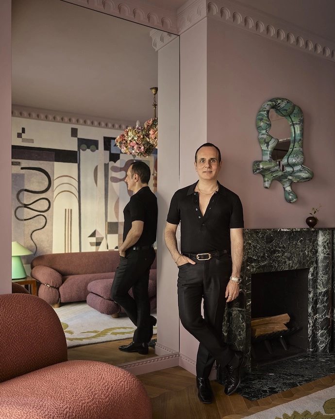
Interior designer Greg Natale. -
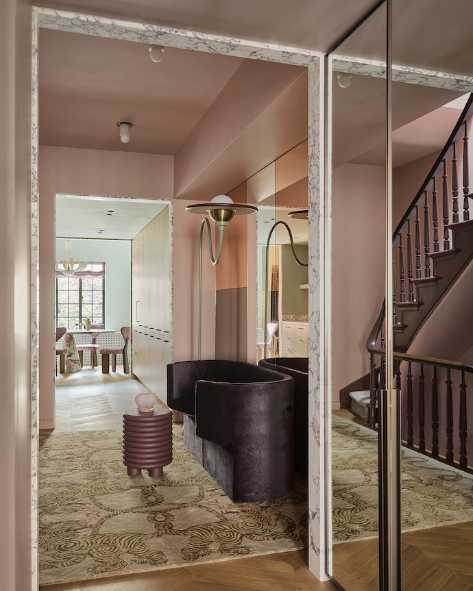
Curved forms – in the shape of Konstantin Grcic’s Odin sofa and Merve Kahraman’s Cassini Rosa fl oor lamp – dominate a landing’s seating nook -
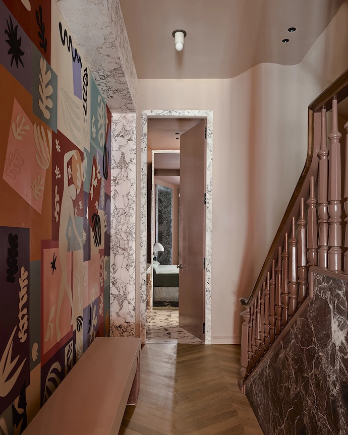
An embroidered and painted de Gournay silk wallcovering in a hallway nods to Matisse’s cutouts. -
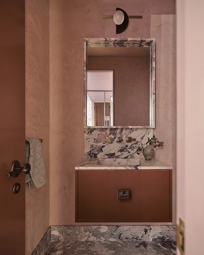
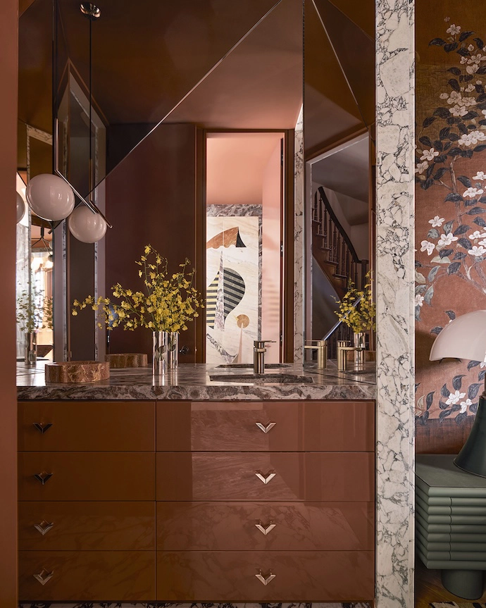
Designs for bathrooms throughout the home were largely monochromatic. -
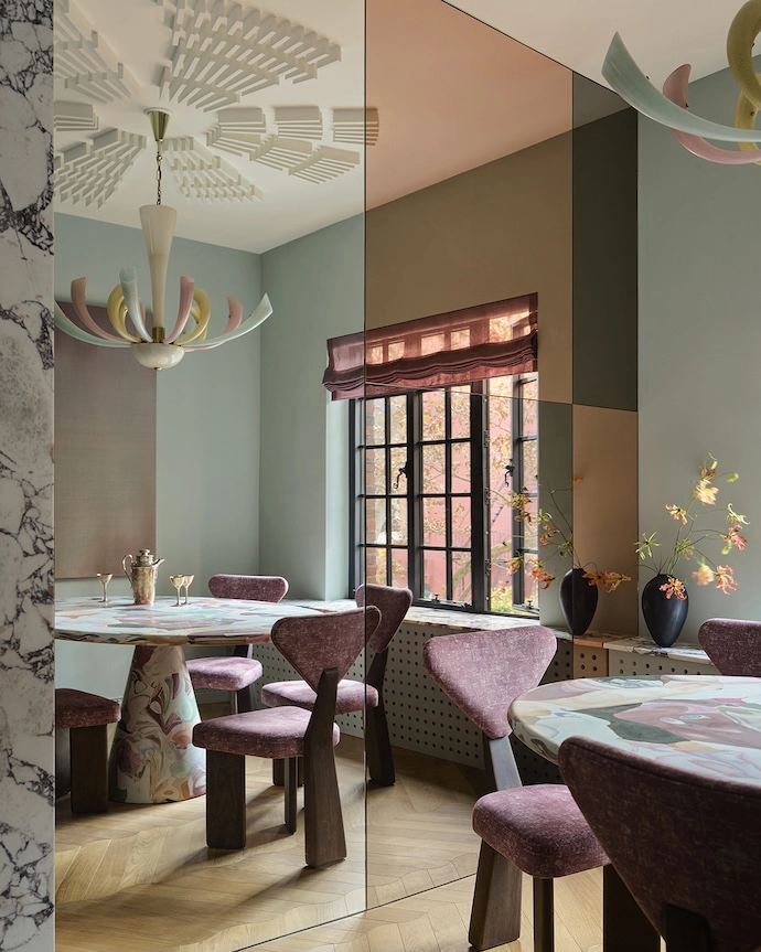
To make the home’s only white ceiling more interesting, Greg affixed a contemporary take on a ceiling rose, a radiating pattern of fins that surround a Murano-glass chandelier. Tinted mirrors add drama. -
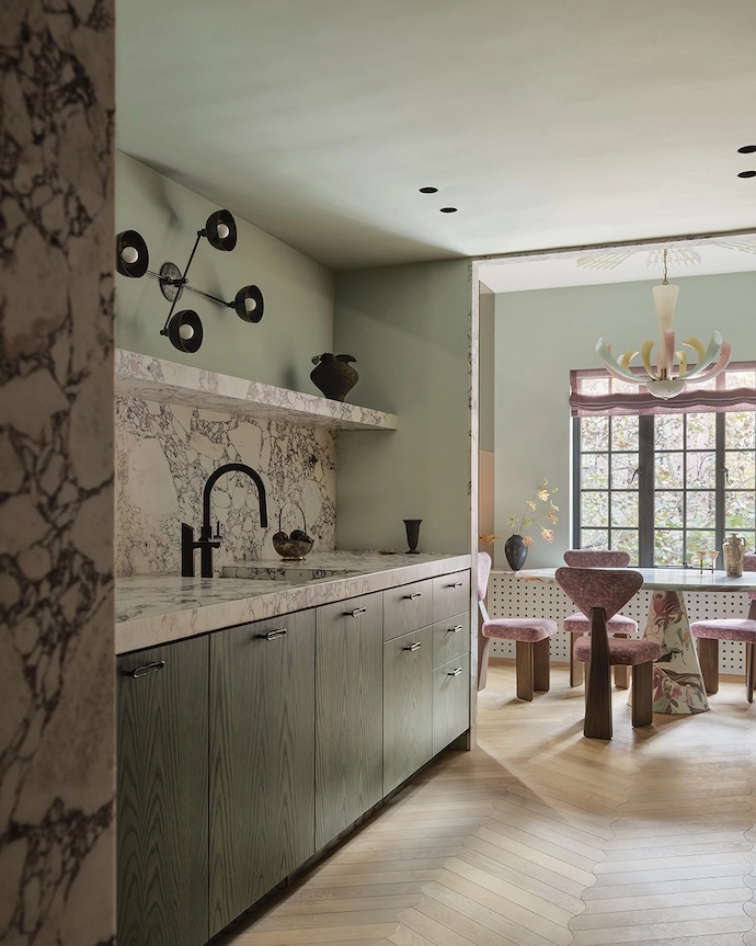
Wall lighting by Gabriel Hendifar, co-founder of Apparatus, and Calacatta Viola marble countertops, shelving and backsplash add personality to the pale-green kitchen, which opens onto the dining space. -
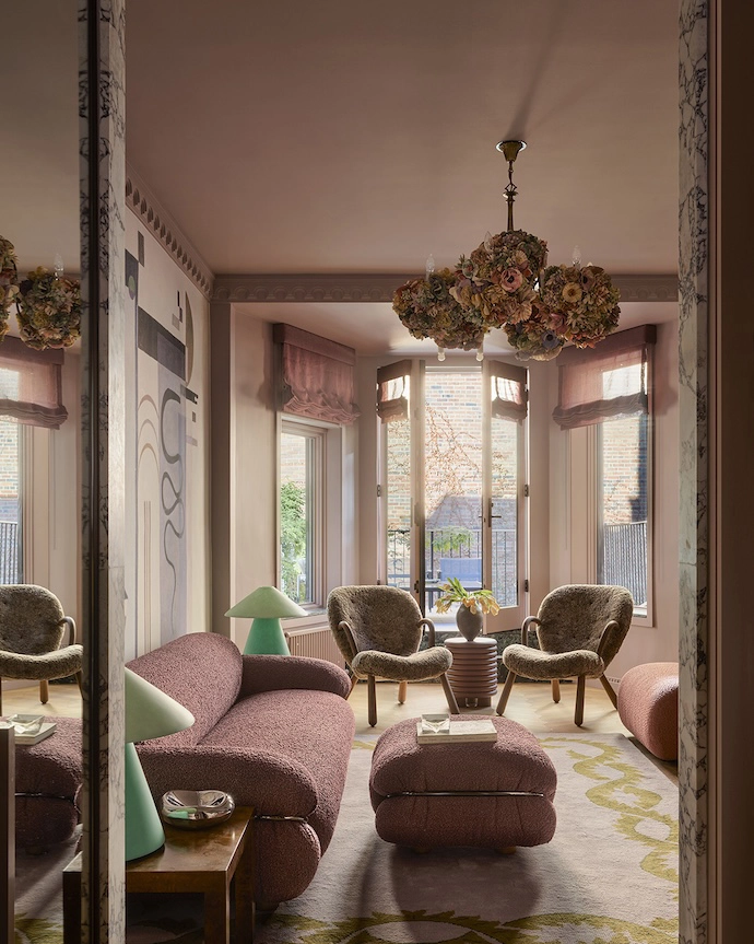
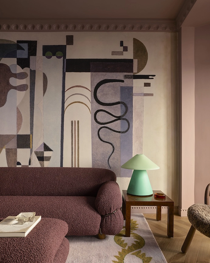
The living room is a masterclass in sophisticated maximalism. A Kandinsky-inspired wallpaper by Papiers de Paris dominates; beneath sits Gianfranco Frattini’s 1971 Sesann sofa and ottoman in a berry-hued bouclé. They are complemented by sheepskin-upholstered vintage Clam chairs by Arnold Madsen and a chandelier by Crizu, made by hand-folding pages from old books. -
The living room is a masterclass in sophisticated maximalism. A Kandinsky-inspired wallpaper by Papiers de Paris dominates; beneath sits Gianfranco Frattini’s 1971 Sesann sofa and ottoman in a berry-hued bouclé. They are complemented by sheepskin-upholstered vintage Clam chairs by Arnold Madsen and a chandelier by Crizu, made by hand-folding pages from old books. -
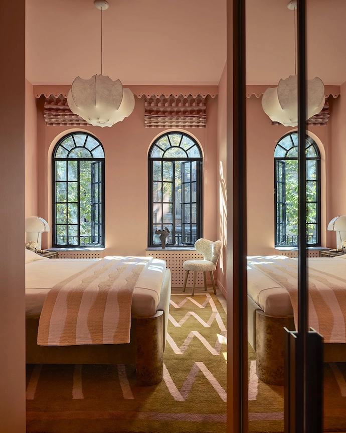
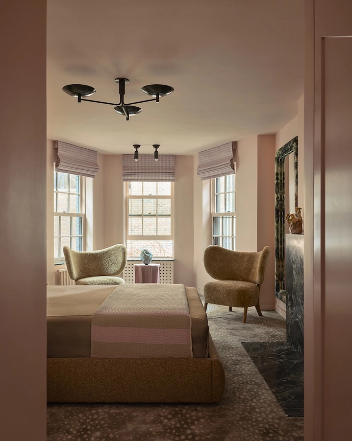
Wanting moments of surprise throughout the house, Greg gave each of the four bedrooms its own distinct look. Here, below a Viscontea pendant light by Flos, pinks and corals abound, off set by a patterned green rug. -
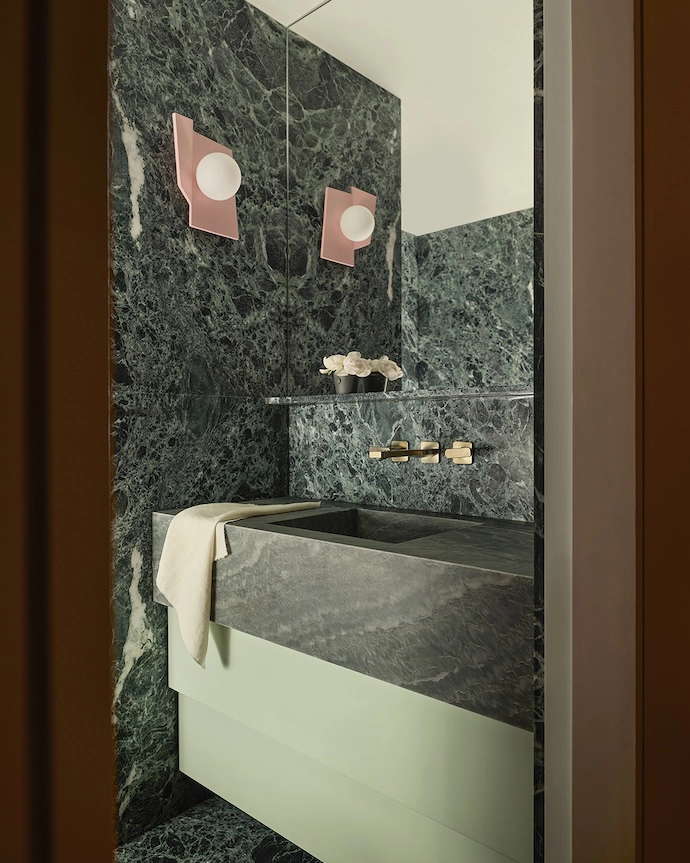
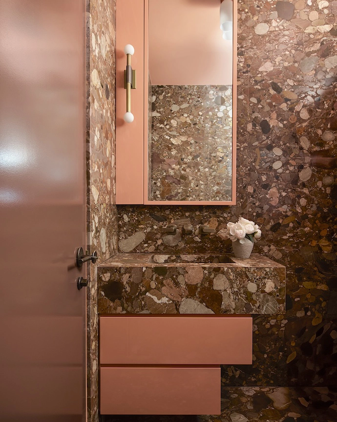
The homeowners’ love of marble saw it used in all the bathrooms. -
There are two guest bedrooms on the top storey – in this one, unusual forms nod to a Surrealist influence. -
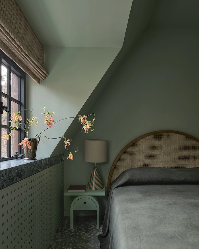
In a bedroom drenched in green, Greg cleverly conceals heating and cooling units behind a perforated screen. -
Colours and textures in the en suite bathrooms complement those in the adjacent bedrooms. -
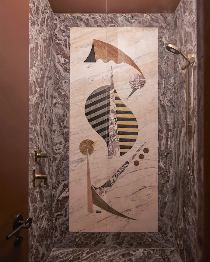
In the en suite bathroom, a bespoke Surrealist-inspired mosaic makes a feature of the shower. -
Mirrors tinted in differing shades create interest above a vanity. -
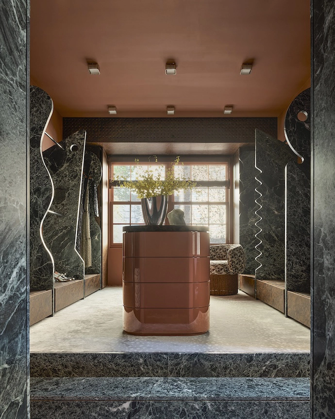
Boutique store display units were the inspiration for the primary bedroom’s dressing room. Several uniquely shaped Verde Alpi marble dividers and walnut burl ledges provide open storage in a space that rivals the sophistication of the city’s boutiques.
Once a narrow button factory on New York’s Upper East Side, this maximalist wonderland combines a pastel palette, Italian finishes and vintage classics to posh effect.
WORDS Martin Jacobs PHOTOS Anson Smart
Wedged between the much wider and taller buildings of New York’s Upper East Side is a sliver-thin red-brick townhouse – a building you might miss were you not already looking for it. Yet for decades, the four-storey structure carried an outsized reputation, drawing New Yorkers and visitors alike to Tender Buttons. The button factory was one of the city’s quirkiest institutions; its closure in 2019 prompted a feature in The New Yorker, in which writer Troy Patterson marked its loss by noting: “Tender Buttons has closed its doors, and we have lost an enchanted place.”
Several years later, an intercontinental phone call kick-started the townhouse’s rebirth – one that today possesses an enchantment of its own. When Australian interior designer Greg Natale received the call from repeat clients – fellow Australians Leticia Francini and Stephen Ninnes – they were dining at a Paris restaurant. So inspired were they by its maximalist interiors that they asked Greg to meet them in New York to undertake the restoration and decoration of their newly acquired 19th-century townhouse, formerly home to Tender Buttons.
The couple envisioned the building as their American pied-à-terre: less a space for entertaining than an intimate home designed to accommodate their visiting adult children. They arrived with a personal brief. “My clients are immersed in the art world, and wanted their home to be treated as a work of art,” says Greg. “Inspired by the Parisian restaurants they were enamoured of, and by maximalist expressions, they sought to apply the same essence to their home, guided by a pink-and-green colour palette. Living in Florence, they had also developed a deep appreciation for natural stone.” Greg’s response is richly cinematic and layered, weaving together Surrealist, Art Deco, Bauhaus and Constructivist references – and the result is a home of jewel-like intensity, where colour, texture and form unfold in surprising ways.
From the street, little has changed. The narrow facade retains much of its historic character, save for the reintroduction of a second entrance – a detail drawn from archival images of the building’s original design. Today, the dual entryways articulate the townhouse’s two identities. One leads to a street-level space (home to the couple’s Art With Love Foundation), the other into their residence. Inside, a primary suite and guest bedroom are on the first floor, entertainment spaces above, and two further guest suites on the uppermost storey.
Other than the kitchen – which Greg reconfigured from a U-shape into a galley, opening it up to the adjoining dining area – the floor plans established during a 1970s renovation have been largely retained. Working within the constraints of a building measuring just short of four metres in width, he turned to illusion to amplify the sense of volume and light. “I approached the design as a painting on a canvas, and experimented with trompe l’oeil to create an illusion of spaciousness,” he explains. “I realised this in the seamless herringbone flooring through all storeys, paired with colour-drenching to maintain continuity of height within each space, while adding mirrors to tight spaces such as the hallways and the dining room.”
Hard finishes become opportunities for pattern play, like in the primary suite’s walk-in wardrobe. “With Surrealism in mind, I designed the cabinetry in sculpted, abstract forms using Verde Alpi stone, contrasted with walnut burl bases,” he says. Fireplaces, door casings, countertops, window sills and stair cladding are rendered in coloured and textured stone. It is here that the homeowners’ affection for marble reveals itself, with Verde, Rosso, Calacatta and Breccia varieties sourced from Italy and installed by Italian stonemasons.
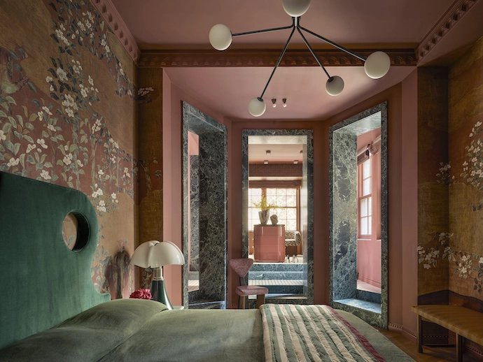
From the simplest to the most intricate surfaces, bold colour abounds. Blush pink, plum, peach, terracotta and mauve pair with celadon, eucalyptus, bottle green, ochre, bronze and more, enveloping each room in an atmospheric palette. Nowhere is this more accomplished than in the primary bedroom. “It’s here that art and maximalism collide at their very best,” says Greg. “There is a Vincent Darré-designed headboard in a Surrealist form, wrapped in dusty emerald-green velvet, and juxtaposed against Chinoiserie wallpaper and deep coral that drenches the suite.”
By way of contrast, the dining room contains the home’s only white surface – its ceiling. In painting it so, Greg draws the eye to the sculptural pieces below. “I chose Dirk van der Kooij’s Meltingpot table, made from recycled plastic and customised by Dirk’s in-house colourist. I paired this statement piece with a set of Juliana Lima Vasconcellos’s sculptural Giraff e chairs and a Barovier & Toso Murano blown-glass chandelier. In each room, I curated furniture pieces to stand like art forms, adding a layer to the home’s canvas.”
The project’s theatrical vintage furniture, audacious palette, glamorous stone and distinctly European sensibility – layered atop a gridded floor plan – speak to Greg’s design ethos. “This approach lives in my studio’s DNA: we look at design through a maximalist lens, layering over a minimalist base.” Were passers-by able to glimpse inside the townhouse, they’d recognise that enchantment has survived – no longer in the curiosities of Tender Buttons, but in the richly layered interiors that have taken its place. | gregnatale.com
Don’t forget to sign up to our weekly newsletter for the latest architecture and design news.