-

Jeremy Volkman, owner and managing director of VISI’s online interior design course partner, BHC School of Design. -

A kitchen Jeremy designed for a project at the Gondwana Game Reserve. -

Interior and architectural designer Hendre Bloem. -

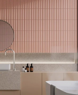
A bedroom that shows how Hendre used a feature paint colour to achieve balance and pull a look together. -

Furniture maker Mia Senekal on her Oyster couch. -

Another piece from murrmurr – the Quarter side table. -

Interior designer Clinton Savage. -

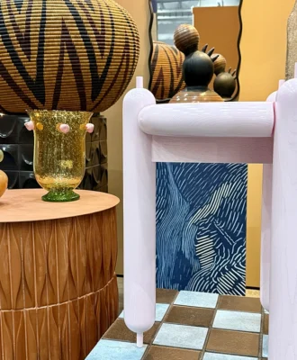
A living room in an expansive Bishopscourt home designed by Clinton's studio.


COMPILED BY Steve Smith
Four interior design gurus – Jeremy Volkmann, Hendre Bloem, Mia Senekal and Clinton Savage – share their approach to using both bold hues and neutrals in projects. Because before you pick up a paintbrush, a few expert tips can make a huge difference.
Choosing the Right Colour Palette for a Specific Space
MIA When selecting a colour, I look at what the space needs to hold. What is the feature of the room? If it is the walls, then I would go for a bold accent colour – but if it is the furniture pieces, then I’d prefer to use a neutral palette for the walls.
JEREMY Although the use of colour is fairly subdued in my designs, I tend to involve the client in the process at an early stage. The use of colour can be so personal, and the psychology behind how a person interacts with the design plays an important role. As a rule, however, I tend to avoid colour trends because they usually date over time, and rather try to focus on a neutral palette, with more textured surfaces within the environment.
CLINTON Before starting any project, there is a process of getting to know the client – understanding their vision and what inspires them, and how this translates into the space. Colour plays a very important part in this. Finding the right balance between trends and longevity will also influence the colour palette, as well as existing decor and lighting. The room in question and its functionality – be it the main bedroom, a child’s bedroom, the kitchen, a study – also plays a role in determining the right colour palette. Each space has an intended purpose that it will serve, and the colours need to work with that.
Balancing Bold and Neutral Colours in Interior Design
HENDRE It’s all about balance when it comes to the use of colour and tones. I look at the space as a whole, because everything from the furniture colour to rugs, feature lights and even artwork can play a role in determining the wall colour. Hendre Bloem Interior Design is known for neutral colour tones that are used in quite bold ways.
JEREMY Neutral colours are timeless, comfortable and warm – and they’re definitely my “go-to”. Accents of bolder colour tend to come thorough in decor accessories such as throws, pillows or artworks. I’ve certainly had to adapt my design style over the years, which has allowed my spaces and designs to evolve. I would suggest using tints or shade variants of the neutral colours chosen as the “bold” colour. Playing with the brightness of these shades will help to set the desired feeling within a space and can create an illusion of depth.
Creating Interest and Depth in a Space when using Primarily Neutral Colours
HENDRE Here it’s all about the layering of tones and the introduction of textures as a contrasting element. I have used the same sort of colour tone on certain projects, yet have achieved a great sense of depth and warmth by combining this with various textural materials. The trick is to layer fabrics, textiles and paint that are all relatively similar in hue.
CLINTON Using textures and layering always creates interest in a space that is primarily made up of neutral colours. Artwork is a great design element for creating a focal point, and so is interesting furniture. Adding reflective furniture pieces and mirrors while paying special attention to lighting is also key.
Incorporating Current Colour Trends into Designs, but still Ensuring Longevity and Timelessness
MIA I like to use trending colours on smaller accent walls or furniture pieces – this allows for easy changes with time. That’s the magic of paint: you can alter an entire space by just repainting one wall; it all looks new and fresh.
HENDRE When it comes to paint, I tend to choose neutral and monochromatic tones. That said, using on-trend colours can also make a statement in key spaces, and especially in areas that are easily repaintable. At Greyton Lodge, areas such as the guest loo and wine bar are great examples of using a single colour on walls, and how it then blends seamlessly with the other tones used in the space.
CLINTON While it’s temping to follow the latest trends, we’re always mindful that these will date. Everyone has their own style, so consider choosing furniture, artworks and other key pieces in colours that resonate with you, because these will always be relevant. Bring in current colour trends with accessories such as scatter cushions, rugs, throws and smaller decor items, or with wallpaper and painted accent walls – these can be changed more easily and affordably. Finding the right balance here is the key to creating a timeless look that will not date.
The Role of Natural Light in Selecting the Right Shade
MIA Natural light is the most attractive feature you can have in a space. When it comes to choosing paint colours, I always take the swatches outside to view, because colour changes with light. Natural light is enhanced by lighter colours, creating a sense of grandeur in a space.
HENDRE Lighting is vital, and it’s important to see things such as paint colours in natural light – but also in the same “temperature” that will be used in the home’s artificial lighting. The surrounding environment also has an impact. For example, if the space is a house on the beach, facing west, the glare of the setting sun will likely be quite harsh – so you might want to move away from a very light or pure white colour, and opt for slightly warmer neutral tones.
CLINTON When it comes to aesthetics, natural light does a far better job of bringing out colour than artificial light. Opting for lighter shades will make a space feel brighter; they tend to reflect the natural light that enters a space. To really maximise this, we use considered design elements such as mirrors or, if possible, a big window, for further emphasis and reflection. All of this will result in a space that feels light and open.
Using Colour to Solve Specific Design Challenges and Enhance a Room’s Functionality
MIA Working with smaller spaces is always a challenge. When you use light and bright colours, it opens up a space.
HENDRE Because paint is relatively affordable and easy to apply, we have used it in various scenarios to solve a design problem. We designed a boutique hotel in which natural oak beds were used in the bedrooms, and at a certain point we realised that, because of other unforeseen costs on site, we could no longer create additional headboard elements as we’d originally planned. The solution was to use a feature paint colour – we achieved the balance we were looking for and pulled the whole look together.
JEREMY Without a doubt, the correct paint specification can mask irregularities in the wall surface. There are so many incredible paint techniques available that I often try various textures and techniques in one space. Not only do these surfaces change as the light changes, but they also provide movement and feeling within the space. Be careful, though – if not applied correctly, many of these techniques can result in costly mistakes. I’ve learnt this the hard way!
VISI Online Masterclass Videos
You can hear more from all our experts when you enrol for our VISI X BHC ONLINE INTERIOR DESIGN COURSE. Jeremy Volkman is the owner and managing director of BHC School of Design, which also happens to be the place from which our other design gurus – Hendre Bloem, Clinton Savage and Mia Senekal – graduated.
Each of them has created an extensive masterclass video with VISI’s editor-in-chief Steve Smith, covering:
✖ Interior decorating core principles (Clinton Savage)
✖ Furniture design (Mia Senekal)
✖ Materials and finishes (Hendre Bloem)
Looking for more design inspiration or tips on how to revamp your space? Sign up to our weekly newsletter, here.