-

With its handsome Art Deco features, the Macleay Regis building in Potts Point remains redolent of the glamour that marked it as unique for Sydney upon its completion in 1939. -

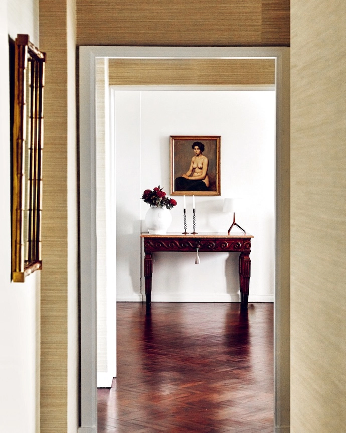
A Phillip Jeffries Manila Hemp grass-cloth wallcovering in Pear lines the corridor to the dining room, where an antique console displays a Foscarini Lumiere lamp beneath a painting that’s a family heirloom. -
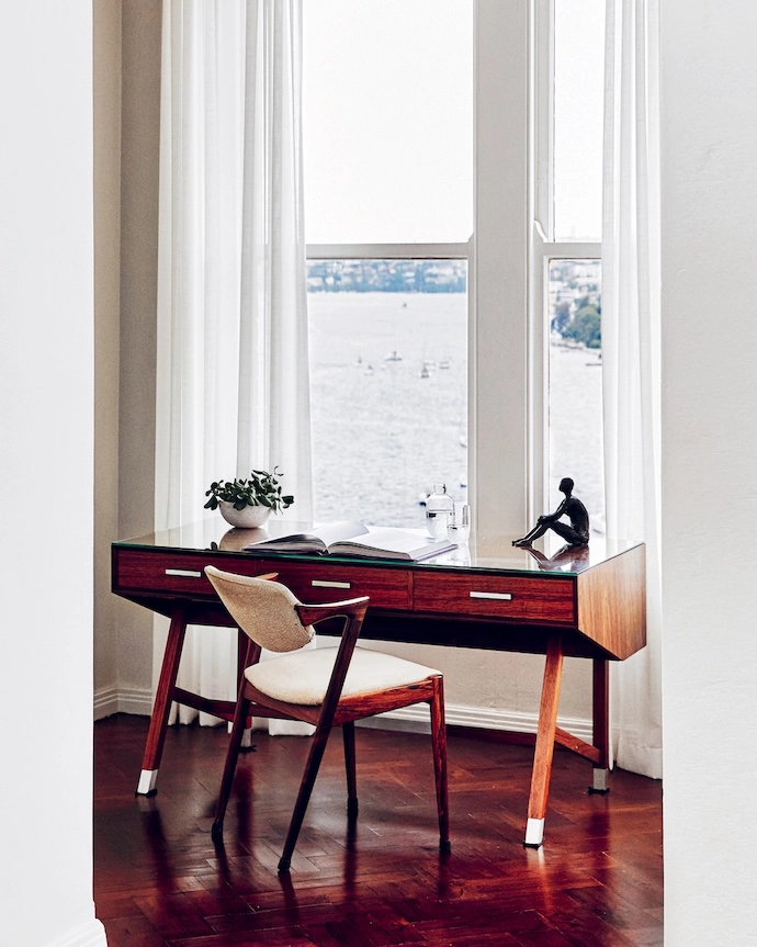
Looking over Elizabeth Bay, the study is furnished with a Henning Jensen & Torben Valeur rosewood desk, and Model 42 chair by Kai Kristiansen. -
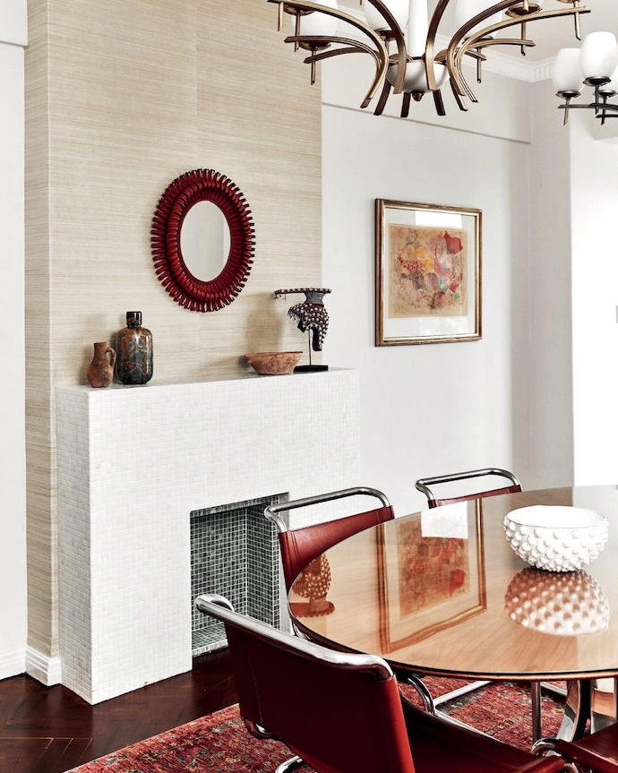
On the mantelpiece, a Neil Bradford ceramic vase is flanked by a Moroccan terracotta vase and bowl. -
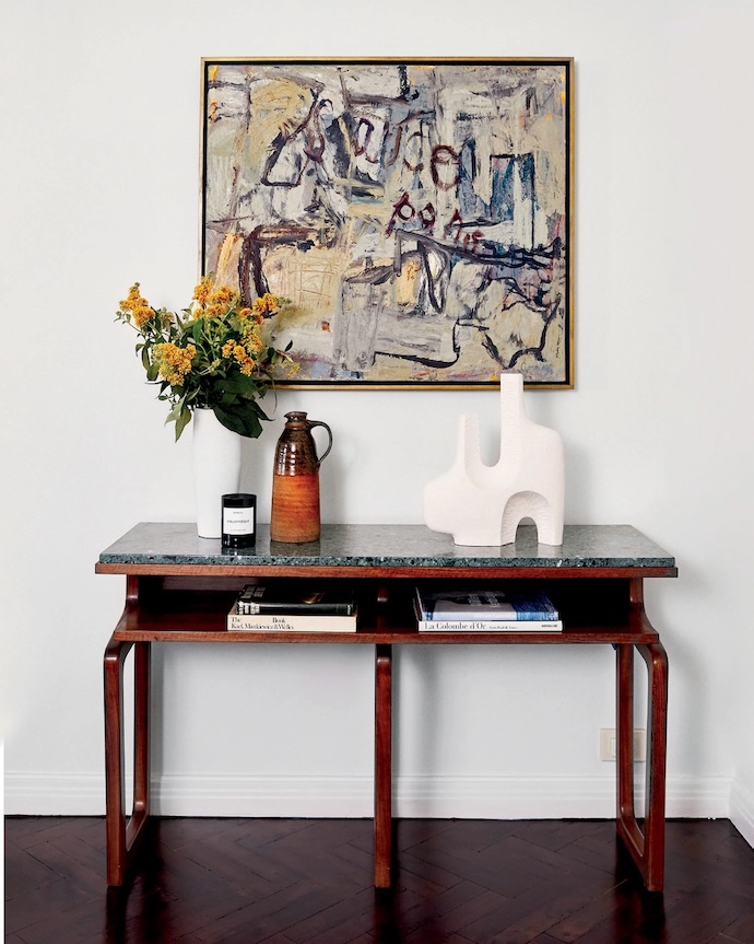
A painting by Elisabeth Cummings hangs above a 1950s console table with marble top. -
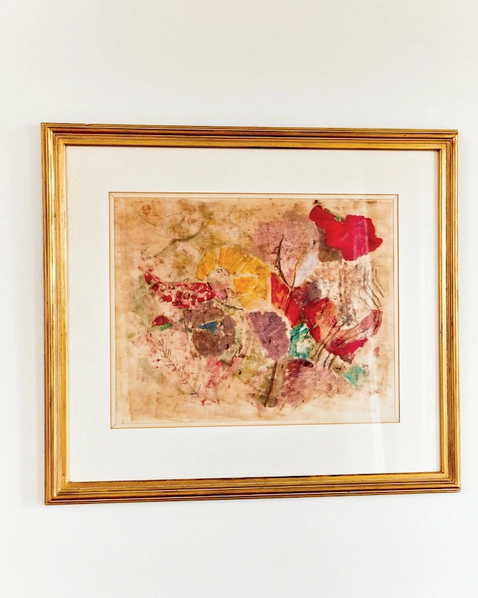
Family heirloom artwork. -
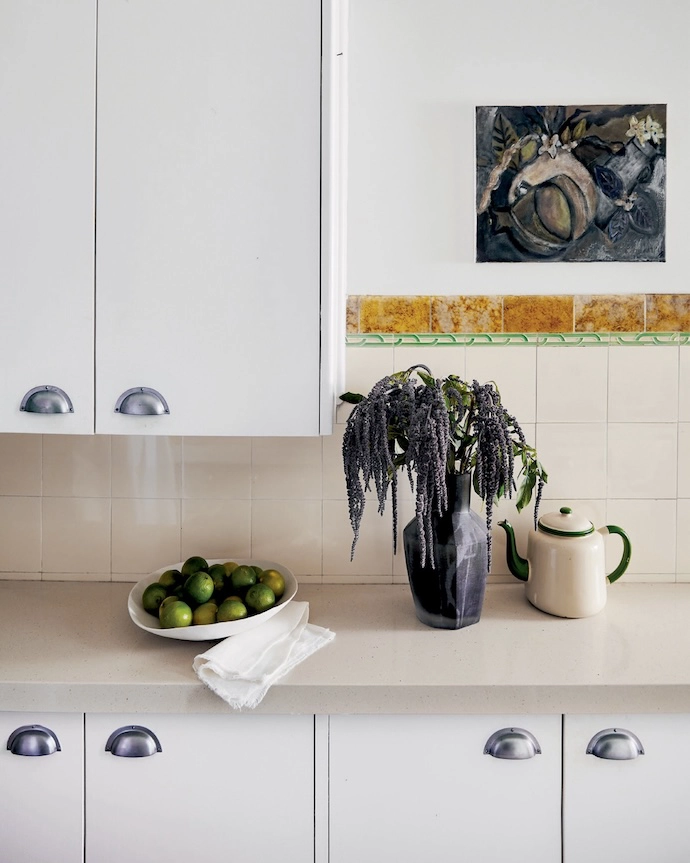
Kitchen cabinetry with period-correct handles. -
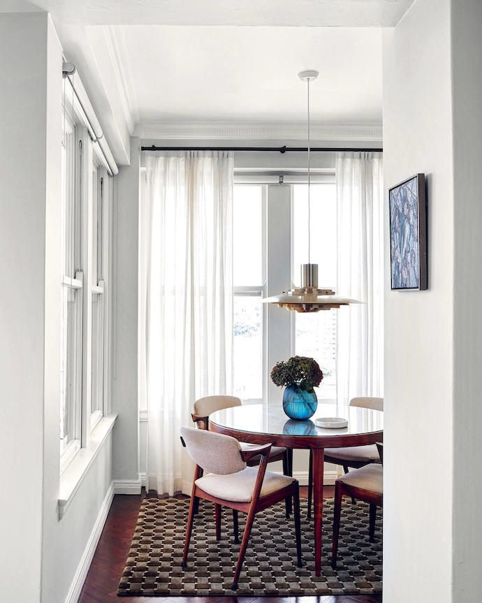
In the breakfast room, a 1950s rosewood table by Helge Sibast and Arne Vodder, with more Model 42 chairs by Kai Kristiansen. -
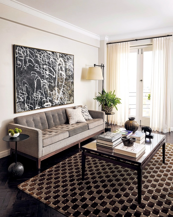
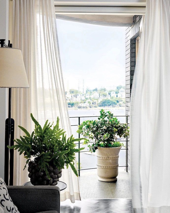
Leading to the distinctive curved balcony, the living room features a three-seater sofa and a 1950s Italian lamp. -
Leading to the distinctive curved balcony, the living room features a three-seater sofa and a 1950s Italian lamp. -
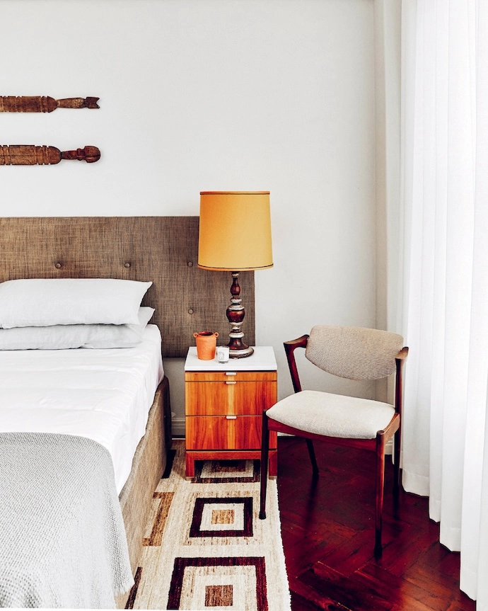
A lamp – a family heirloom – fashioned with an orange silk shade sits on a walnut bedside table. -
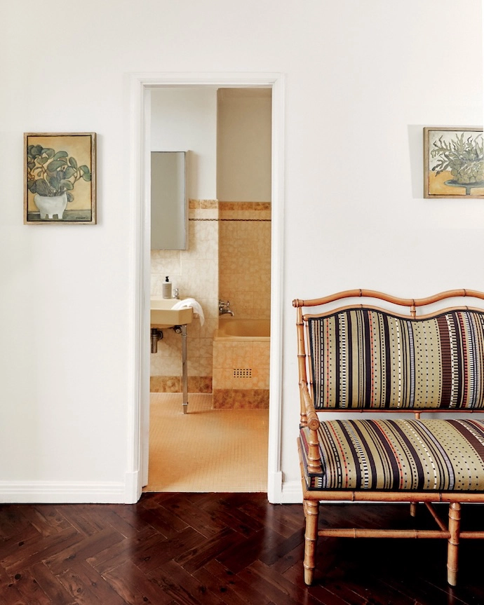
Artworks by the owner and a 19th-century French carved wooden bench reupholstered in a Paul Smith fabric flank the door to the main bathroom. -
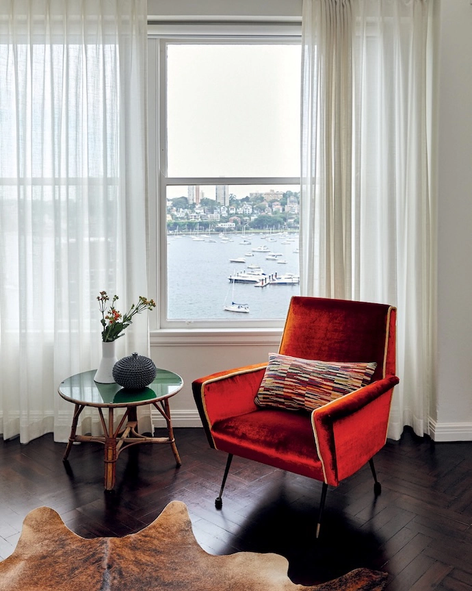
A vintage armchair has been reupholstered in red velvet. -
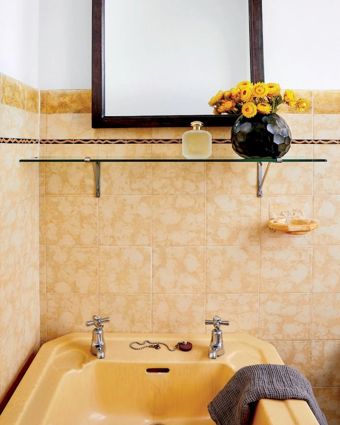
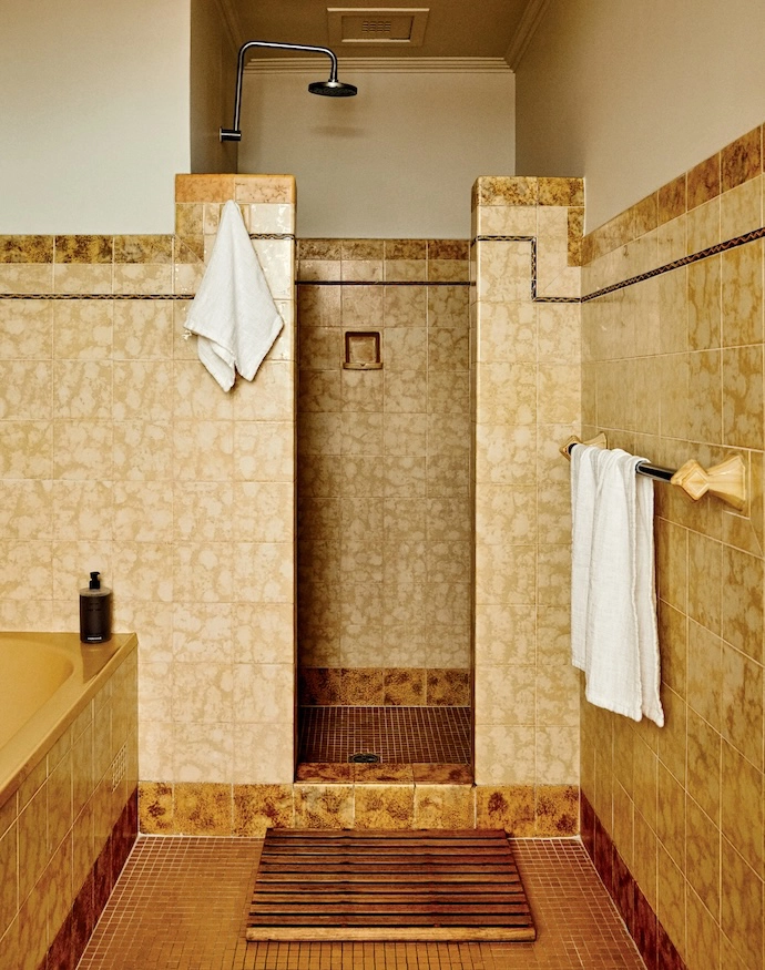
A Colonia fragrance by Santa Maria Novella and a Guaxs vase in the bathroom. -

The main bathroom.
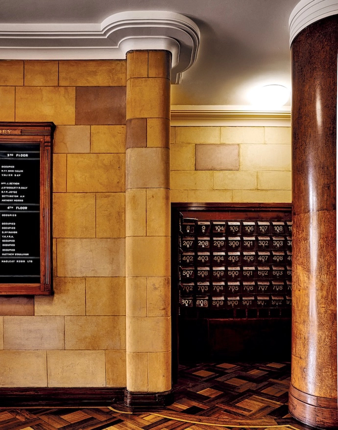
A sensitively restored Art Deco apartment in Potts Point, with an interior that masterfully blends classic, deco and Mid-century design.
PRODUCTION Olga Lewis PHOTOS Alana Landsberry/Are Media/Magazinefeatures.co.za
With its generous room proportions and period details such as parquet floors, geometric cornices and stepped architraves still intact, this 1939 apartment building was a good example of residential Art Deco design in Sydney, Australia. And its heritage significance was always top of mind for its new owner, Peter Stewart – especially since he had bought two mirror- image apartments and was planning to merge them into one. “I imagined what might be possible if they could be joined,” he says. “Each had a logical layout and flow, so the design aimed to make as few changes as possible while ensuring that the finished apartment would feel coherent and original.”
Happily for him, the new space seemed bigger than the sum of its parts. Previous unsympathetic modernisations were reversed, mirrored walls were stripped back in the reception area, and bathrooms were restored to original condition. Peter’s intention was to keep the appearance seamless and authentic, without it being a pastiche of a 1930s flat. The finished space retains its pre-war detailing and layout, and is simply furnished with 20th-century bespoke pieces and personal objects. “Curated interiors can sometimes feel stiff, so the aim was a home that’s relaxed, individual and not too considered,” he says.
“The twin chandeliers in the dining room are the only exuberant touch – but the room can take it.”
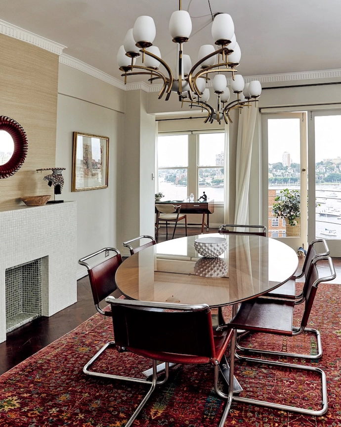
To visually shorten the linear apartment, Peter created focal points by filling in doorways at either end of the corridor. He placed consoles in front of these, with paintings hung above, so there is always something to look at when moving between rooms. Not that lovely views are in short supply: every room has one, including the bathrooms and the kitchen. He also hung mirrors opposite some doorways to bring views and light into the corridor.
Two factors informed Peter’s selection of furniture, art, fittings and finishes: appropriate scale, and his preference for a clean Mid-century aesthetic. He first drew the furniture placement on a floor plan, then confirmed it in the room using newspaper cut to size and laid out on the floor to ensure the pieces would fit and the rooms felt uncluttered. When suitable furniture could not be found, he had it commissioned and made locally.
When a home doubles in size, the risk is that some of the new space doesn’t get used – but Peter quite cleverly overcame that. “At planning stage, we made sure that a few frequently used rooms were scattered throughout to ensure the entire space was well utilised in the course of a day.”
As you’d expect, merging two separate apartments into a single space that offers the internal flow of something originally designed as one could never be achieved without some challenges. The structural issue of combining the two proved relatively straightforward with the creation of a linking corridor between two walk-in cupboards. This now forms the spine of the apartment, off which all other rooms flow. There was a minor challenge when it came to aligning the mismatched corridor walls – one jutting out further than the other – but a few sheets of plasterboard solved that. “The biggest hurdle was obtaining approval for the project; it took several years of negotiations,” says Peter. “Whenever I felt like throwing in the towel, I was reminded of the potential of the finished place… and of a favourite family mantra: ‘If at first you don’t succeed, try, try and try again!’ The result was worth the effort.”
Don’t forget to sign up to our weekly newsletter for the latest architecture and design news.