-

Tea with George by Scholten & Baijings -

Paper Patchwork by Studio Job for Moooi -

Dalmatian pup by Magis -

Adidas by Tom Dixon -
Adidas by Tom Dixon -

Urban Tribe by Fiona Kruger -
Urban Tribe by Fiona Kruger -
Urban Tribe by Fiona Kruger -
Urban Tribe by Fiona Kruger -

Rising Table by Robert van Ebricqs -

Rising Side Table by Robert van Ebricqs -

Rising Stool by Robert van Ebricqs -
Rising Chair by Robert van Ebricqs -

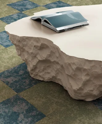
Patricia Urquiola’s Earthquake 5.9 collection for Budri -

Patricia Urquiola’s Earthquake 5.9 collection for Budri -

Adidas by Tom Dixon -

Patricia Urquiola’s Earthquake 5.9 collection for Budri


The 2013 Milan Furniture Fair has come to an end, but four intrepid design pilgrims from Africa, including VISI’s Annemarie Meintjes, Formfunc’s Peter Kowalski, Design Indaba’s Kelly Berman and 5rooms’s Sean Weldon are still ululating about this year’s highlights and the trends that are bound to pop up at a shop or a show near you.
 Annemarie Meintjes, deputy editor of VISI
 Annemarie Meintjes,
 What was the mood at the Milan Furniture Fair this year?
Rather businesslike – at least until the cocktail hour, when things usually loosened up a bit.
What was different about the event this year?
Everything was even more spread out with numerous capsule expos popping up in a variety of new spaces all over town. Saloni 2013 at Rho Feira revolved around Jean Nouvel’s project Office for Living. Zona Tortona has lost its buzz and all the young designers now gather at Ventura Lambrate, but it still a cumbersome and time consuming destination to visit making it difficult on the extremely tight time budget of many Milan visitors. To me it seemed that Spazio Rossana Orlandi is the place to be and to be seen.
What was the same?
The fabulous exhibitions at the Triennale Design Museum never disappoint!
Which trends caught your attention?
- Furniture pieces that are a perfect blend of home@work and work@home.
- More chairs than we’ll ever be able to sit on.
- Shades of green – clearly an interpretation of “emerald”, Pantone’s colour of the year for 2013, which is actually a very difficult colour to capture.
- Basic colours – everything is either all white, all black, sometimes shades of grey, with strong colour accents.
- Tone-on-tone colour use, for example pink – from flesh to nipple pink, used against a terra cotta backdrop.
- Designers revisiting tradition with a special nod to artisans, their craft and traditional materials.
- LED lights.
Tell us about some of the show-stopping designs that you saw.
- I was bowled over by the Afrofuture exhibition at the La Rinascente department store – from the animated storytelling window displays right down to the Design Supermarket and the coffee shop in the basement.
- I loved the stands of the big lighting brands at Euroluce and Tom Dixon’s new Adidas online range, which was launched in the steam train section of the Museum of Science and Technology (MOST).
 Peter Kowalski, Formfunc Studio
 Peter Kowalski,
 What was the mood at the Milan Furniture Fair this year?
Circumspect, cautious at best. I’m speculating that this was partly due to the precarious economic times continental Europe is facing. There was less innovation than previous years and more revision of existing designs, but that’s not to say that there weren’t interesting concepts to view.
What was different about the event this year?
There was much less emphasis on translucent polymer materials – natural tones and raw materials like timber and stone were everywhere.
Which trends caught your attention?
I loved the emphasis on acoustics and mobile spaces extended from Orgatec 2012 – the concept of creating a private space with effective sound attenuation without the need to build fixed walls. Several manufacturers have continued the momentum of high-walled sofas and armchairs upholstered in various sound-absorbing fabrics. This concept will gain momentum as it represents a more cost-effective solution for private spaces and allows designers to challenge the repetitive workplaces dominating current open-plan offices.
Tell us about some of the show-stopping designs that you saw.
Jean Nouvel’s Office for Living goes a long way to reiterate how internet-age knowledge workers are starting to reject repetitive corporate environments. It provides examples of how easily existing (even residential or light industrial) spaces can be transformed into working environments. Nouvel talks about interpreting the technical, cultural and social changes of the mobile/internet age. His ideas are not new but they highlight how easily the divide between work and play can be blurred successfully. It inspired visitors to think differently about our current corporate workspaces.
The young designer Robert van Ebricqs was my highlight at iSalone Satellite. His refreshing use of material – cutting transformed raw manufactured bamboo sheets into organic functional pieces – clearly took a lot of thought to develop. It was one of the few design concepts from the emerging designers that had some commercial viability attached to the aesthetic value. It will definitely not be the last we see of this young talent.
Kelly Berman, Design Indaba Expo
 Kelly Berman,
 What was the mood at the Milan Furniture Fair this year?
It was my first time so it was difficult for me to get a read on the mood. For me though it was very exciting!
What was different about the event this year?
I stand to be corrected, but I think the Afrofuture event presented by La Rinascente, a popular Italian department store, was the first concerted presence our continent had at the event. It entailed a very exciting series of events held in the “Design Supermarket” on the lower level of the store and included Ghanaian coffin-making workshops, panel discussions, a party featuring a DJ playing Angolan music, and the “Galactic Zine Sweatshop” where Cape Town-based zine Jungle Jim crowd-sourced the creation of a new issue with people in store and around the world.
Which trends caught your attention?
Colour, colour everywhere! Brands such as Vitra, Moroso and Casamania revelled in lush green, lemon yellows, pumpkin and cherry pink. An ubiquitous scheme was paler tones paired with strident candy colours à la Scholten & Baijings, particularly neon coral with the palest of grey greens (as in Mae Engelgeer’s new collection shown at Ventura Lambrate).
In decor: Storage as a design feature – cabinets and sideboards in bright, poppy colours and as stackable modular units (Tomás Alonso’s Offset Shelf System for Max Design and Paolo Cappello’s Monk storage units for Valsecchi 1918); lots of wicker, sometimes mixed with plastic (Casamania); and woven elements, especially in indoor/outdoor furniture.
Tell us about some of the show-stopping designs that you saw.
I was impressed by Patricia Urquiola’s Earthquake 5.9 collection of wall and floor coverings, coffee tables, wall-mounted bookcases and decor accessories for Budri, an Italian marble-inlay company. The marble came from the marble plant’s slabs that were damaged in the earthquakes that shook Northern Italy last year. I have never seen the full range of colours and striated patterns of marble used so creatively.
I also loved the young designer Fiona Kruger’s Urban Tribe series of textiles and vessels. She used patterns that she developed from industrial buildings and objects and translated it into richly coloured, striking motifs. She had her sketchbooks laid out for visitors to page through and it was fascinating to see her process of simplifying images into a pattern.
Sean Weldon, 5rooms.com
 Sean Weldon, 5rooms.com
 What was the mood at the Milan Furniture Fair this year?
The mood was far more upbeat, contemporary, professional… It was clear that the top brands are still the market leaders and also good to see collaboration between brands such as Diesel and Moroso, etc.
What was different about the event this year?
There was clearly an effort to combat “Chinese copy cats” with the utilisation of multi-materials in new products as well as the revival and relaunch of old classics. Magis have managed to reflect this strategy in many of the products in their latest ranges.
What was the same?
The 1940s to 1970s inspired most of the designs in Milan. Many manufacturers were reviewing old designs from their archive. There is also still a strong Scandinavian influence as well as a slant towards industrial chic.
Which trends caught your attention?
For me bare wood – especially walnut wood – and truly beautiful joinery was the biggest overall trend. A certain section of Saloni was dedicated to solid wood with displays of all different types of wood and small workshops where craftsmen gave insight into their work. New sub-straight combinations were also used in many furniture designs: wood and resin, wood and metal, wood and wicker.
Earth tones, terracotta, putty, slate and mustard are the hottest hues when it comes to home textiles, wall finishes and decorative accessories and upholstery. Other colours that kept popping up were neutrals and desaturated shades with nude (salmon pink) as the new favourite colour used by many manufacturers. Candy colours are also still around.
Furthermore, a huge amount of metal was used in furniture and lighting designs with bronze, and its 1950s feel, being the latest trend.
Tell us about some of the show-stopping designs that you saw.
Brands such as Flos, Moooi, Kartell, Magis, Tom Dixon and Arper and designers such as Stefano Giovannoni, the Bouroullec brothers, Philippe Starck and Marcel Wanders still have a huge influence on the catwalk of product and interior design.
The Cape Town 2014 World Design Capital pop-up store on Corso Garibaldi in the Brera district was an impressive campaign. The 40 or 50 of us in the South African contingency were very proud.