-

The scallops were the perfect opportunity to do a colour-fade. Each band has its own hue and, even though only four colours have been used, each scallop, with the light reflecting in different ways as it curves, has a natural fade. -
The scallops were the perfect opportunity to do a colour-fade. Each band has its own hue and, even though only four colours have been used, each scallop, with the light reflecting in different ways as it curves, has a natural fade. -
Dokter and Misses not only created custom pieces for Tropicana (including the striking Strelitzia floor lamp), but also introduced counterintuitive colours such as burgundy and olive-green, which work brilliantly with the pinks and blues. -
Tropicana: A Colourful Art Deco-Inspired Gem by Robert Silke -
Tropicana: A Colourful Art Deco-Inspired Gem by Robert Silke -
Tropicana: A Colourful Art Deco-Inspired Gem by Robert Silke -
The kitchen is proof that great design doesn’t have to cost a lot, as expensive terrazzo kickplates and countertops and fancy cupboard handles are off set by cheaper backsplash tiles, melamine cabinets and blue vinyl flooring. -
Dokter and Misses created all the artworks seen on the walls of Tropicana. -
The custom wallpaper is a design by Kipper Millsap for Cara Saven Wall Design. -

Tropicana’s rooftop pool transports you through a time portal – straight onto the deck of a 1930s cruise ship as it approaches the Miami marina. -
Tropicana’s rooftop pool transports you through a time portal – straight onto the deck of a 1930s cruise ship as it approaches the Miami marina.


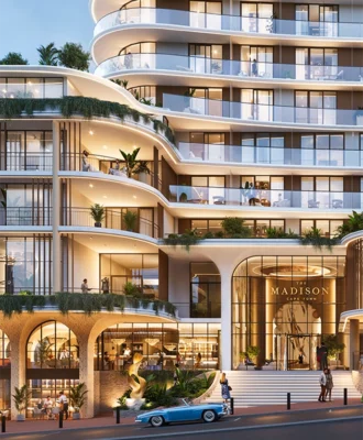
Tropicana – a new Miami art deco-inspired hotel by Robert Silke & Partners – revels in a few playful games with its architecture, its interiors and, appropriately, its price tag.
WORDS Steve Smith PRODUCTION Mark Serra PHOTOS Greg Cox
You can’t miss Tropicana – at least on paper. As you can see here, the striking hotel is a dreamy piece of confection that you could as much take a bite out of as step inside. Among its mostly monochromatic neighbours, the light-blue-and-pink Tropicana looks like it’s crowned by a permanent rainbow and staffed by My Little Ponies. Except it’s deceptively hard to spot in the flesh.
Rising from a small triangular plot of land where Sea Point’s Kloof Road forks, Tropicana’s pale blue-meets-pastel pink manages a trick of hiding in plain sight. Along with its curves and soft lines, the blue half of its exterior merges with the sea and sky for most of the day, while the pink folds it into the blush of sunset. Robert Silke, founder of Robert Silke & Partners – the architects of the building – describes it as having “an almost holographic appearance, like you’re not sure if it’s pink or blue or silver”. It’s genius… and a fortuitous stroke of luck.
“It was supposed to be white, like the Flamingo,” says Robert, referring to the nearby Bauhaus-inspired apartment block also designed by his team. “We sort of have an unwritten office policy that our buildings must be white, especially on Sea Point Main Road. But during construction, the client, Signatura, said, ‘Don’t you want to do some colour?’
“We initially fought the idea, and I felt some resentment… I thought, ‘You want colour? I’ll give you colour.’ With the gradation concept, I thought I was presenting them with something they’d never go for. But the moment they saw it, they were like, ‘Yup!’”
Like the trick it plays on the eye, Tropicana also fools around with its architectural style. At first glance, it seems a fun homage to the kind of tropical Art Deco that Miami’s famed South Beach is known for. And it is – but it’s also playfully subversive. For one thing, the way the balconies on the corners alternate and come off the colour-graded scallops breaks all the rules of how trad Art Deco would employ this architectural device.
“The scallops should have come all the way to the ground, creating the idea of a skyscraper on the corner. Ours go off at a tangent onto the balconies, which breaks the skyscraper motif in a way an Art Deco architect would never have done. It’s actually more in line with what Paul Rudolph would have done,” says Robert, referring to the US architect of the 1960s and ’70s known for his avant-garde Brutalist buildings. Strip away the pink and blue paint, down to plain cement, and you’ll indeed have a facade that’s more than just a nod to Brutalism.
“We love that people love our buildings and that they’re crowd-pleasers – but we also try to get a bit of real architectural muscle in at the same time. ‘Good’ buildings can play to both audiences – and there are some architectural in-jokes and references in Tropicana.”
Tropicana doesn’t just laugh up its powder-blue linen shirtsleeve, though; in its own way, it’s all about inclusivity. “Context is everything. Our buildings are designed to speak to the buildings around them – the pretty ones as well as the ordinary ones,” says Robert, referring to the variety of buildings that surround Tropicana, from Art Deco to ’80s and ’90s Pomo, and contemporary black brick and steel. “The hope is that if you speak to those buildings by incorporating bits of them into your design, you acknowledge them, and perhaps help uplift them as well.”
Another stroke of genius was getting Katy Taplin and Adriaan Hugo, the interior product design duo behind Dokter and Misses, to do the furniture and lighting. As with Tropicana’s exteriors, simply replicating Art Deco furniture in the interiors would have been way too on the nose for this project – so instead, Dokter and Misses designed a series of pieces that play somewhere between old, new, Deco, Memphis Group and Futurism.

“I see a strong link between early 1980s Memphis Group furniture and Art Deco,” says Robert. “When Memphis started to appear in Milan in the late 1970s, founder Ettore Sottsass’s pieces were basically all retro Deco. The Miami Art Deco revival movement started in the mid- ’70s, and was an avant garde part of design culture in the late ’70s and early ’80s, with Memphis picking up directly where Deco left off. The Joburg Memphis vibes of Dokter and Misses were, therefore, perfect.”
There is some clever fun and games going on with the interior materials, too. As game as the folks at Signatura were for Tropicana’s whimsical design, the budget was still constrained by the parameters of a spreadsheet. Fortunately, Art Deco was always about being decorative on a limited budget, creating cheap forms with bricks and plaster. If you wanted “premium”, Art Nouveau was more your bag. Deco was for the masses.
Not only does Tropicana’s curved exterior represent that affordability, but Robert, Adriaan and Katy have been pretty canny in mixing expensive and cheap materials. The terrazzo tiles in the passageways and on the kitchen floors and kickplates are, for example, quite pricey – or, as Robert puts it, “reassuringly expensive”. It allowed the team to use cheaper materials such as marble-look melamine for the bedside tables and coffee tables (as decorators actually did in Deco apartments back then), as well as employ clever tricks like installing wonderfully retro ceiling lights made from sheets of MDF, and cheese-light fittings from a local supplier.
The ceramic wall tiles are another example: they’re called Project Grey, and were purchased at Tiletoria for R130-R140/m2. You simply can’t get better value than that. What you can do is pimp them up by adding pink epoxy grout; together, they make a statement.
And then there are the blue vinyl floors. Instead of the ubiquitous faux-oak vinyl go-to favoured by most developers, Robert chose a standard vinyl that’s usually installed in hospitals. It’s not just hard-wearing but, in blue, it’s also fun – and, again, it’s period-correct for 1930s Deco. “It speaks of the sea and the sky… and the budget. It’s, like, R250/m2,” he says. “That said, I don’t think we could have got away with it if we didn’t have the Dokter and Misses furniture!”
The end result of all this is a slice of escapism, which is exactly what you want when you’re on holiday. Holidays need to be memorable – and yes, Intstagrammable – something Tropicana offers in spades. “Pink might not be your favourite colour,” says Robert. “You might not have it in your home. But you would endure it, and probably even enjoy it, for a few weeks while on vacation.” robertsilke.com | dokterandmisses.com
Don’t forget to sign up to our weekly newsletter for the latest architecture and design news.