-

Shades of winter -
Shades of winter -
Shades of winter -
Shades of winter -
Shades of winter -
Shades of winter -
Shades of winter -
Shades of winter


WORDS Malibongwe Tyilo
In the lead up to Colour Nation, Plascon’s colour forecast that will be featured at Decorex Cape Town from 25 to 28 April, Plascon’s colour manager Anne Roselt and 100% Design South Africa’s programme director Cathy O’Clery gave us a sneak peek into what we can expect from this year’s palettes.
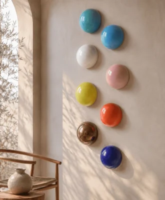
Autumn is here and winter is looming but, just because the skies are grey and leaves are starting to turn brown, does not mean your home’s colour scheme should stick to brown and grey too. According to Anne, bold colours are the way to go: “This year, purples, oranges and reds are coming through very clearly, and decorators and consumers are being much braver with stronger colour than they’ve been before.”
African influence also has quite a role to play in the new palettes, she goes on: “The world of colour is drawing tremendous inspiration from Africa and, using that inspiration to assist the third world in return.”
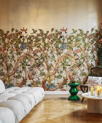
Admittedly, not many of us are about to completely redo our homes because of the change in season, however a fresh coat of paint could be as good as a makeover, and addition of colour through affordable decor accessories could turn your home into a sanctuary from the harsh winter weather.
“In the past, there was a trend towards featuring one accent wall in your home. Now we are seeing complimentary colours on the other walls instead of a safe neutral,” points out Cathy, who also consulted on the Plascon colour forecast. She also added that while tones of grey were still quite popular, they work well with colorful pastels.
“Consumers are much more confident these days and a lot more educated than ever before. With social media platforms like Pinterest, it has enabled us all to edit our own style and head out to the shops knowing what we want,” she asserts.
When it comes to Cathy’s choice of the strong colours and accents for this season purple was one of the top colours on her list. Incidentally, Radiant Orchid is the Pantone Colour of the Year. This winter’s biggest metallic accent is copper: “It came down from northern Europe, where the Swedes and the Danes started to use copper. It is now most definitely the metal of the moment and works so well with this season’s pastels,” explains Cathy.
Look out for more colour inspiration at the Plascon stand at Decorex Cape Town, where experts will be on hand to demonstrate paint effects as well as advise on the best paint for your needs.