-

Inner space -
Second nature -

Urban tribe -

Calm contrast -

Anne Roselt -

Urban tribe -
Second nature -
Inner space -
Calm contrast


WORDS Lauren Shantall PHOTOS Mark Williams
Colour is her currency, which is why Plascon’s colour manager, Anne Roselt, is printing new notes for 2014 – ones that are as vibrant as the emerging BRICS nations and as ethereal as the halo ringing the moon. We asked her how she came upon her crystal ball and what it really entails to pluck these colours, seemingly, from the air.
How did you become a colour-trend forecaster?
I’ve been involved in colour forecasting since Plascon’s first forecast in 1999; we used the London-based International Colour Authority (ICA) trend forecasts as our base. The ICA panel members did not have any African representation, however, so I wrote to them as I felt that Africa was already a source of inspiration to international designers. I was invited to a meeting in 2000, went over with an African-inspired range of colours that went down a treat, and have been invited back every year since.
How do you decide which colours go in?
It’s a matter of staying aware of what colours are coming through in all sectors of design – product and fashion – as well as material innovation, and political and social drivers. We also have a South African panel, who decides on the final colours that go into the forecast.
Are trend forecasts best decided by panel or a sample of one?
Definitely a panel, because we have such strong emotions attached to colour. If it was only up to me, chartreuse would probably never make the final cut! You need a balanced view of colours. We actually have major arguments about which colours are more important than others, believe it or not!
If trends are seasonal, what makes you confident that your trend forecast will remain valid for a year?
While it is true warmer colours are more desirable in winter and cooler colours in summer, the season’s edges are becoming blurred and we feel confident that colours selected in the Plascon Colour Forecast cover the full gamut.
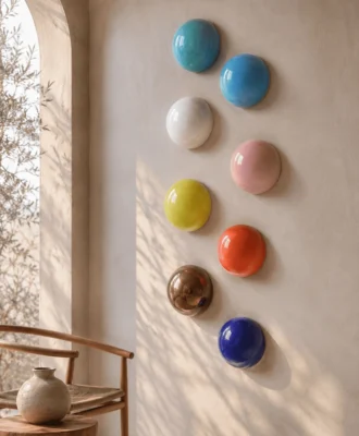
Plascon Colour Forecast 2014
Urban tribe
With South Africa having hosted the World Cup, Brazil hosting it this year, as well as Cape Town being World Design Capital, there is worldwide enthusiasm for the countries of the Global South. Finding their place in the spotlight, these countries’ vibrancy and design aesthetic is cause for celebration – the essence of these colours, which exude enthusiasm, new energy and drive.
Second nature
“Green” and sustainable design has always tended to occupy a conventional palette of earth-led colours. This collection sees a new injection of vibrancy, more suited to urban window farms than farmlands! The new, brighter “naturals” have the kind of vitality that will appeal to city-dwellers who carry an acute consciousness of the environment paired with sophisticated expectations.
Calm contrast
Pastels have broken out from the confines of the baby’s nursery. Previously associated with a soft, feminine appeal, pastels are no longer gender-specific and thus more balanced and far-reaching in their appeal. Pastels can appear effortlessly contemporary when the placid hues, lacking in oomph on their own, are combined with deep navy, copper and other heavy, grounding neutrals.
Inner space
This moody and contemplative palette is the perfect “silk” for the cocoon effect, which treats the modern home as a sanctuary and respite from the stresses of today’s world. This colour set has a decided lunar and cosmic bent, drawing its neutral and deep tonal inspiration from the night skies, the very skies that invite reflection and introspection.
Follow Anne on Twitter @anneroselt or visit plascontrends.co.za stay on the cutting-edge of colour trends.