-

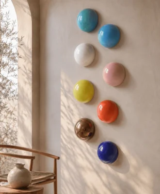
Calm : Muted, soft, subtle and tranquil  these colours create understated sophisticated interiors that are long lasting. Due to the muted chalky grey undertones these colours are an excellent choice for north-facing rooms and add a sense of spaciousness. -
Fresh : These colours are clean, crisp and breezy and include a wide range of shades from intense pigmented brights that are well suited to children¹s décor and contemporary styled homes to the lightest of pastels  great for maximising light in a room. -

Rich : Strong, dynamic, powerful and bold  due to their intensity these colours are mostly applied as an accent wall and combined with a suitable neutral. -
Warm : These colours are comfortable and welcoming, perfect for adding a gentle cosy atmosphere to open plan living rooms that may feel clinical.


“Colour is a very personal choice and an expression of us,” says Dulux colour expert Sonica Bucksteg. Here she offers some practical advice on how to create a colour scheme for your home that is as beautiful as it is functional.
Four moods
Our homes reflect our wonderfully varied personalities and different rooms require specific atmospheres for each of us to feel at ease in them. Dulux has grouped its colours according to these four moods:
- Rich: Strong, dynamic, powerful and bold – due to their intensity these colours are mostly applied as an accent wall and combined with a suitable neutral. If you prefer a dramatic effect, paint all walls with a rich hue, but be sure to balance it by adding lots of neutrals or white to your soft furnishings and decor.
- Fresh: These colours are clean, crisp and breezy and include a wide range of shades from intense pigmented brights that are well suited to children’s decor and contemporary styled homes to the lightest of pastels – great for maximising light in a room.
- Warm: These colours are comfortable and welcoming, perfect for adding a gentle cosy atmosphere to open plan living rooms that may feel clinical.
- Calm: Muted, soft, subtle and tranquil – these colours create understated sophisticated interiors that are long lasting. Due to the muted chalky grey undertones these colours are also an excellent choice for north-facing rooms and adding a sense of spaciousness to small rooms.
A balanced palette
Unless you’re starting from scratch, your new room colour needs to harmonise with all other existing elements to ensure the space is well balanced.
- View your potential colour against furniture, flooring and soft furnishings. If it works well with all elements it should harmoniously complement that which you already have.
- Are your walls the focus or do they need to act as a canvas to show off other decor or art elements? Your walls can take centre stage if your flooring, furniture or soft furnishings are neutral in colour or white or you may find that existing elements in the room offer more than enough colour, and painting walls in the same shade could be overwhelming. So view your starting colour as a guide to finding the perfect shade or neutral to balance the scheme.
- Repeat your spot colour elsewhere in the same space e.g. If you introduce a teal-coloured feature wall combined with a soft warm neutral, repeat the teal colour in scatter cushions or add a vase and/or rug that links back to the hue.
- Paint a tester on an artist canvas board, which can be moved around the room and give you a better impression of how the colour will appear on each wall.
Match the lighting
Because colours alter under different light sources, a colour scheme that was chosen in a room other than the one for which it was intended, can look completely different once it’s on the walls. Therefore view your colour cards in the room you intend to paint and view them vertically against the wall, as lighting angles also affect one’s perception of a colour.
Live with the colour for a couple of days, view it at different times of the day, both in natural and artificial lighting. Decide when you will be using the room the most – in the morning, daytime or evening? Then settle on the shade that looks good at that time of the day.
Out of space
Colour and space are inextricably linked and if you find that you are literally out of space and need more of it, there are several trade secrets that can be used to open up a room. Sonica explains: “Walls can create a feeling of open or cramped, warm or cold spaces. For this reason, it’s important to remember that warm colours advance to the foreground, creating a closed effect, while calmer colours recede to the background creating a distant effect. Furthermore, if surrounding walls are painted lighter than the ceiling, it gives the impression of a lowered ceiling. When surrounding walls are darker than the ceiling, it appears to be higher and lighter in weight. In general flooring should complement walls and not draw the eye down.”
Taste is personal
“All perceptions of colour are relative, and every colour is subjective to its surrounding hues,” Sonica remins. “By taking into account your preferences and making use of the colour tips provided you can confidently create a colour scheme to renew the spaces in your home.”
Find more paint advice here theduluxwall.co.za