Want to integrate this on-trend neutral shade into your decor? Take note of these top tips.
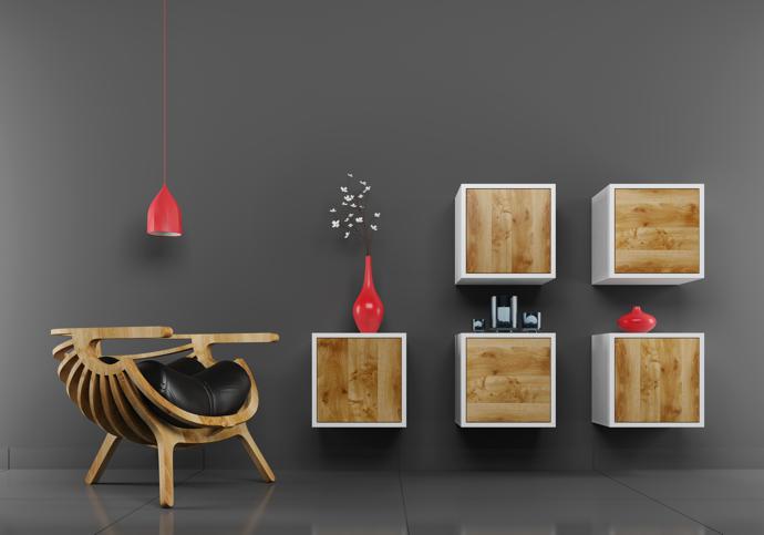
Grey On Grey
Piling grey on grey may seem like a daunting prospect but, when done correctly, will make a powerful statement in a minimalist scheme. While common thinking has it that lighter shades open up a room and darker ones create a sense of intimacy, a palette of all-over grey (one that extends over walls, floors and even ceilings) will, in fact, produce the illusion of enhanced space. Below, a few wall-mounted storage boxes and the odd pop of fire-engine red help break the potential monotony of a grey-on-grey scheme.
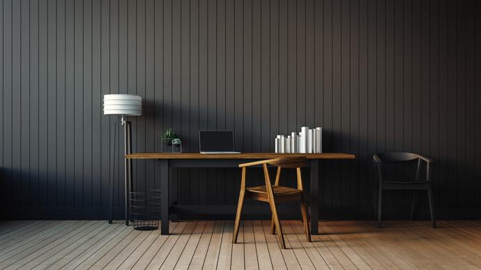
Highlight Architectural Features
The interplay of light and shade that results in grey’s ‘shadowy’ properties makes it a very effective colour for emphasising decorative architectural add-ons, such as dados, cornices, pressed ceilings and wall panels. Generally, the darker the shade, the more these features stand out. Simple timber cladding, for instance, takes on the alluring impression of smart pinstripes when painted a deep slate colour. The same moody hue, meanwhile, imparts a slick modern edge to the period panelling in an elegant Victorian home.
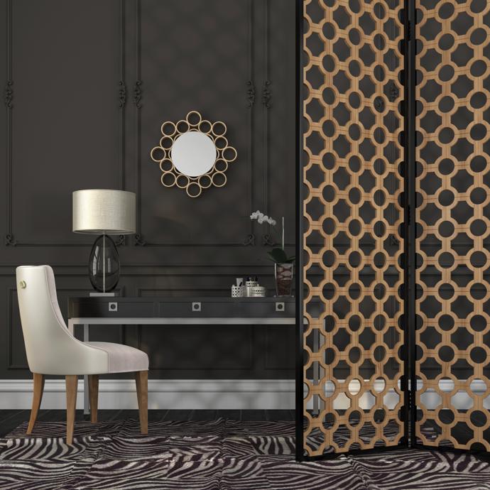
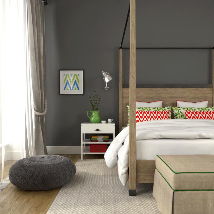
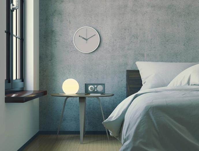
Don’t Forget Texture
As a neutral, grey lends itself beautifully to textured treatment. One need only consider the vast array of grey textures that play themselves out in the natural world – think the soft indulgence of cashmere and the smooth pliancy of clay. Grey schemes will benefit enormously from the layering of textures, which need not necessarily be confined to soft furnishings. Picked out by light from a strategically positioned table lamp, a tactile paint finish, for instance, lends infinite depth to this deep charcoal wall.
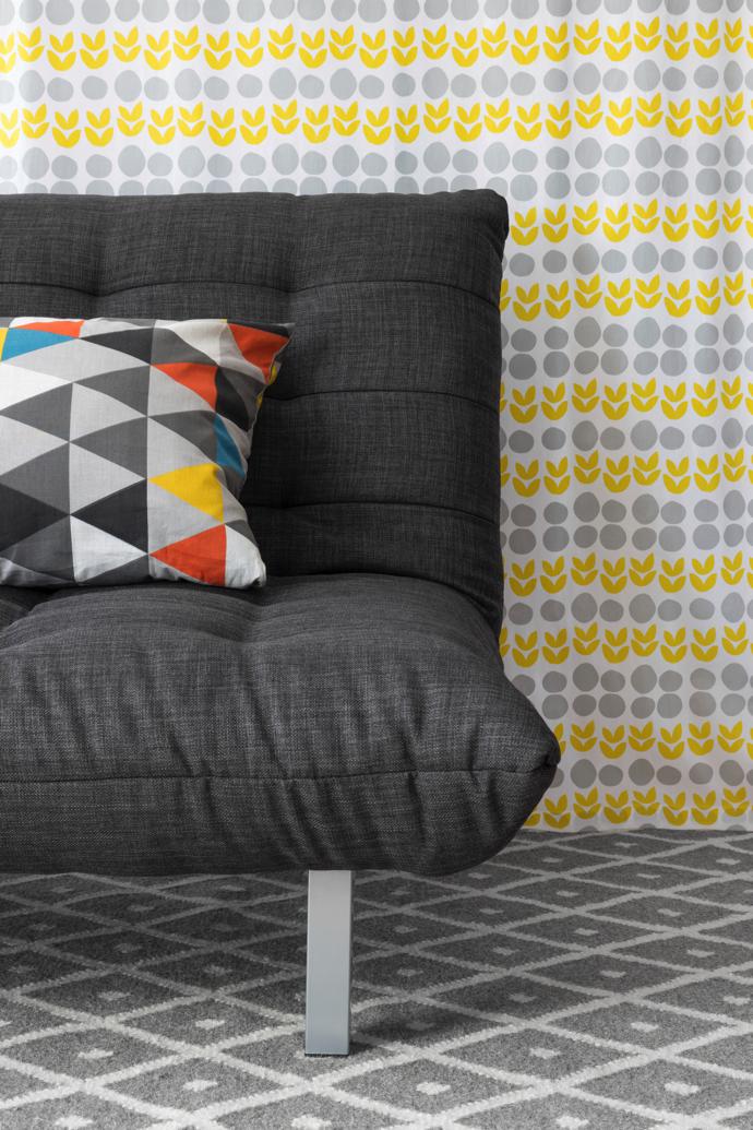
Play With Patterns
More impactful than white and more forgiving than black, grey forms the perfect “solid” or anchoring colour to support the mixing of vibrant patterns. The rule of thumb when mixing patterns is to stick to odd numbers. Use a minimum of three different patterns, varying the scale by using small, medium and large prints.
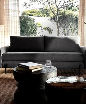
Don’t Ignore Lighting
Greys are complex as hues and undertones take on shades of pink, blue, lavender and green. Because grey’s many natural undertones really come to life in the right light this chameleon hue is a colour that benefits from being well lit. Take advantage of your natural light resources to emphasise and play up the natural tones as they change with the lighting over the course of the day. And enhance your lighting with sconces and well-placed table lamps that all add extra layers of complexity and energy.
Decorex Cape Town will be open from 10am to 7pm daily (6pm Monday). Tickets cost R85 for adults; R75 for trade, pensioners and students and R20 for kids under 12. For more information, e-mail decorexsa@ThebeReed.co.za or visit decorex.co.za.