WORDS Gina Dionisio PHOTOS Ruy Teixeira (,ovo), Supplied
From plexiglass tables to blown crystal sculptures, we look at some of the best designs we spotted at SP-Arte 2023.
Housed at São Paulo’s Bienal Pavilion – a three-story pavilion designed by legendary Brazilian architect Oscar Niemeyer – SP-Arte is Brazil’s largest art and design event. The 19th edition, which ran from 29 March to 2 April, showcased some of the best contemporary art and design from across the country. Here are some of our favourites.
,ovo
Luciana Martins and Gerson de Oliveira, the designer duo behind the award-winning ,ovo brand, are known for pushing the envelope when it comes to exploring the limits between art and design.
The designers showcased two new series at this year’s SP-Arte: Arranjos (Arrangements), a collection of plexiglass tables and screens, and Rio (River), an assortment of multifunctional raw stone pieces. With Arranjos and Rio, Luciana and Gerson wanted to explore the territory between the industrial and natural world. “Our intention was to work with these two extremes, tensioning the relationship between them”.


Organic shapes and colour are the two key features of Arranjos. Together these pieces take on a new form, creating new hues where they intersect.


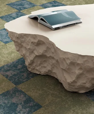
For Rio, large-scale rolled pebbles have been taken out of their original context (the river) and take on new uses, such as side tables or stools, which explore the sculptural strength of the stones combined with the lightness of the metal lines.
Cristiana Bertolucci

Considered one of Brazil’s pioneering modern lighting designers, Cristiana Bertolucci presented an exciting collection of new and existing lamps at SP-Arte. For the event, she divided the collection into four parts, each demarcated by a different colour alluding to the raw material and element it represents. “After I created the collections, I had the idea of being inspired by the four elements of nature to develop the stand at SP-Arte. It was a way I found to unify what was very different, and the colours help to make this integration”, she explains.


The first colour, a red clay hue, referred to the element of earth and featured bronze pieces inspired by traditional brickwork from Bahia. “I went to a brick factory and asked them to make a 1-metre mould with the texture of that material. From there, I had the lid of the brick cast in bronze, which I used to create the two tables”, explained the designer, who also developed a lamp using this technique.


The second colour represented the element of fire, and featured lamps from his existing Cápsula collection in new warm shades including terracotta and old rose.


The jade-green and beige tones in a set of semi-transparent acrylic lamps represented the fluidity of the water element.

A collection of linen pendants, with a light and airy design in light tones, represented air.
Jacqueline Terpins
Jacqueline Terpins is well-known for her sculptural works of blown crystal and flat glass. Her exhibition at SP-Arte, titled XY-Shape and Scales, showcased pieces that blur the lines between art and design through their shared features of geometric lines and simplistic construction.
Her exhibition featured a range of pieces, including furniture, objects, and artistic installations. Despite their apparent differences, they all shared a common visual language. The works in XY-Shape and Scales were centred around clean, minimalist forms and explored the interplay of vertical and horizontal planes through various compositions. These compositions incorporated techniques such as parallelism, repetition, mirroring, and overlapping.


Each composition elicited a distinct response from the material employed. For instance, metal enabled the construction of delicate yet sturdy lines. Natural expressions of stone and wood created opaque planes, while glass plates defined geometry and graduated intensities of colour. Finally, mirrors, whether flat or convex, introduced the phenomenon of reflection into the mix.
XY-Shape and Scales was an exercise in synthesis and lightness, in which composite geometries challenge and provoke balance, in the search for expression guided by reason.
Mel Kawahara


Known for her work with pleated surfaces, Mel Kawahara presented a new range of weaved lamps inspired by Eastern architecture.
Composed of sconces, the range was crafted using a manually woven weft on a grid and explores the relationship between light and shadow. “The idea was to create a play with the effect of light and shadow between solids and voids through this mesh”, explains the designer.
In addition to the unique design, another important characteristic of the Trama collection is that the lamps are made with material left over from the studio’s production. “I am very concerned about the use of raw materials and I don’t like to discard anything. We are in a climatic moment that demands this awareness from everyone”, reflects Mel.
Trama is the second range Mel has developed through the reuse of waste material. “I kept the leftover materials and asked my suppliers to cut the polythene film into several thin strips – from 5 mm to 10 mm thick – so that I could familiarise myself with this format”, she says. Mel played with the material, trying to create braids, experimenting with formats and analysing the effect of these experiments with light to understand how the overlaps would look.
Looking for more design inspiration? Sign up to our weekly newsletter, here.