-

Real spaces: Commune.1 -
Real spaces: Commune.1 -
Real spaces: Commune.1 -

Real spaces: Commune.1 -
Real spaces: Commune.1 -
Real spaces: Commune.1 -
Real spaces: Commune.1 -
Real spaces: Commune.1 -
Real spaces: Commune.1 -
Real spaces: Commune.1 -

Real spaces: Commune.1 -

Real spaces: Commune.1
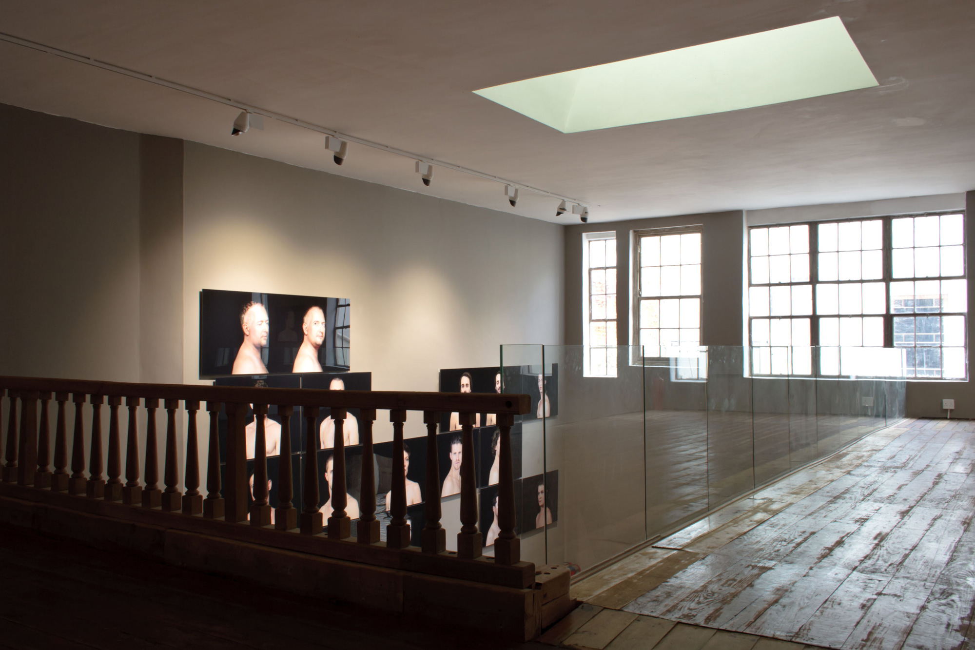
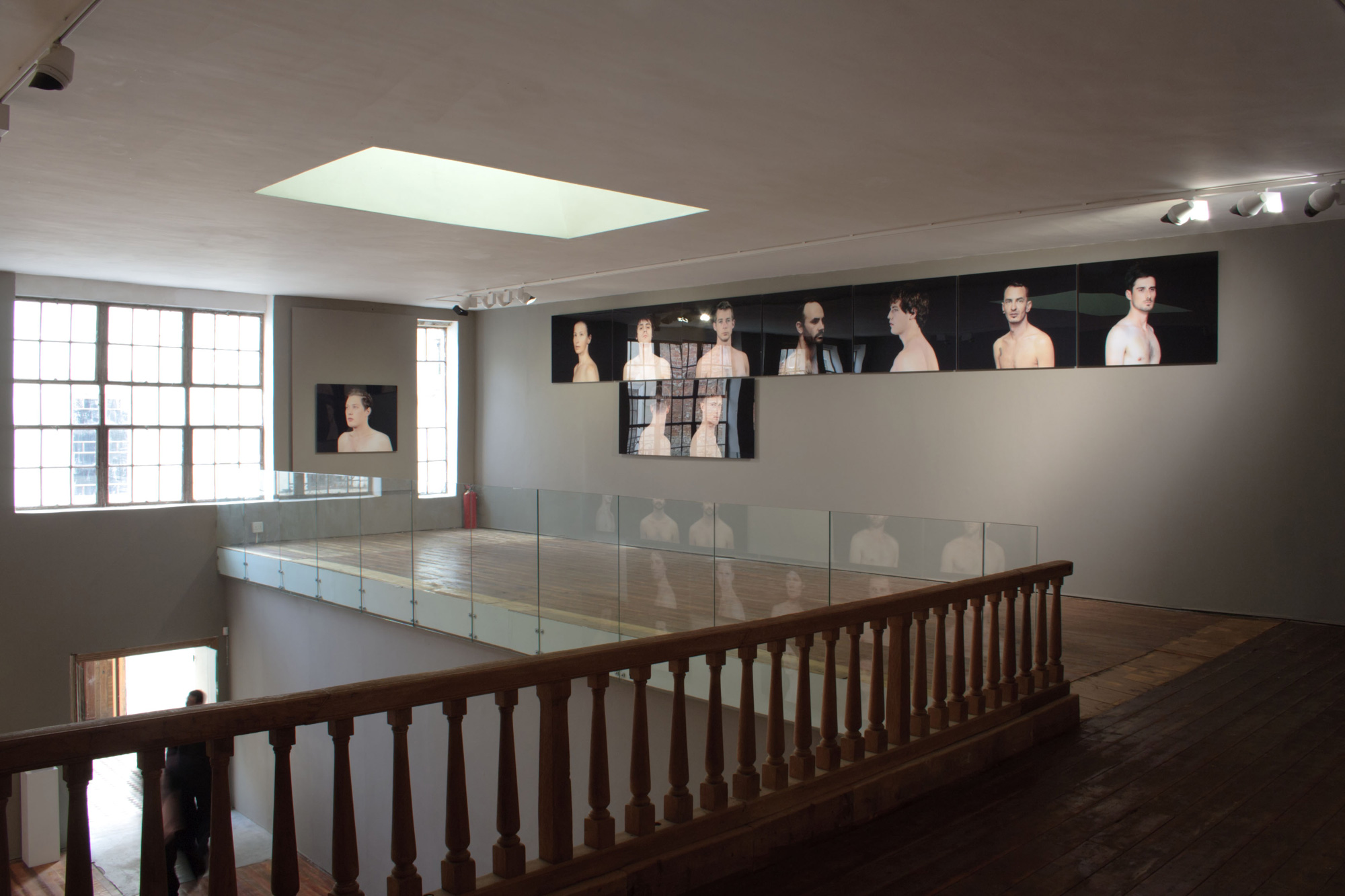
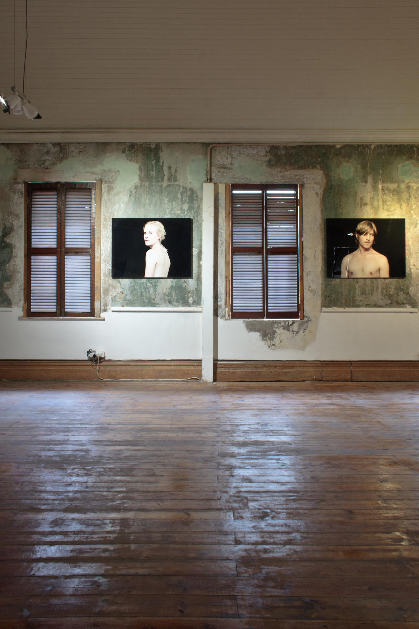
Taking a giant step away from the traditional aesthetics of a ‘white cube’ exhibition space, the Commune.1 gallery on Wale Street uses its historical architectural skeleton to create more than just a backdrop for the art that hangs there, it creates an experience.
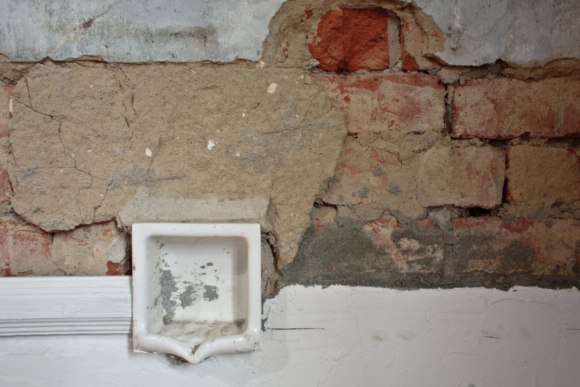
The building, which was a working funeral home beforehand, was bought and transformed by Greg Dale in May last year. After completely stripping the building of everything but its original features and scraping away nearly 200 years of paint, the gallery opened its doors in September to reveal a space dedicated to sculpture and installation artworks.
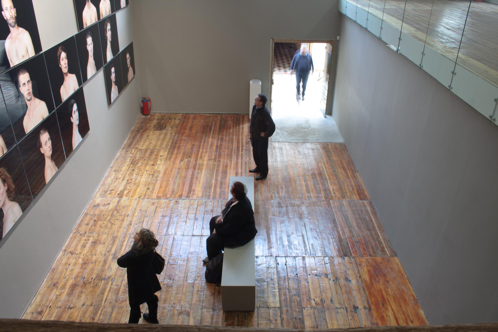
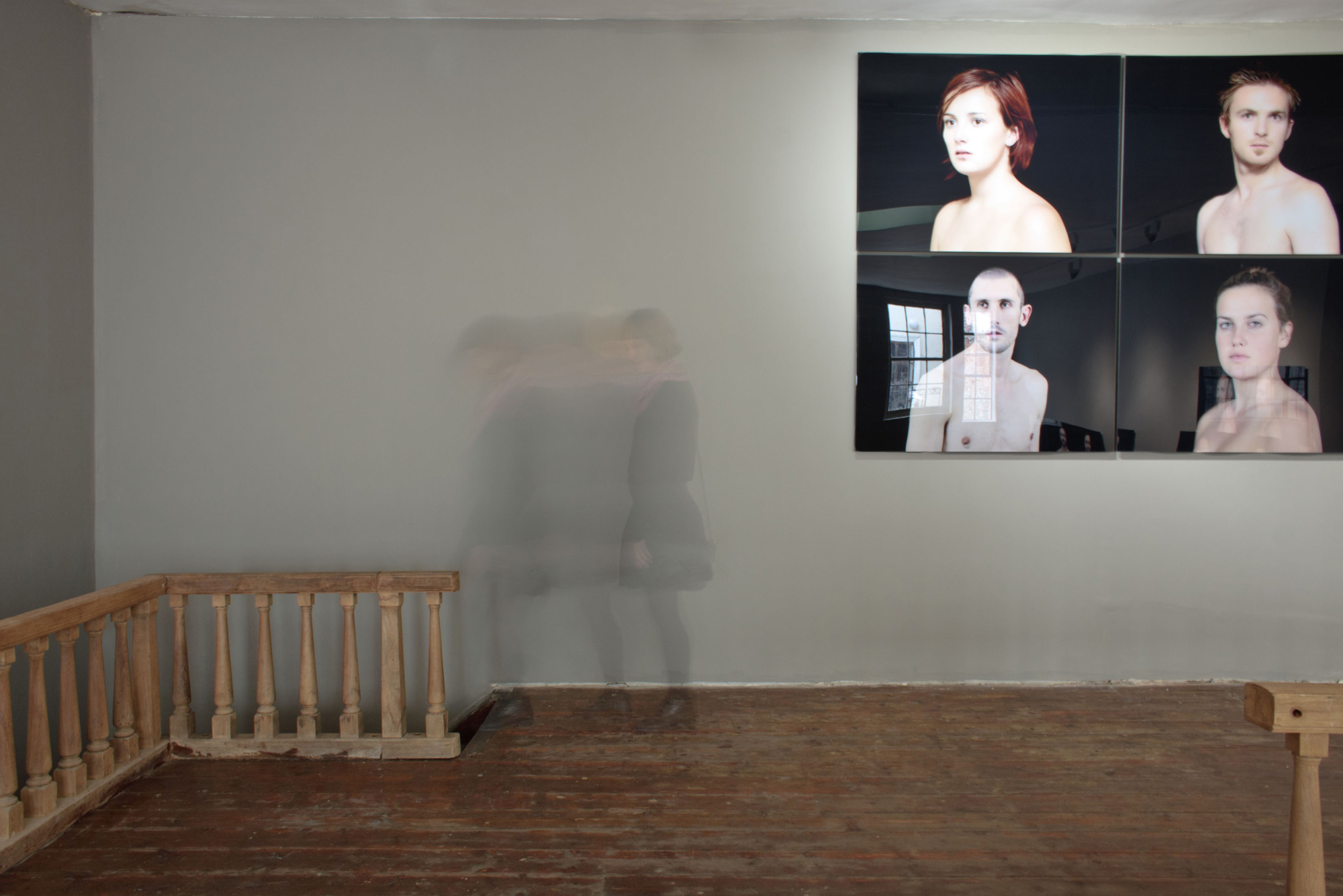
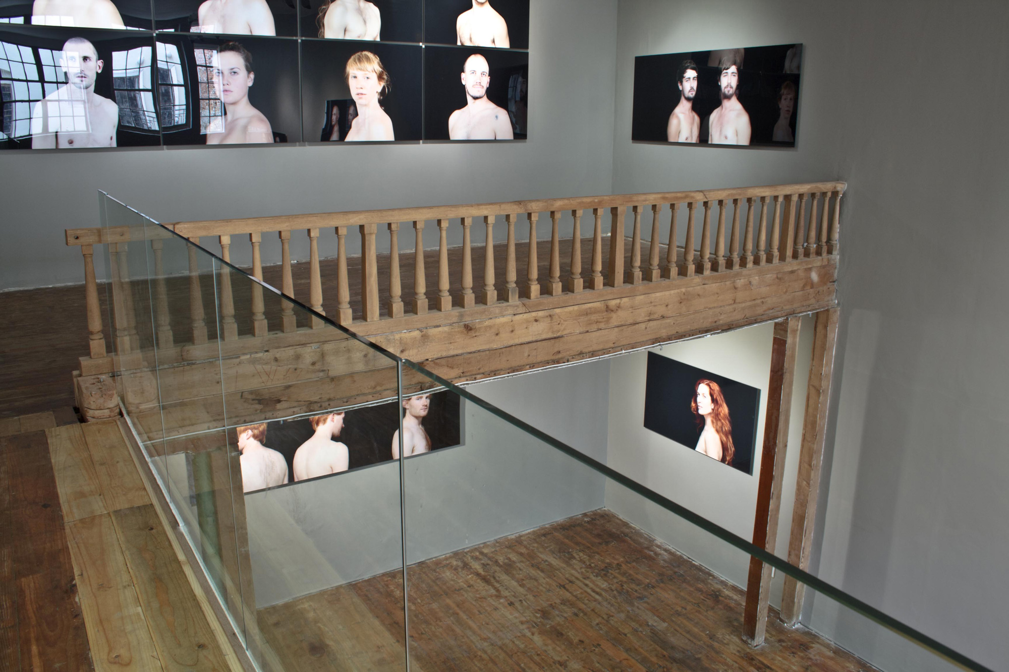
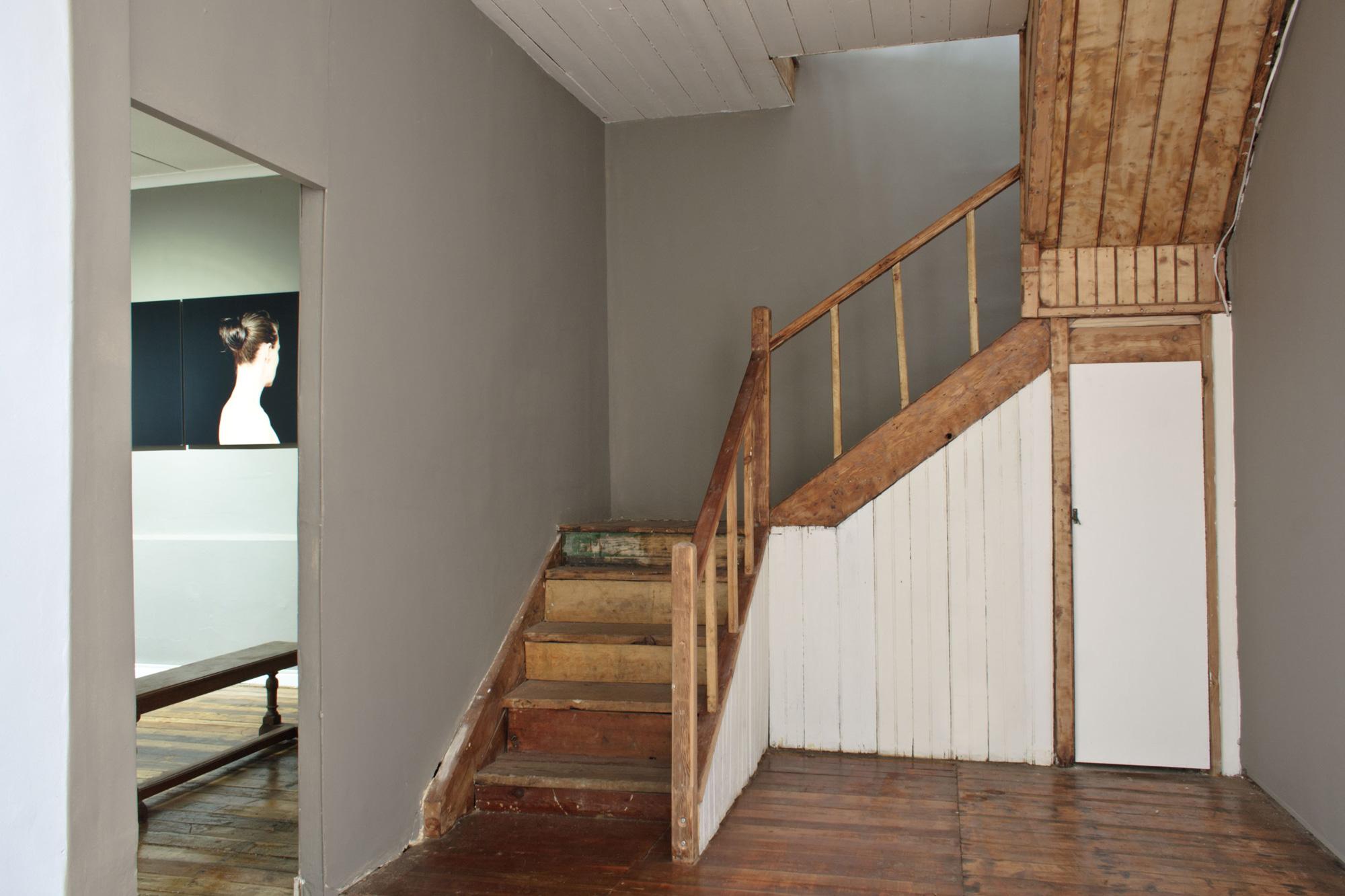
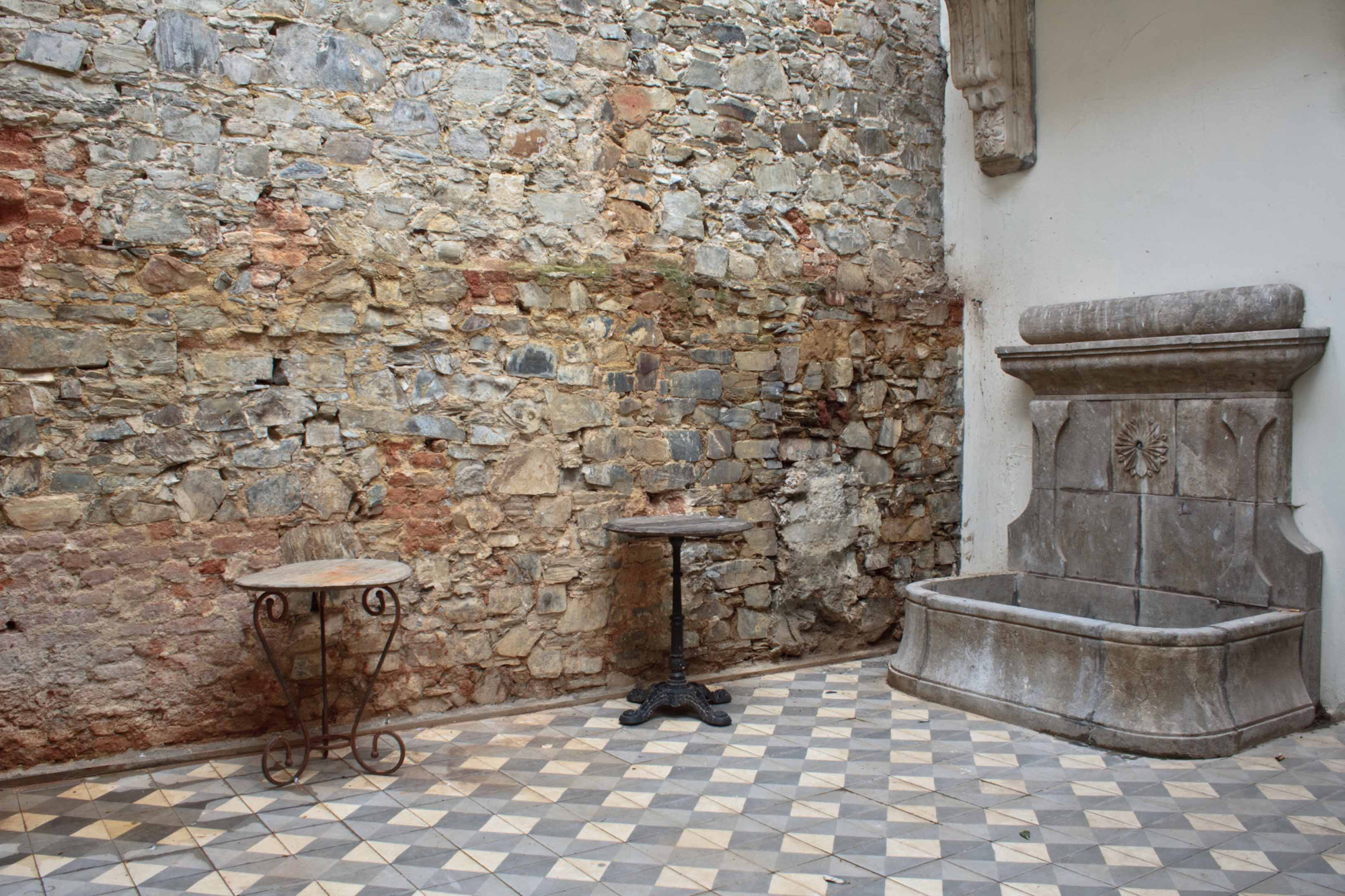
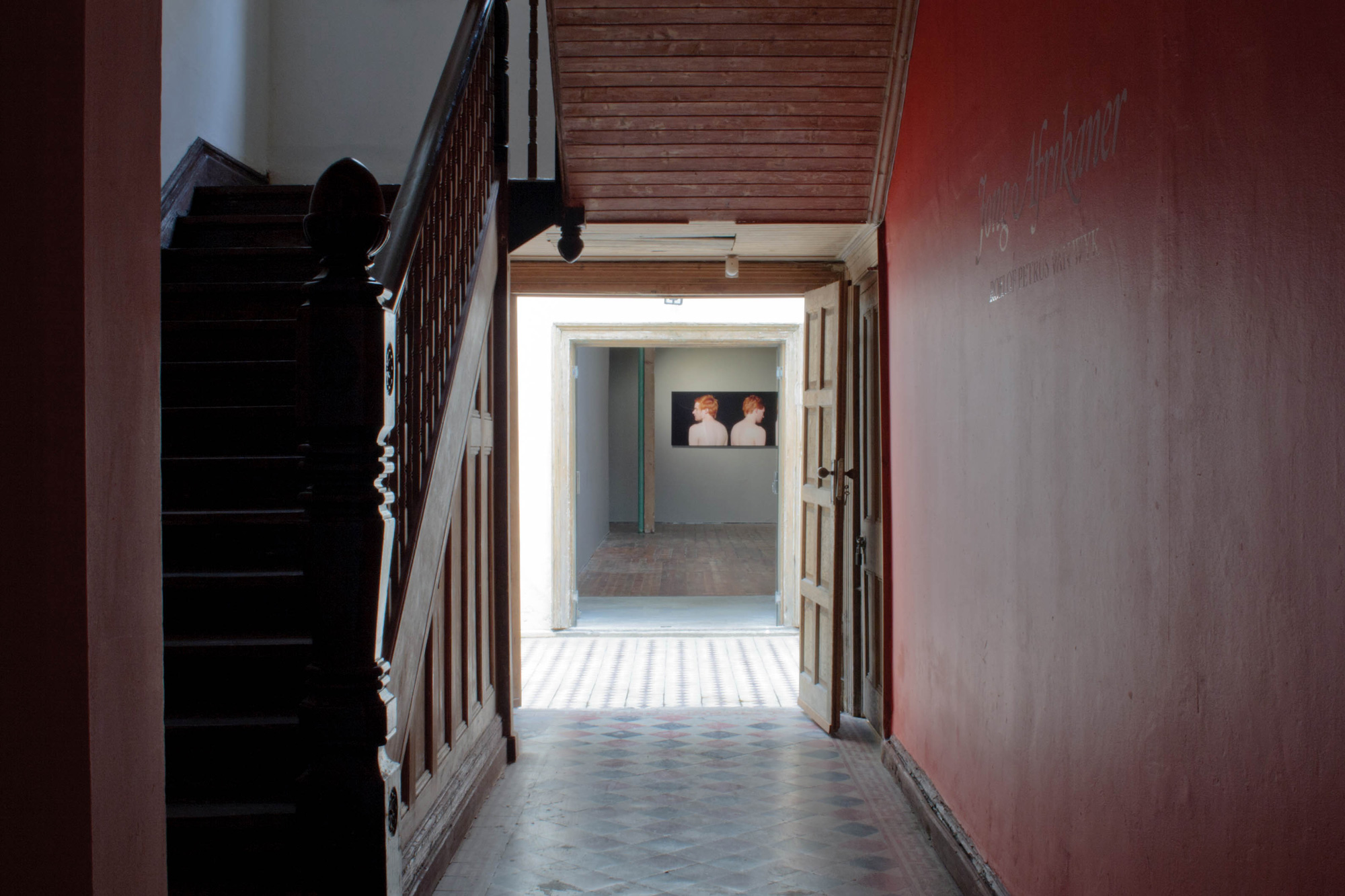
Through the door on the street, a narrow, dimly lit passageway opens onto an open aired courtyard. Beyond a set of double doors, the largest of the exhibition spaces reveals itself. The original features like the wooden floors and staircase, which Greg left intact, provide warmth, allowing the viewer to interact with the artworks in a more authentic way.
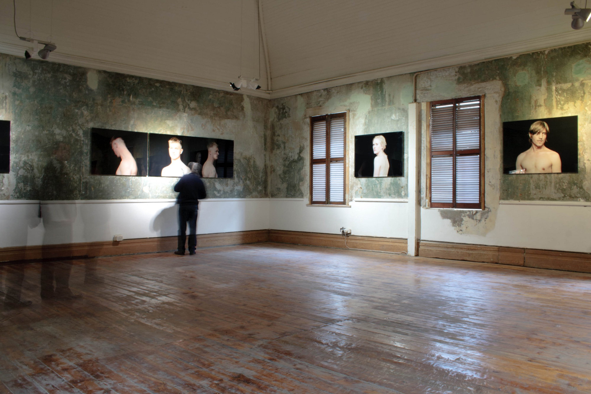
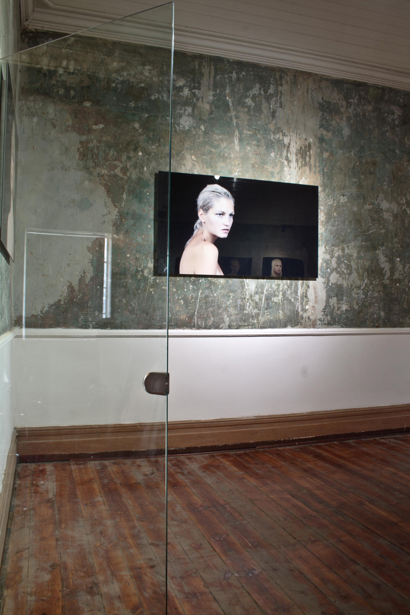
Roelof van Wyk’s Jong Afrikaner: A Self-Portrait currently hangs in the gallery, and viewers are able to absorb the larger than life photographs from many different vantage points. The enormity of the double volume space allows the art to breathe, which in turn allows viewers to take in everything it has to offer. As the viewer follows the flow of the gallery new spaces – and consequently new artworks – are revealed, making the move through the space an experiential one filled with surprises.
Greg, who has been an art collector for years, opened Commune.1 as an arena for artists working in installation and sculpture to exhibit in “a space that is relatively adaptable to their needs,” he says.
“The intention is to provide a dedicated space showcasing this kind of work, that will hopefully eventually lead to a shift in thinking and understanding of installation art, and slowly build a culture of appreciation for this kind of experience.”
We spoke to Greg to find out more about his gallery.
VISI: How long have you been in business?
Greg: Commune.1 opened its doors on the 1st of September, 2011, spring day, and there were many clever headlines along the lines of ‘from death to life’, referring obviously to the building’s checkered past and its new function.
Did you design the space yourself?
I designed everything, from the lighting to the bathroom fittings. The gallery is something that I had very clear ideas about and I felt I was the person closest to understanding what was required.
Was the gallery’s interior inspired by anything in particular?
There are a few different areas within the gallery building, and each was inspired by something different and motivated by functionality and aesthetics, and obviously by how the space would suit the work that would be exhibited in the best way. Interestingly, I had carried around a reference of my ideal space layout, which was a Spanish museum, and the layout of this building was nearly identical, so with very few additions I was able to recreate almost exactly what I had in mind from the outset. A few surprises during the stripping process led me to new choices, but on the whole it created itself and slowly became what I had set as the ideal.
In your opinion, what are the key design considerations for an exhibition space?
Being an installation space, the design considerations are very different from say a commercial gallery that may need more wall space, or a different flow. For the kind of experiential work I exhibit, the flow of people through the experience was my most important consideration. How they view the work, from which vantage points. And volume. The need for big volume in height and floor space was constantly considered. The mezzanine level allows a great viewpoint to view the exhibits from a new angle, and also creates a pattern of experiential momentum where the spectator can experience ideas from entirely new perspectives.
And for a home space?
I tend to approach living spaces the same way. Volume, height, space. A simple starting point where you can highlight things that you feel are integral. Room to breathe.
Where did you source the raw materials, decor and furniture items in Commune 1?
Most of Commune.1 is original, very little was added. But the brilliant Lutge Gallery on Loop Street provided most of the architectural extras that I needed, and most fit so seamlessly into the space that they appear to be original.
How does this environment encapsulate or enhance the art on exhibit?
The environment, in the way that it is laid out to constantly reveal new spaces, new areas, mimics the concept of the work that is being shown. A space that holds as much mystery and freedom to perceive things in your own way, it melds perfectly with the work on show. The building also very quietly provides a background to the works on exhibition, without ever forcing itself onto the spectator.
And lastly, what do you think Cape Town’s title of World Design Capital 2014 will bring to the city?
I hope it will bring an awareness of the need for more public sculpture, works that will become part of the Cape Town scenery, and inspire art tourism on the level that this city deserves. Beautiful outdoor art enhances a city in so many ways, and speaks volumes about the country’s dedication to the arts, as well as being aesthetically and conceptually integral to the continuation of the growth of the arts.
Roelof van Wyk’s Jong Afrikaner: A Self-Portrait is on show at Commune.1 until 26 July.
More information: www.commune1.com