-

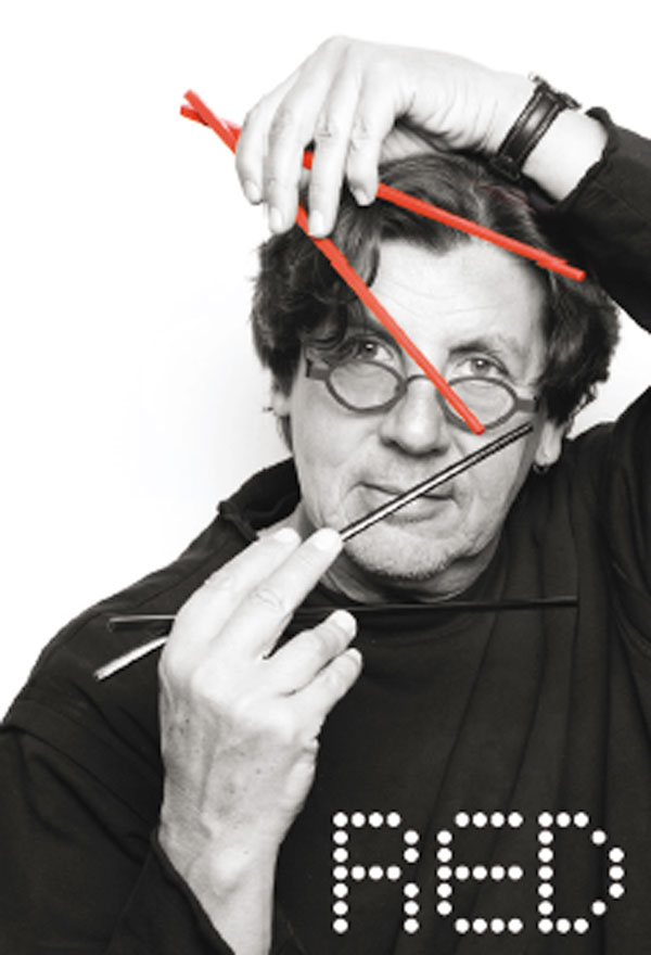
Seeing red : Designer, Charles Storr, fell in love with The Red Chamber and its proprietor, the dynamic and popular Emma Chen. -

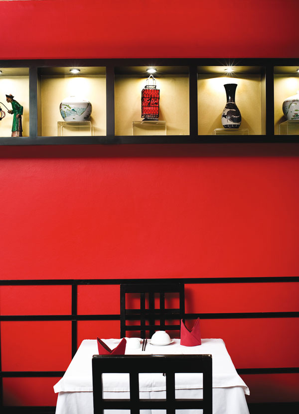
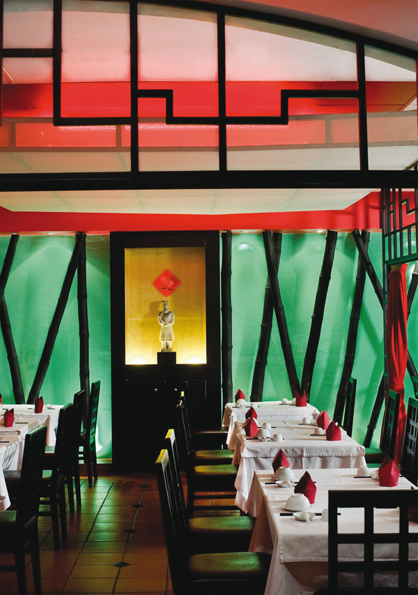
Seeing red : Light boxes containing Chinese objects mean there is no direct light shining into the restaurant. Instead, they cast a subtle glow and add to the authentic ambience. The ceiling screens are repeated against the wall to create seamless continuity. -

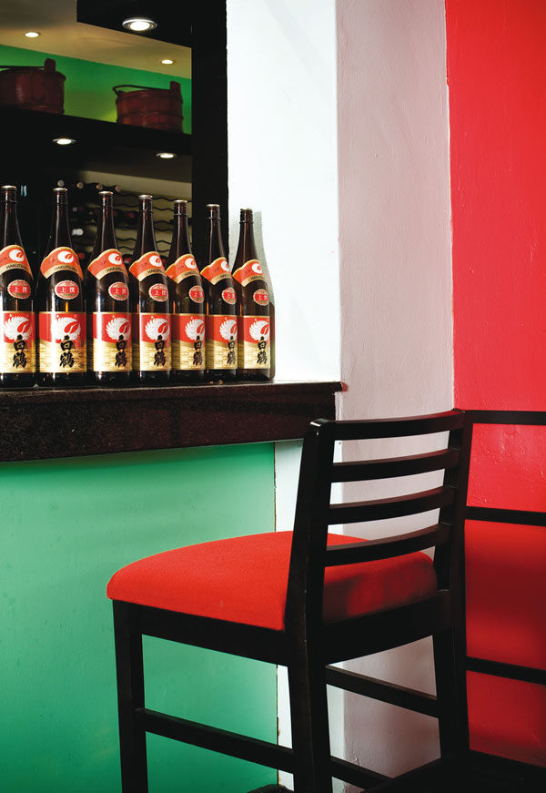
Seeing red : The Shanghai Café Bar was Charles’s idea to address the rather chaotic kitchen entrance in the middle of the restaurant. Now it’s stylish and functional and has added to the overall mood of the restaurant. -

Seeing red : Colour and light have been central to the redesign. One of Joburg’s most authentic Chinese restaurants is now modern and elegant in its design, while the food and mood remain the same.
PHOTOS: Dook | PRODUCTION: Annemarie Meintjies | WORDS: Jacqueline Myburgh Chemaly
Colour and lighting is all it took to turn a 20-year-old Chinese restaurant into a modern classic.
When you choose to name your restaurant The Red Chamber, you pretty much know what you’re in for in terms of the place’s colour scheme for the rest of its days. Or do you?
Anything is possible if your design consultant is Charles Storr of The Kiteworks. Before you know it, you may find a strong shade of green highlighting the red and even the subtlest shade of blue on the pillars to create some light relief. And it works.
Following a makeover by Charles and his team, The Red Chamber in the Hyde Park Corner shopping centre remains one of the most authentic Chinese restaurants in Johannesburg, only now, business is better than ever before.
The same, but better
Patrons who have been ordering the famed Peking duck, crab and specialities such as spicy Sezchuan cuisine for the past 20 years, say it is still the same restaurant, only better.
Charles Storr adores The Red Chamber. More specifically, he adores its owner. “Once you come under the spell of Emma Chen, you’re lost. Because Emma is from heaven,” he says.
The admiration is mutual, as Emma says the renovation of her beloved Red Chamber was quite painless under Charles’s stewardship. Since her restaurant is like her second home, she found she was no longer able to see what it needed in terms of a redesign and that’s why she called in Charles for some advice.
All she knew was that she wanted it to have a classic Chinese feel – no “fusion” elements and no confusing touches that could make the restaurant appear Japanese.
The result is a strong design statement where black wooden floor and ceiling screens break up the restaurant into natural spaces.
A great believer in the “form follows function” design philosophy, Charles said he simply created what Emma needed to make her restaurant work better. The Shanghai Café Bar now stands where previously there had been a rather chaotic kitchen entrance. The bar anchors the restaurant, lending a moody feel that encourages diners to linger.
The next step was to perfect the lighting. Lighting is everything, according to Charles. It’s the theatrical part of design and he made it the focus of much of his work at The Red Chamber.
Lightening it up
Light boxes in the wall display classical Chinese objects, at the same time casting a subtle glow into the dining area. Gigantic light boxes on the ceiling are black wooden frames covered in off-white cotton. This kite-like effect diffuses the light and adds to the new mood.
Generally, the restaurant is darker than before, giving it an intimacy seldom found in Chinese restaurants. There’s a private dining area that can be closed off with red curtains and Emma says they are working on lightening one corner of the restaurant for her Chinese clientele who prefer bright lights.
Whether he’s working in an office, a home or a restaurant, Charles says he has two simple rules when it comes to lighting: Lights should either wash the walls or be at sitting head height.
The colour on the walls was the next step, with green the perfect foil for the classic Chinese red. “People need colour,” says Charles. “It makes them feel good and has an amazing effect.”
He also worked on the restaurant signage, enlisting the services of Glenne Meldrum at Gee Design, who’s described by Charles as a genius in the world of signs. Charles insists his work at The Red Chamber is not finished, though.
As with most of his clients, Emma is now a friend and together they regard the further reinvention of the restaurant as a collaborative work in progress.
• The Kite Works: 011 646 5090, www.thekiteworks.co.za
• The Red Chamber: 011 325 6048