-

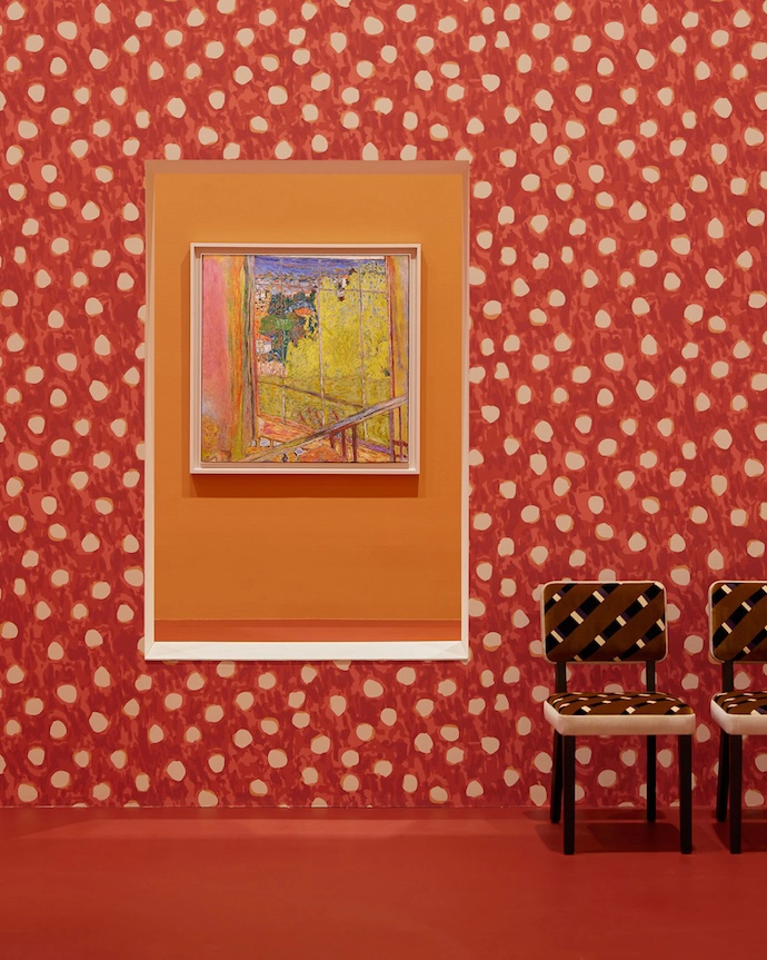
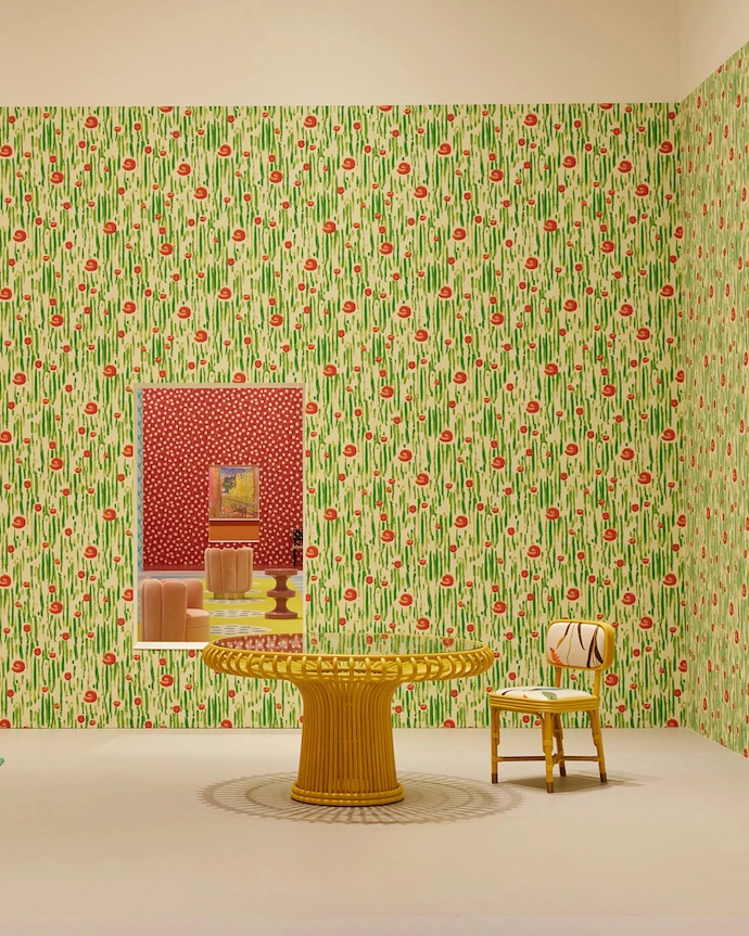
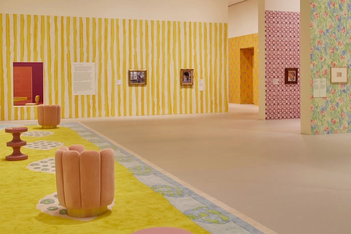
Interior designer and architect India Mahdavi’s scenography for a 2023 exhibition of Pierre Bonnard paintings at the National Gallery of Victoria. In a letter to the late Bonnard, she writes, “This encounter enables me to dive into your harmonies, into your geometrical and flower patterns, into your world – a pure sensation of colour – and to make it mine, just this one time.” -
Interior designer and architect India Mahdavi’s scenography for a 2023 exhibition of Pierre Bonnard paintings at the National Gallery of Victoria. In a letter to the late Bonnard, she writes, “This encounter enables me to dive into your harmonies, into your geometrical and flower patterns, into your world – a pure sensation of colour – and to make it mine, just this one time.” -
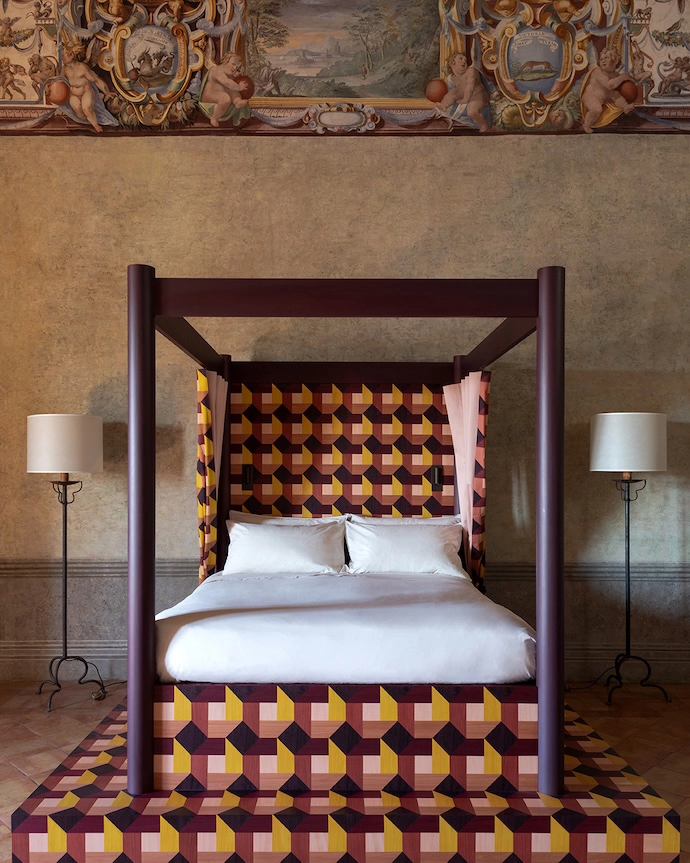
A bed designed for Villa Medici in Rome. -
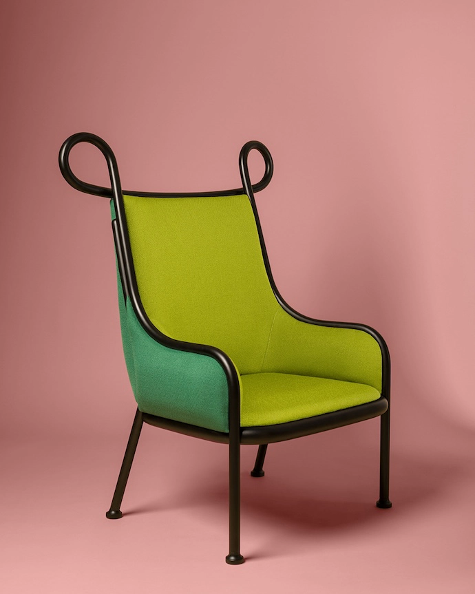
The Mickey armchair. -
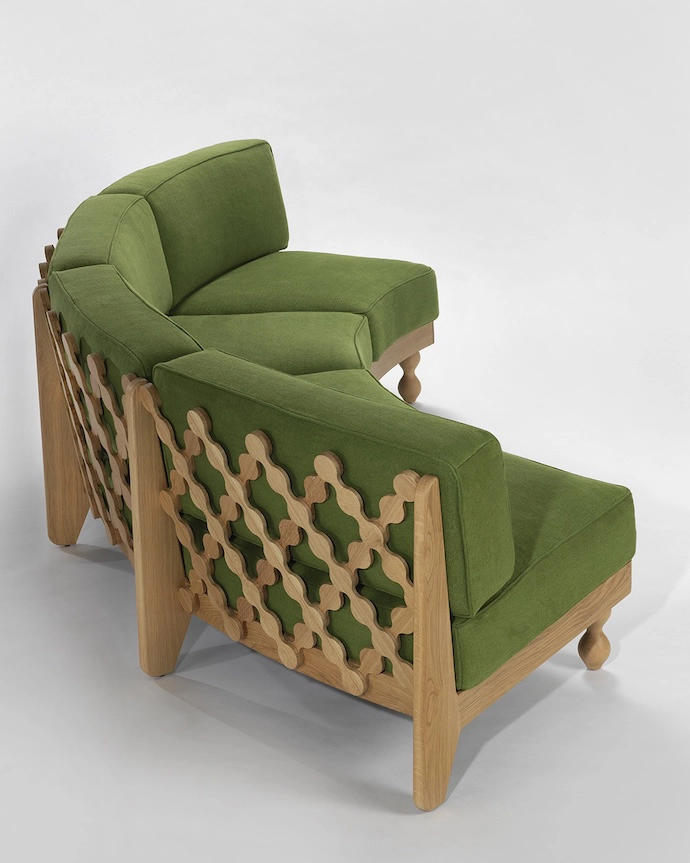
The Criss Cross sofa. -
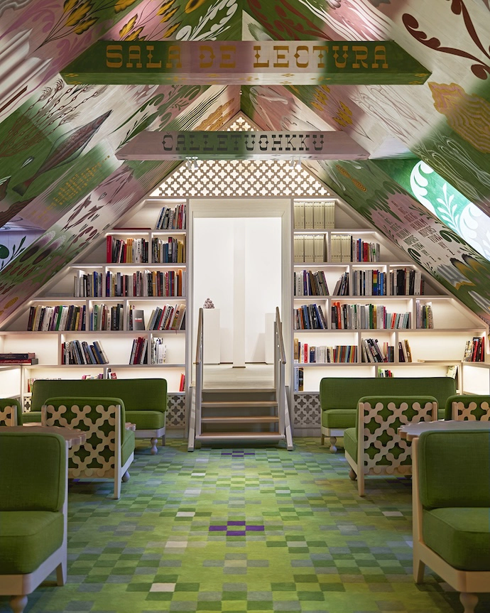
For the interiors of the PoMo Museum in Trondheim in 2025, Mahdavi commissioned FreelingWaters to paint the reading room’s ceilings.
Our series on international design trailblazers continues with lauded interior designer and architect India Mahdavi, self-proclaimed “polyglot and polychrome – a rich mix of cultures and colours”, and the undisputed queen of colour.
WORDS Martin Jacobs PHOTOS Lillie Thompson, Alice Rosati, Gebrüder Thonet Vienna, Jason Varney, Daniele Molajoli, Rob Whitro, Valerie Sadoun, Supplied
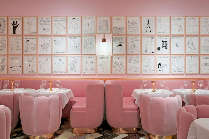
Hers was the original restaurant interior to break the internet: a pink-on-pink masterclass that, to this day, remains one of the world’s most recognisable restaurants – one that was instrumental in defining Millennial pink. Yet for all its cultural impact, India Mahdavi’s design for London’s The Gallery at Sketch was never intended to be permanent. Conceived as a temporary installation that would off er a hyper-feminine take on traditionally masculine brasseries, the project was expected to remain in place for two years. “I conceived the room as a monumental, windowless cube submerged entirely in a single Hollywood pink, with no relief, no interruption, no place for the eye to rest except on the pink itself,” she says. “I had Stanley Kubrick and David Lynch somewhere in the back of my mind – that quality of uncanny immersion, spaces that feel slightly more real than reality.” Her design remained in place for eight years, transforming from a playful experiment in colour into one of the most iconic interiors of its generation.
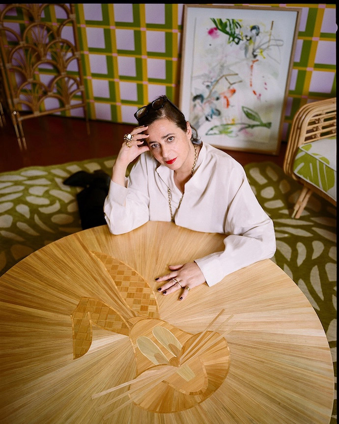
India’s own path was similarly unplanned: she never set out to become an architect or interior designer. Born in Tehran to an Iranian father and Egyptian mother, India spent her childhood moving between countries, relocating to Cambridge, Massachusetts, then Heidelberg, Germany, followed by the south of France. “To grow up nomadic is to grow up without the comfort of the self-evident. You cannot take a culture for granted when you’re always arriving into someone else’s,” she says. “That condition sharpens the eye enormously – you learn to read a room before you can read a sentence, to decode the visual grammar of a place out of necessity. In that sense, being a foreigner was my first design education.”
She credits both her heritage and this upbringing for her enduring love of colour, recalling the visual exuberance of 1960s America as formative. “Cambridge felt saturated with colours and joy – Bugs Bunny, Mary Poppins, pop culture in full Technicolor bloom. For a child who had no fixed identity yet, that saturation was liberating. Colour was a kind of belonging that didn’t require a passport.” With the family’s move to Heidelberg came change. “Almost overnight, the world turned to black and white. I understood then what colour does to a human being – what its absence costs – and I’ve been recovering that first chromatic joy ever since. I think that’s what drives everything I make.”
Drawn to filmmaking, she instead enrolled to study architecture at Paris’s École des Beaux-Arts before moving to New York, where a growing interest led her to study graphic, product and furniture design at Parsons School of Design, Cooper Union and the School of Visual Arts. By the time she returned to Paris to join Christian Liaigre’s studio, and in 2000 establish her own, the foundations of the multidisciplinary approach for which she is known were already in place.
More than a quarter of a century later, India is considered the undisputed queen of colour. Whether in Paris, Rome, Berlin or London, or in cities further afield – like Tokyo, Mexico City and Melbourne – her interiors possess a recognisable visual language, defined by bold chromatic juxtapositions and an understanding of emotionally comforting atmosphere. “I think of colours as characters in a room who must negotiate their coexistence: they can argue, they can clash, they can create tension, and through that tension arrive at something alive,” she says. “A room where every colour agrees is a room where nothing is being said.”
India’s approach to colour is multifaceted and relational. She believes that a colour can only become itself in the presence of another (three is her minimum combination). She never approaches colour in a fearful manner. “Courage with colour is not about “Courage with colour is not about loudness – it’s about commitment. You must be willing to add when you think there is already enough, and then add once more,” she says. And for India, colour never travels alone. “I use texture as colour, and pattern as light. The two are inseparable for me: a rough linen and a polished lacquer placed against each other produce a chromatic effect as powerful as any pigment.”
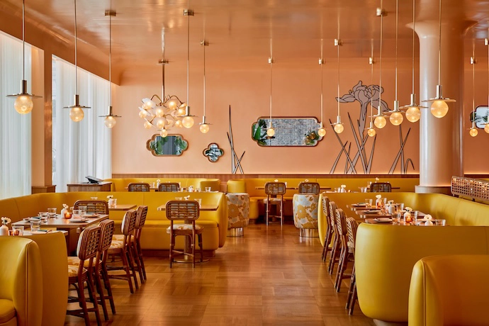
Her chromatic confidence extends to her extensive work in furniture design and brand collaborations. She has partnered with luxury houses – Dior, Louis Vuitton and Guerlain – as well as with design-led brands such as Bisazza, de Gournay and Pierre Frey, and household names like H&M Home and Nespresso. Across these collaborations, she’s consistently treated colour not as surface decoration but as a sensory and emotional language.
Described as a visionary, she’s responded, “I feel the sign of the times before other people.” Her interiors for The Gallery at Sketch speak to this talent, as does her sidetable-cum-stool, the Bishop. Deriving its form from a barstool she designed for a New York nightclub in 1999, 27 years later the Bishop remains India’s bestselling product, selling on average one per day. “What has given it longevity is that it is fundamentally one form – a single continuous gesture – that changes entirely at different scales, and in different materials and colours,” she says. “It is a chameleon, which is why it has found its way into so many contexts: as a sidetable, as a stool, in ceramic, in lacquer, now in 20 colours. An object that adapts without losing its identity is a rare thing. Most design ages because it is too specific to a moment. The Bishop has no moment – it has only a character.”
India describes both her interiors and her objects as couture pieces – singular creations that are shaped by context. It is a philosophy that has defined her career. As she once joked in an interview at Stockholm Furniture Fair, reflecting on the enduring legacy of The Gallery at Sketch, “Pink owes me, I think!” This it does – because few designers have done more to shape the way colour is experienced in contemporary interiors than India Mahdavi. | india-mahdavi.com
Don’t forget to sign up to our weekly newsletter for the latest architecture and design news.