-

Minimalist Coastal Renovation in Sea Point -
Minimalist Coastal Renovation in Sea Point -
Minimalist Coastal Renovation in Sea Point -
Minimalist Coastal Renovation in Sea Point -
Minimalist Coastal Renovation in Sea Point -
Minimalist Coastal Renovation in Sea Point -
Minimalist Coastal Renovation in Sea Point -
Minimalist Coastal Renovation in Sea Point -
Minimalist Coastal Renovation in Sea Point -
Minimalist Coastal Renovation in Sea Point -
Minimalist Coastal Renovation in Sea Point -
Minimalist Coastal Renovation in Sea Point
A heritage renovation in Sea Point offers a fresh perspective on coastal living.
WORDS Neyani Mphephu PHOTOS VinylRae Photography
Set within the textured coastal strip of Sea Point, this heritage home has been thoughtfully reworked into a refined, minimalist retreat anchored by natural materials and subtle contrasts. Guided by a client deeply connected to the ocean, the design yields a home that feels both intentional and intuitive, with surf culture subtly embedded in the architecture and atmosphere. We caught up with interior designer Susanne Brodnik to explore the ideas and influences behind the transformation.
What drew your client to this heritage house in Sea Point, and how did their passion for surfing and minimalism shape the design brief?
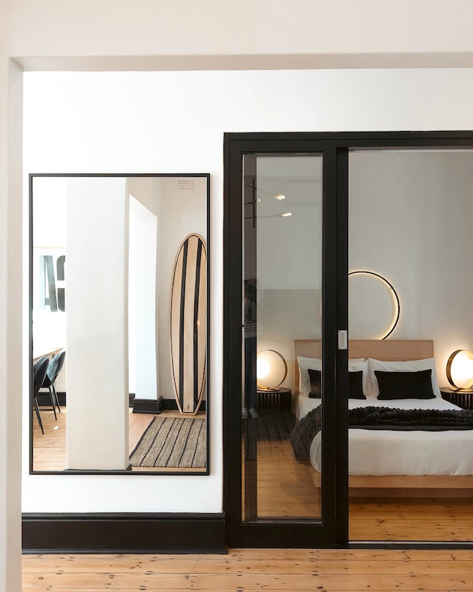
“The client was drawn to the quiet strength and history of the heritage house – its proportions, presence, and position within Sea Point. As an avid surfer, his lifestyle is fluid and ocean-driven, which translated into a brief rooted in reduction and clarity. We led the project with a minimalist lens, stripping back to what is essential while embedding subtle, local surf references. From early on, it was clear the client was drawn to contrast rather than cliché, so a typical blue ‘shabby surfer’ aesthetic was never considered; this was always about a more refined, personal interpretation. This aligns closely with our studio approach, which is rooted in contrast and restraint – pairing strong spatial frameworks with warm, local layers”
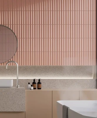
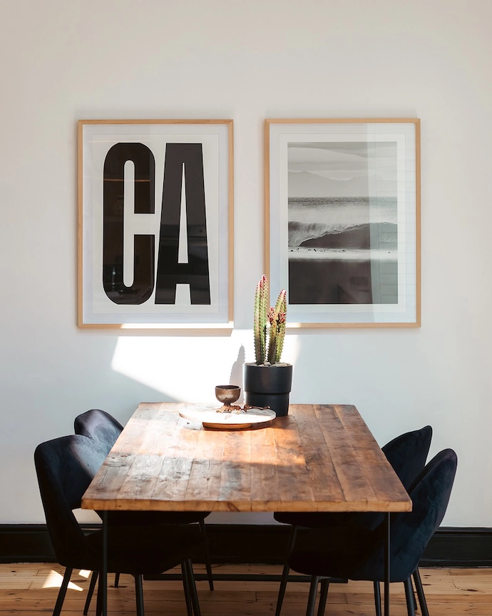
There’s a consistent monochromatic and neutral colour palette throughout the home – what led to this choice compared with the typical blues associated with coastal design?
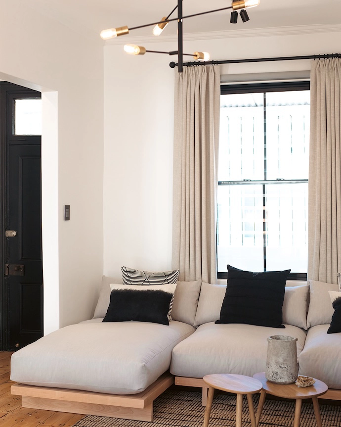
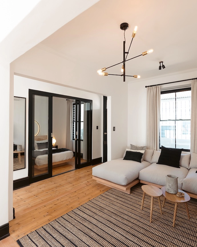
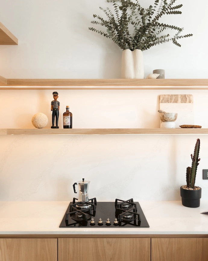
“We deliberately avoided the expected coastal palette to keep the project timeless and grounded. The monochromatic base, layered with light timber and subtle black accents, allows space, proportion, and materiality to take precedence over theme. Black elements were introduced strategically to anchor the openness and bring a more masculine edge to the interiors. This restraint reflects both the client’s sensibility and our studio’s approach – creating a calm, architectural backdrop that allows collaboration, curated pieces, and personal narratives to hold presence.”
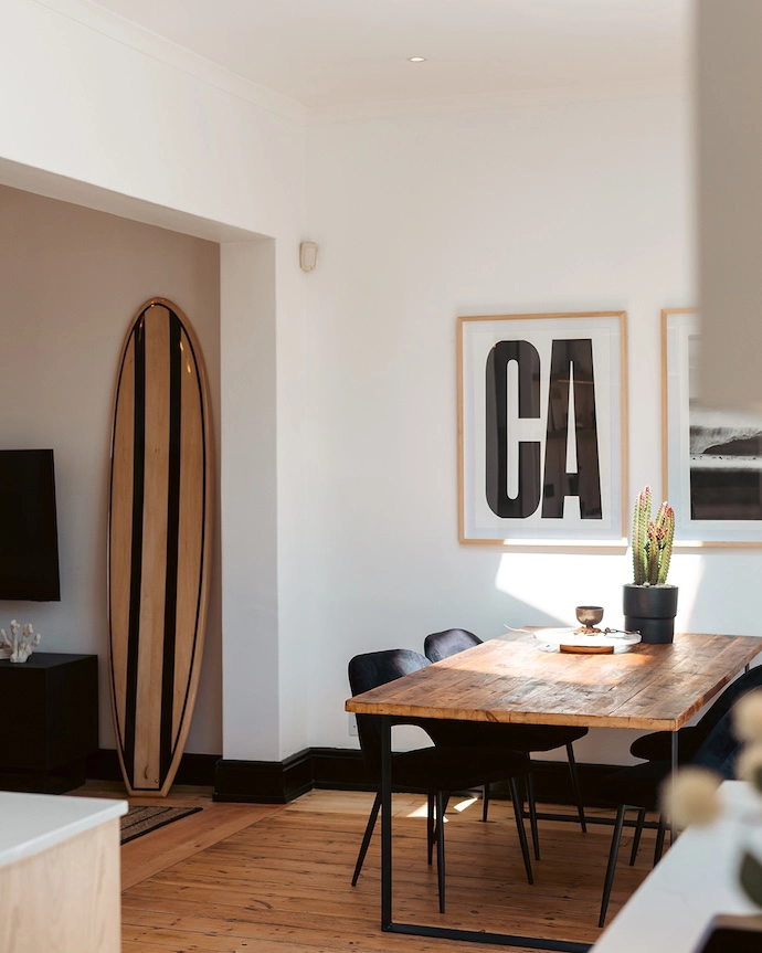
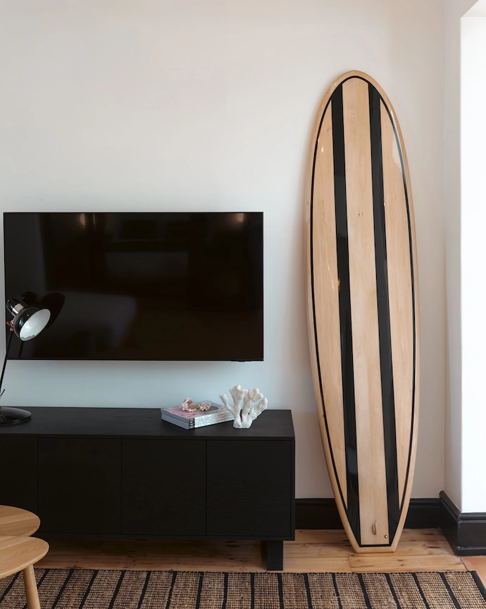
How did the collaborations with the local surfboard shaper and a surf photographer influence the final design, and what custom pieces did they create?
“Collaboration was central to grounding the project in authenticity. Together with the client and Burnett Wood Surfcraft, we developed a bespoke wooden surfboard that is fully functional, designed to be surfed rather than simply displayed, while also acting as a sculptural element within the space. In parallel, we curated a photographic work with Greg Chapman, capturing the client’s favourite local surf break. These pieces were carefully integrated into the overall design language, creating a narrative that is personal, place-specific, and quietly expressive.”
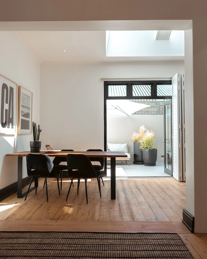
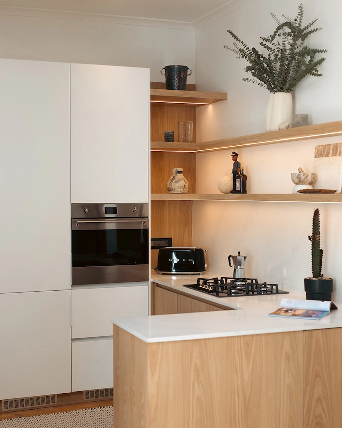
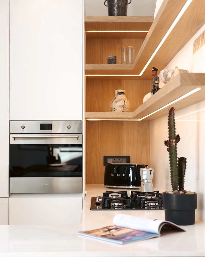
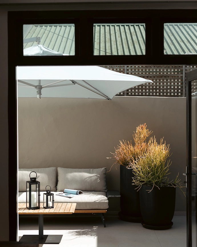
The kitchen and courtyard saw the biggest structural changes. What was your vision for introducing those softer, flowing forms, and why make these rooms the focal point for the surf theme?
“We reimagined the kitchen and courtyard as the experiential core of the home, open, flowing, and designed for everyday living and entertaining. In collaboration with Cami Interiors, we created a fully integrated kitchen where appliances disappear into the architecture, reinforcing a seamless spatial reading. At the same time, we resolved key structural challenges, including a leaking roof, rising damp, and courtyard drainage, transforming what was a harsh, overexposed space into a shaded, usable extension of the interior. Softened forms, greenery, and defined zones, created through planters and an outdoor shower, allow the courtyard to function as an extension of the living space, with an immediate visual connection upon entry.”
What materials and finishes did you choose to capture that coastal narrative while maintaining the clean, minimalist aesthetic your client desired?
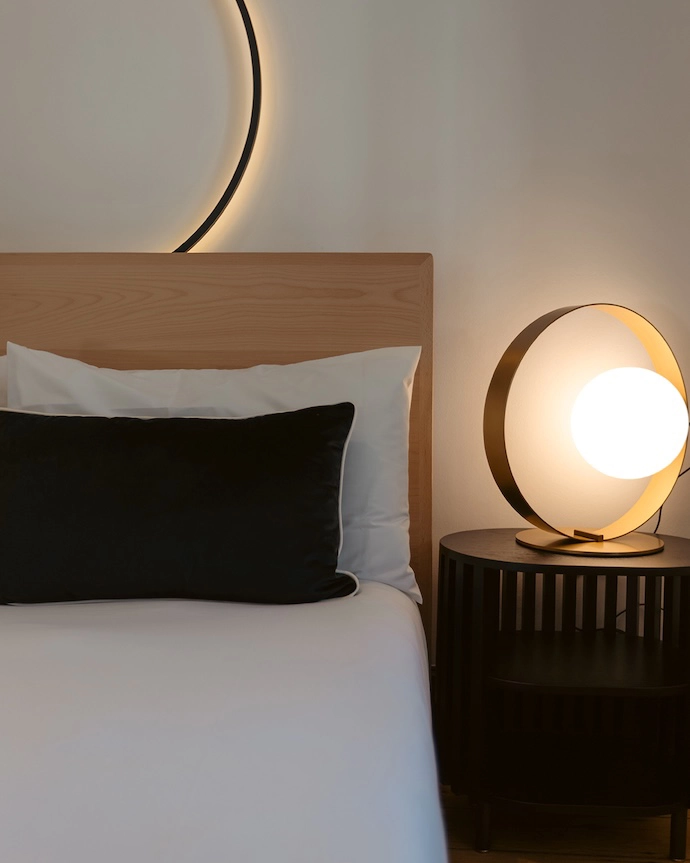
”We led the material direction with a focus on restraint and tactility, using light timber, soft mineral finishes, and brushed metals, grounded by subtle black accents. The original wooden floors were intentionally preserved and simply sanded back, allowing their history to remain part of the narrative. Lighting was sourced from Hoi P’loy to emphasise the height and architectural presence of the space. Key furniture pieces, including the bed and couch, were custom-made by Lifeforce Living, while outdoor seating by Mon Exteriors extends the interior language outward. Planting, curated with Jean Green, introduces softness and a lived-in calm. Drawing on my background in graphic design, I also developed typographic wall artwork to sit in dialogue with the surf photography, reinforcing a cohesive and highly personal narrative.”
You mentioned creating a more ‘relaxed, tactile ground-level experience’. How does the home feel different as you move through the spaces?
“The home is designed around a grounded, tactile experience, open to the courtyard, materially rich, and connected to the rituals of returning from the ocean. As you move through the spaces, the atmosphere becomes more distilled, with a clear sense of volume and breathing room that allows the heritage architecture to come forward. We introduced blinds and curtains to soften the light and give the client control over privacy and mood, adding another layer of calm. The bedroom forms its own narrative – we designed the space around a pair of sculptural, round bedside lights, creating a softer, more intimate environment. The result is a balance between openness and retreat, allowing the home to feel both expansive and deeply personal.” | myplaceincapetown.com
Don’t forget to sign up to our weekly newsletter for the latest architecture and design news.