-

The Living Palette -
The Living Palette -
The Living Palette -
The Living Palette -
The Living Palette -
The Living Palette
The newly opened Olympic Colour Cafe by Olympic Paints is built around the philosophy of curated living, inviting customers to choose colours, textures and finishes through a considered, sensory design experience.
INTERVIEWED BY Gina Dionisio PHOTOS Courtesy of Olympic Paints
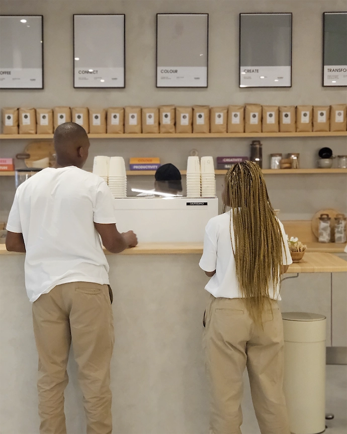
The Olympic Colour Cafe turns the idea of a conventional paint store on its head. This immersive environment – part gallery, part workshop, part cafe – dissolves the boundary between retail and ritual. Here, homeowners, decorators, architects and design enthusiasts can explore Olympic Paints’ extensive colour range, enjoy a coffee, collaborate with in-house interior design experts, and leave with a bespoke decor plan tailored to their lifestyle.
Designed by architect Nisha van der Hoven, founder of Hoven, the Olympic Colour Cafe blends contemporary design trends with local character, transforming traditional retail into a warm, tactile and inspiring environment where decor meets experience. We spoke to Nisha about the idea of curated living and how the Olympic Colour Cafe transforms the simple act of choosing paint into an immersive design experience.
The Olympic Colour Cafe moves away from the traditional retail model towards what you describe as a ‘curated living’ experience. How did this philosophy inform the conceptual foundation of the space?
“The project began with a simple question that stayed with me for months: what if paint was no longer just a product, but a medium for experience?
“Traditional paint stores tend to focus on efficiency – shelves of colour swatches, quick decisions, and a transactional moment. I was interested in slowing that process down and reframing colour as something more exploratory.
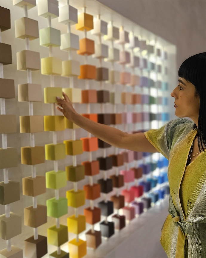
“The idea of ‘curated living’ emerged from this. Instead of retail alone, the space operates more like a micro design laboratory where colour intersects with material experimentation, furniture, art and everyday rituals like coffee. It allows people to encounter colour not only as a singular decision to be made, but as something holistic to experience, interpret and live with. By juxtaposing colour within a curated environment, the colour itself plays a role in a larger design story.”
You’ve spoken about dissolving the boundary between retail and ritual – how did this idea translate into the interior’s architectural language and spatial atmosphere?
“From the outset, I was interested in softening the traditional boundaries between product display and a curated living experience. Retail environments often prioritise clarity and speed, but colour is emotional and atmospheric – it deserves a slower encounter.
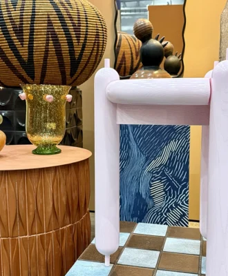
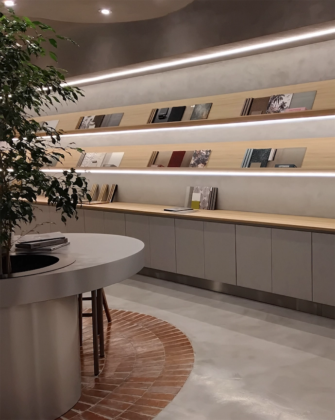
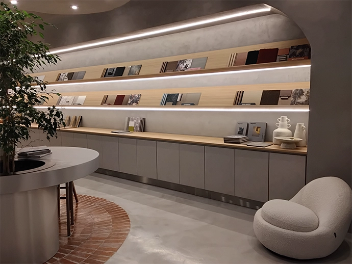
“Architecturally, the space is therefore quite calm and grounded yet tactile. Stucco plaster walls form a neutral canvas, Klompie brick paving anchors the interior in warm earth tones, and stainless steel and raw timber introduce a quiet material honesty. Living trees rooted within the colour testing stations introduce nature and its seasonal palette.
“This is probably counterintuitive to what one would imagine when walking into a paint store. Instead of the space shouting colour, we wanted to create a restrained framework where colour becomes the protagonist and for the consumer to feel a sense of calm during the colour selection process. This process in itself becomes ritualistic.
“The café window acts as a social threshold that draws people inside. The incorporation of coffee within the space was intentional and is a daily moment of pause for many. The opportunity to invite people to interact, experiment and linger makes the space feel less like a store and more like a studio or living laboratory.”
The project combines a gallery, workshop and cafe within a single environment. What strategies did you use to balance these distinct functions while maintaining a cohesive design identity?
“We structured the space around three anchors: technology and innovation, coffee culture, and creative collaboration. These elements organise the experience without separating the functions into rigid zones.
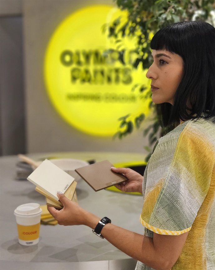
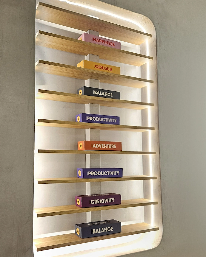
“Designer Pods allow collaborators to build small installations and material experiments, the colour testing stations function almost like laboratories where pigments can be selected, compared and explored, and the café introduces a familiar social ritual that softens the environment.
“Although each function serves a different purpose, they are connected by a shared material palette and a common narrative around colour exploration. The result is a hybrid space that feels cohesive rather than fragmented.”
Tactility appears central to the experience, encouraging visitors to engage physically with colour and materials. How did material selection and detailing support this sensory approach?
“Colour is never purely visual – it’s deeply sensory. It carries temperature, texture and atmosphere.
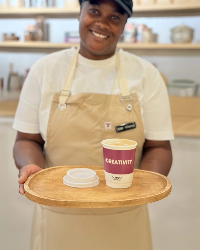
“For that reason, the interior encourages physical interaction wherever possible. Visitors can compose combinations on the colour palette wall, sort through pigments at the testing stations, or experience seasonal colour narratives through drinks developed by the cafe.
“Materially, we chose finishes for the space that feel grounded and tactile: stucco plaster, brick paving, raw timber shelving and stainless steel surfaces. Living trees rooted in the colour testing stations reconnect the interior to the natural world. Curvilinear forms also contribute to the softness of the space. These elements create a layered sensory environment where colour can be experienced through touch, smell and atmosphere, not just sight.”
Contemporary design trends are layered with a sense of local character throughout the space. How did you approach contextualising the design within a South African setting?
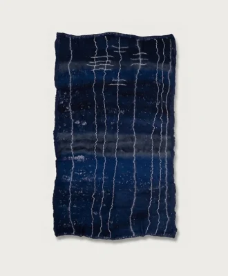
“Since Olympic Paints is a South African brand, it was important that the colour stories within the space reflect its local context. Prior to the launch of the Olympic Paints Colour Cafe, I worked on a seasonal colour story titled Fieldwork #1: Joburg Geologies. This provided an important point of departure. I’ve always been fascinated by the mineral landscapes of Johannesburg – the iron-rich soil, the subtle shifts in the colour of the stone, the dusty grasses of the Highveld.
“Those tones became the foundation for the palette: mineral greens, oxidised reds, dusty ochres and softened charcoals that echo the local landscape. These colours translate into various materials introduced within the Colour Cafe.
“At the same time, materials like Klompie brick and the integration of living trees help ground the space in a tactile, regional sensibility. The intention was not to create a literal interpretation of place, but rather to allow the atmosphere of the Highveld landscape to quietly inform the colour narrative.”
Rather than simply displaying paint, the interior encourages emotional decision-making around colour and living. How did you design the environment to influence how people feel, interact and ultimately choose?
“Most paint stores ask visitors to make a decision quickly. I wanted to create the opposite condition – one where curiosity and experimentation come first. The Olympic Colour Café grew from that spirit of exploration.
“In my latest piece on Substack, I write about how ‘many of us were taught, quite literally, to colour within the lines. To stay neat, careful and contained’. For the Olympic Colour Cafe, the design explores ‘what happens when we allow colour to move beyond its expected role – when paint becomes not just a product, but a medium for experimentation, collaboration and experience’. Instead of standing in front of shelves comparing swatches, visitors are invited to engage with colour more physically – to test it, combine it, layer it and build a relationship with it.
“In my experience as a designer, I’ve often encountered fear around colour selection. Clients tend to see the selection process as a major decision and something so permanent. By turning colour selection into a creative act – composing palettes, testing pigments, experiencing curated colour stories through installations and even seasonal drinks – people begin to build a relationship with colour before committing to it.
“The environment also encourages visitors to slow down and engage emotionally with colour. In that sense, paint stops being the final layer of a space and becomes the beginning of a narrative – something people choose because of how it makes them feel, rather than simply how it looks on a swatch.” hoven.co.za | olympicpaints.co.za
Don’t forget to sign up to our weekly newsletter for the latest architecture and design news.