-

Rooted in Intention -

Rooted in Intention -
Rooted in Intention -
Rooted in Intention -
Rooted in Intention -
Rooted in Intention
Local jewellery design studio Black Betty has been quietly evolving, but its new look isn’t a rebrand – it’s a return to its roots.
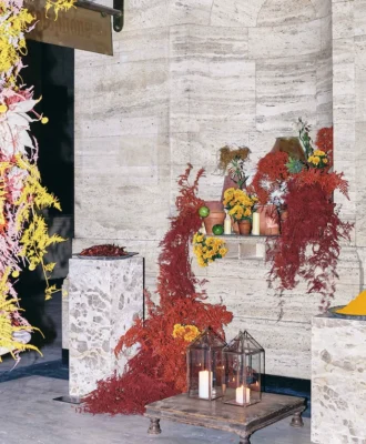
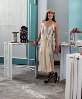
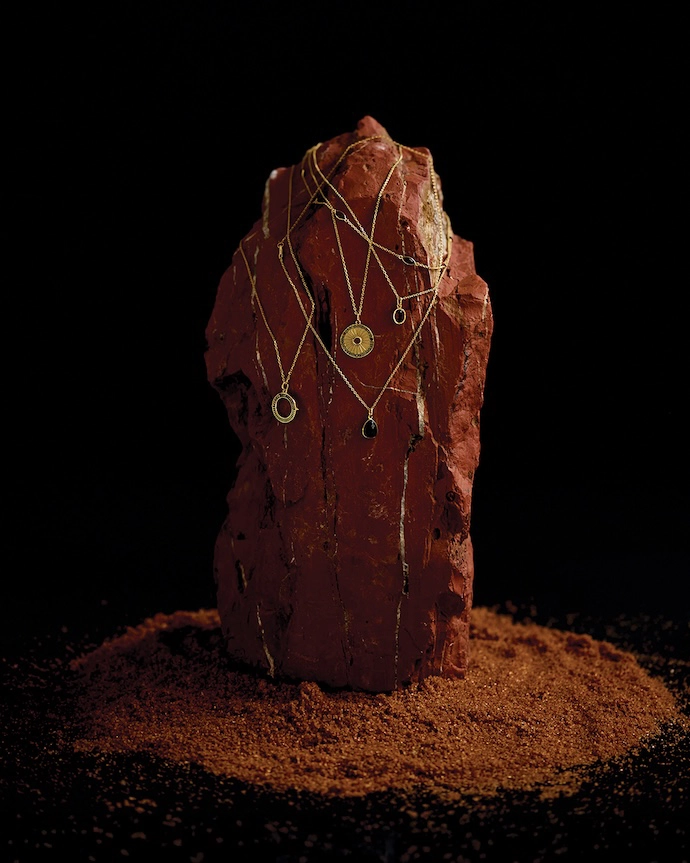
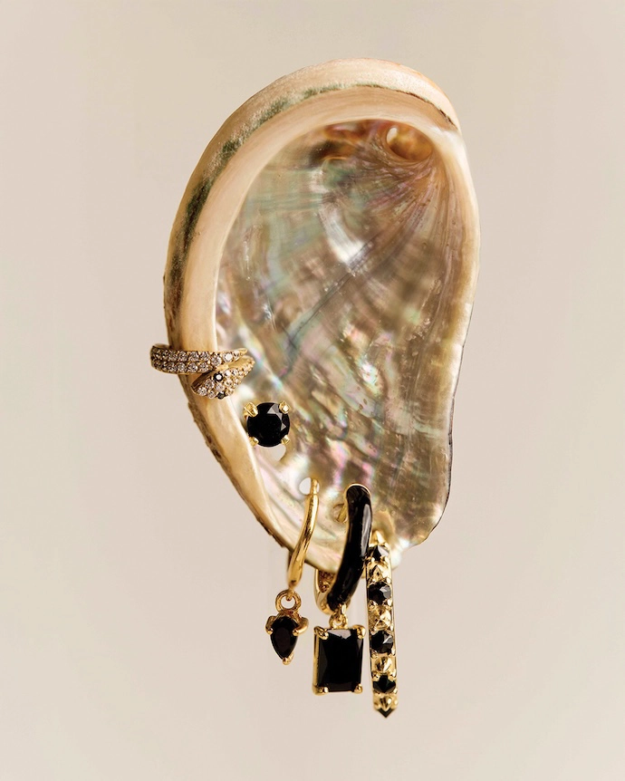
PHOTOS Courtesy of Black Betty
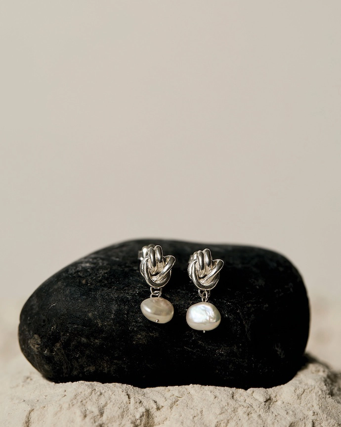
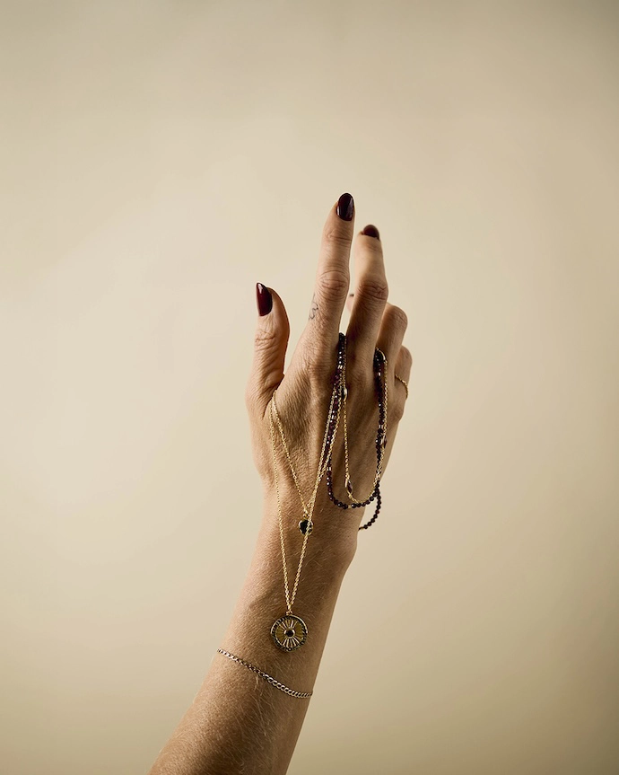
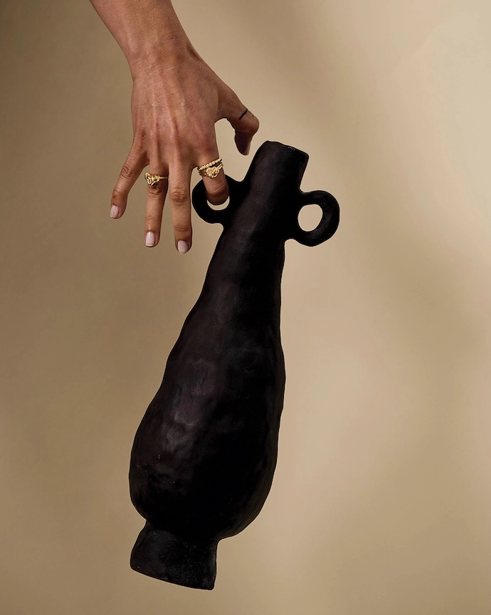
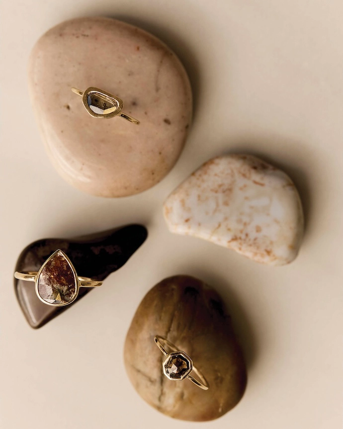
Founded in 2012 by Kristin Weixelbaumer, Black Betty is known for crafting distinctive pieces for those drawn to jewellery with an emotional connection. From the beginning, Black Betty has been shaped by intention, presence and self-expression, and the brand’s refreshed look is a return to that original force. Kristin shares the thinking behind Black Betty’s refined new chapter, its philosophy and the vision for what comes next.
Black Betty has just entered a new chapter. How would you describe what this rebrand represents?
“This rebrand is a return to essence. Black Betty was always about more than jewellery. It was built on the belief that adornment can carry meaning, intention, and energy. Over time, as the brand grew, that clarity became diluted.
“This new chapter is about refinement rather than reinvention. It’s about bringing depth, ritual, and consciousness back to the centre of everything we create, while expressing it with greater clarity, maturity, and confidence.”
Jewellery has long been central to your creative philosophy. Where did that perspective begin?
“Before founding Black Betty, I studied crystal healing in the Himalayas and immersed myself in various spiritual and energetic practices. Those experiences fundamentally shaped how I see adornment.
“For me, jewellery is something you wear into your life. It can mark transition, hold intention, and act as a reminder of who you are becoming. That belief was the foundation of Black Betty from the very beginning, and it’s what this rebrand consciously reconnects to.”
What feels most different about Black Betty now?
“The difference is intention.
“Every element of the brand now speaks to conscious adornment. Jewellery as ritual. Piercing as a moment of choice. Experiences as thresholds rather than transactions. There’s a stronger sense of coherence between what we make, how it’s worn, and why it exists.
“Visually, energetically, and emotionally, the brand feels quieter, more grounded, and more confident in who it is.”
Was there a moment that prompted you to pause and re-evaluate the direction of the brand?
“Yes. One collection shoot became a turning point. It revealed a disconnect between what we were creating and what the brand stood for. It wasn’t about failure, but clarity, and it marked the moment I knew the brand needed to realign and return to its essence.”
How did that realisation shape the rebrand?
“It reframed the way I approached everything. The question became how to grow a business sustainably without losing its essence. The answer wasn’t to strip things back, but to build with greater intention. To balance structure with intuition, and discipline with creativity.
“This rebrand reflects that clarity. Black Betty now knows exactly who it is, what it stands for, and how it chooses to show up in the same world, inviting our community to do the same.”
What do you hope people feel when they experience Black Betty now?
“I hope they feel seen. Grounded. Empowered.
“Black Betty is about wearing pieces that hold meaning, not just beauty. About making moments, transitions, and identity. This chapter is more aligned, more honest, and more expansive than ever. It feels like coming home.” | blackbettydesign.com
Don’t forget to sign up to our weekly newsletter for the latest architecture and design news.