Pantone has unveiled its much-anticipated Color of the Year for 2026: an airy, billowy shade that signals a return to calm.
WORDS Gina Dionisio PHOTOS Courtesy of Pantone
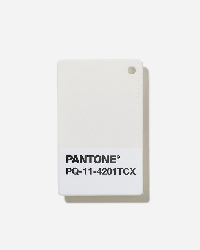
With its understated elegance, the Pantone Color of the Year for 2026 – PANTONE 11-4201 Cloud Dancer – invites an environment in which function and feeling intertwine, providing a paired-back palette that inspires well-being and calm.
Every year, the colour selected by the Pantone Color Institute is the shade they see gaining in importance across all areas of design. It is the colour forecast to communicate the colour message that best reflects what is happening in our global culture at a specific moment in time; a hue they see crossing all areas of design, serving as an expression of mood and attitude.
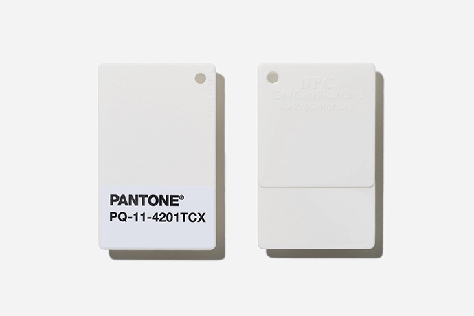
“At this time of transformation, when we are reimagining our future and our place in the world, PANTONE 11-4201 Cloud Dancer is a discreet white hue offering a promise of clarity,” says Leatrice Eiseman, Executive Director of the Pantone Color Institute. “The cacophony that surrounds us has become overwhelming, making it harder to hear the voices of our inner selves. A conscious statement of simplification, Cloud Dancer enhances our focus, providing release from the distraction of external influences.”
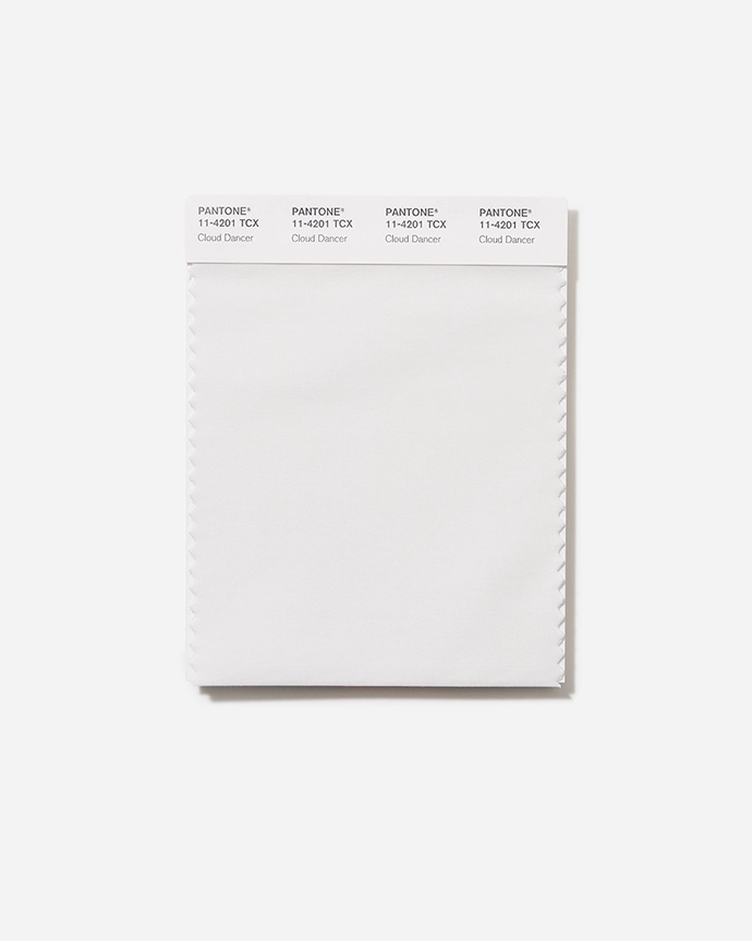
Despite speculation (once again) over bolder shades being named for 2026, PANTONE 11-4201 Cloud Dancer is a billowy hue imbued with a feeling of serenity. Similar to a blank canvas, 2026’s ‘it’ shade is said to signify a fresh start. The hue quiets the mind, encouraging true relaxation and focus that allow the mind to wander and creativity to breathe, making room for innovation.
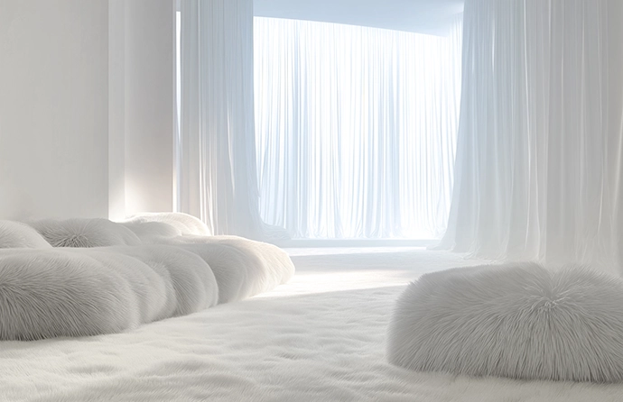
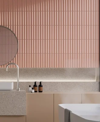
A minimalist statement with a high-end modern feel, PANTONE 11-4201 Cloud Dancer expresses a pared-back aesthetic. The quiet hue creates a setting in which function and feeling intertwine, fostering an atmosphere of serenity and spaciousness, whether introduced through furniture or furnishings throughout the home. Infused with tranquillity, the shade introduces a spa-like feel in bathrooms and an open, spacious quality in the kitchen.
New Colour Palettes
The Pantone Color Institute created several colour palettes featuring this year’s hue to highlight its versatility:
- Powdered Pastels – soft tones like Lemon Icing and Peach Dust, which offer subtle shifts in hue.
- Take a Break – a playful palette featuring delicious, juicy shades like Papaya and Mango Mojito.
- Atmospheric – think breezy blues and aqueous shades such as Regatta.
- Comfort Zone – a collection of natural and organic colours.
- Tropic Tonalities – bright, vivid hues like Paradise Pink and Kiwi Colada.
- Light & Shadow – a veiled palette of softened hues and shadowy shades.
- Glamour & Gleam – shimmering greys and metallic tones such as Satin Slipper bring the drama.
A key structural colour, PANTONE 11-4201 Cloud Dancer adapts, harmonises and creates contrast, bringing a feeling of airiness to all product applications and environments, whether used on its own or combined with other hues. | pantone.com
Don’t forget to sign up to our weekly newsletter for the latest architecture and design news.