Mervyn Gers Ceramics’ new ‘Blush’ colour, with its soft, velvety charm, beautifully redefines the phrase ‘pretty in pink.’
WORDS Gina Dionisio PHOTOS Supplied
Globally, pink has become a standout accent colour in hotel interiors, coffee shops, and restaurants – and it should come as no surprise that the blushing hue looks just as striking on ceramics.
Enter ‘Blush’, the latest colour from Mervyn Gers Ceramics – a soft, muted pink that evokes elegance and serenity in any setting. Inspired by the popularity of the brand’s signature Dahlia glaze, Blush offers a lighter, more subdued alternative, adding a touch of romance and tranquillity to any tablescape.
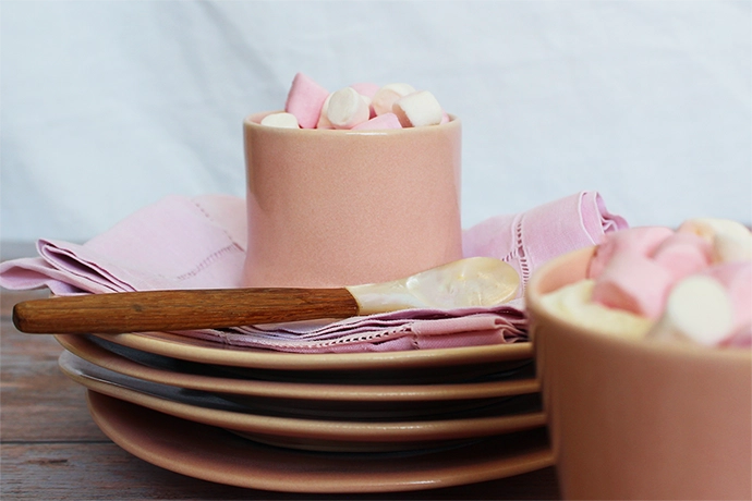
“We saw the need for a gentler shade of pink, and with the expertise of our chemical engineers, created this beautiful, magical colour,” explains Mervyn Gers. “Blush joins our curated palette of pinks, including Marshmallow, a delicate whisper of pink, and Dahlia, a bold and definitive tone. Sitting comfortably between the two, Blush strikes the perfect balance with its creamy, pastel charm.”
The hue is steeped in history. “The concept of pink dates to 800 B.C. in Homer’s Odyssey, where dawn is associated with Eos, the Greek goddess of the morning. The term ‘pink’ was first coined in the 17th century by a Greek botanist, inspired by the ruffled edges of carnations. By the mid-18th century, pink became a symbol of luxury among aristocrats,” notes Mervyn. Today, it remains an iconic colour, with Cape Town boasting a famous landmark in this timeless hue.
For enquiries and orders, email info@mervyngers.com or visit mervyngers.com.
Don’t forget to sign up to our weekly newsletter for the latest architecture and design news.