WORDS Michaela Stehr PHOTOS courtesy of Plascon
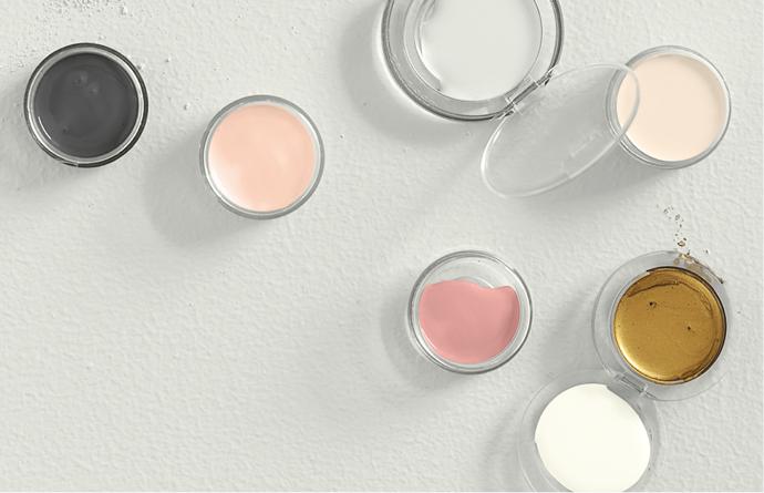
Plascon has released their Colour Forecast for 2017. Explore the four below trends and get inspired to use these palettes around the home.
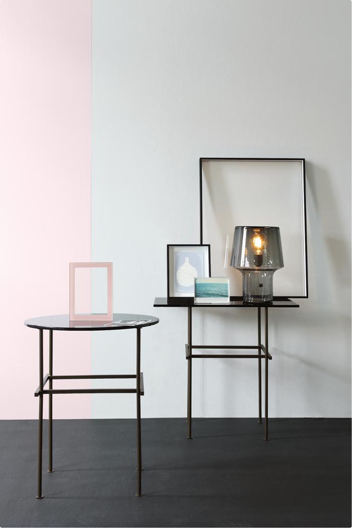
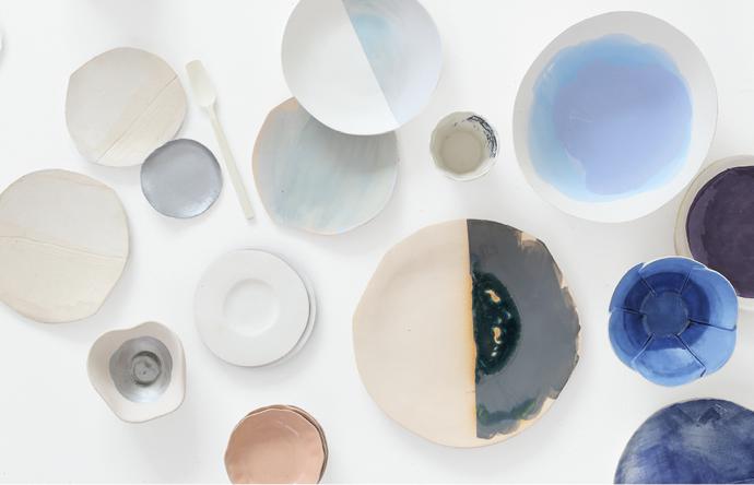
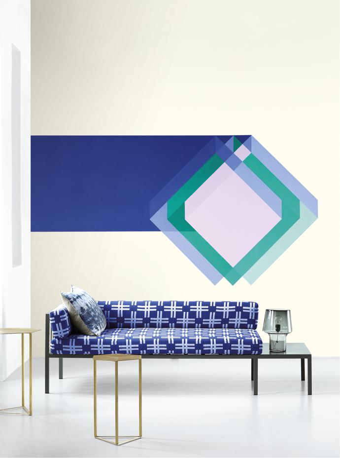
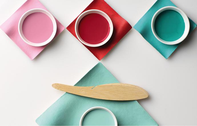
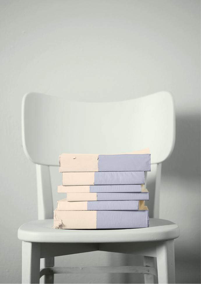
Anonymous
Anonymous takes neutral to the next level, embracing simplicity and a soft pared-back style. The colour wheel combines light blue, pink, green, purple-blue and black. Depth and dimension are added to the theme with accents of metallic-inspired shades.
The palette is designed to calm the mind and bring relaxation in today’s busy world.

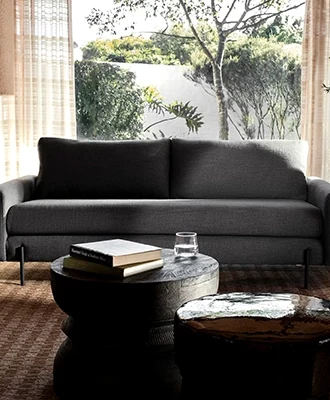
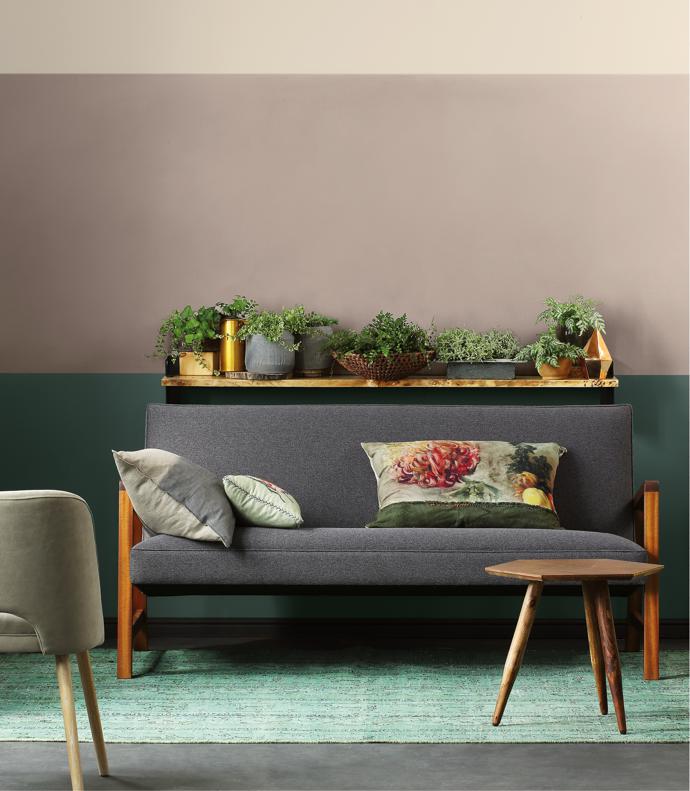
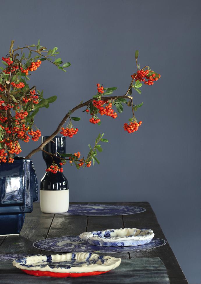
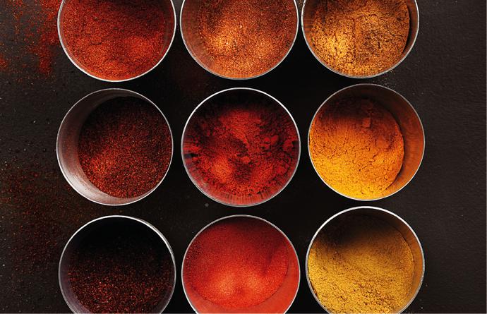
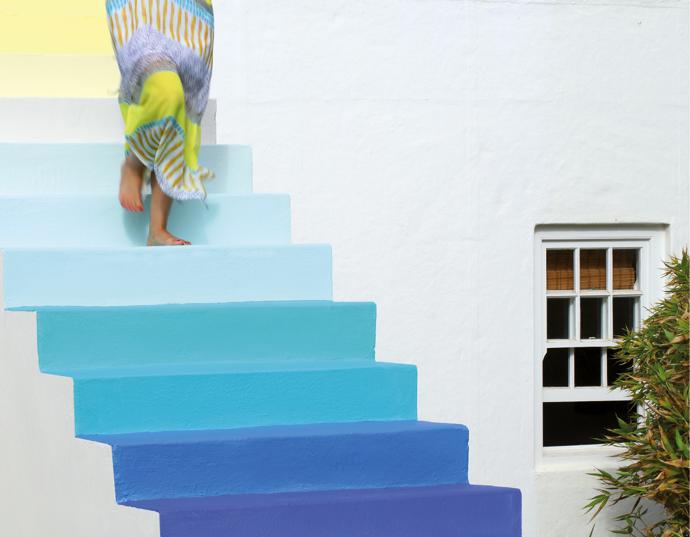
Terrain
Inspired by the earth, terrain draws influence from desert landscapes. Oranges and yellows are complemented by blue and mineral green.
Greys and neutrals offset this look and introduce balance.
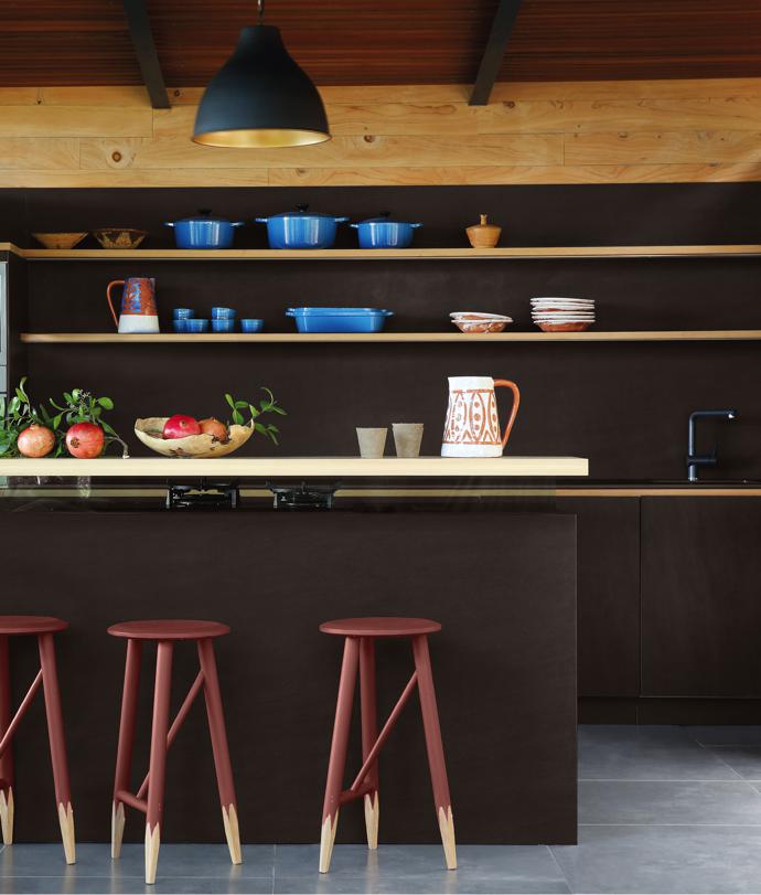
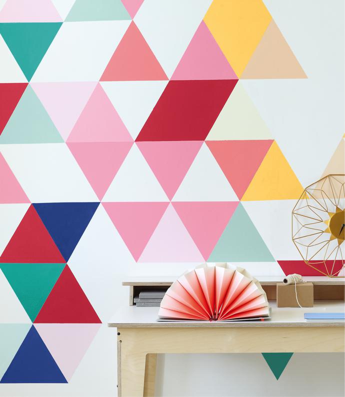
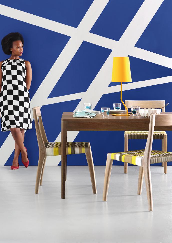
Prism
This contemporary theme uses digital art as a point of reference. This bold theme embodies youthfulness and is fun, striking and playful.
The idea is to be brave, while still remembering to offset bold brights with lighter, fresher tones.
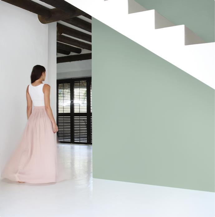
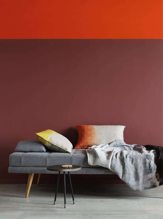
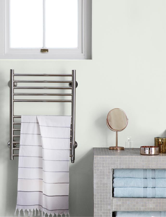
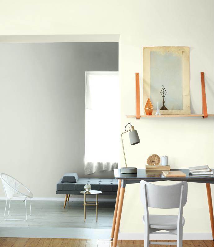
Pause
Pause represents the minimal and sophisticated. Muted tones such as classic beige are offset with luxurious gold and chalky colour treatments to give additional texture.
For more information and paint techniques, visit plasconspaces.co.za.