-

Interiors: Durbanville Wellness Facility -
Interiors: Durbanville Wellness Facility -
Interiors: Durbanville Wellness Facility -
Interiors: Durbanville Wellness Facility -

Interiors: Durbanville Wellness Facility -

Interiors: Durbanville Wellness Facility -

Interiors: Durbanville Wellness Facility -
Interiors: Durbanville Wellness Facility -
Interiors: Durbanville Wellness Facility -
Interiors: Durbanville Wellness Facility
PHOTOS Jan Ras and Shutterstock WORDS Michaela Stehr
The new M-Care Durbanville Wellness in Cape Town has received a stylish interior by award-winning designer Etienne Hanekom.
Medical facilities are known for their stark interiors. With his work at the new M-Care Durbanville Wellness facility, interior designer Etienne Hanekom shows that mental health hospitals needn’t be the drab stereotype associated with these important spaces. We chatted to him about the project.
What was your design brief?
The brief was to create a calming and relaxing interior for patients. I had a tight budget and a short timeline for completion.
How did you decide on the colour palette?
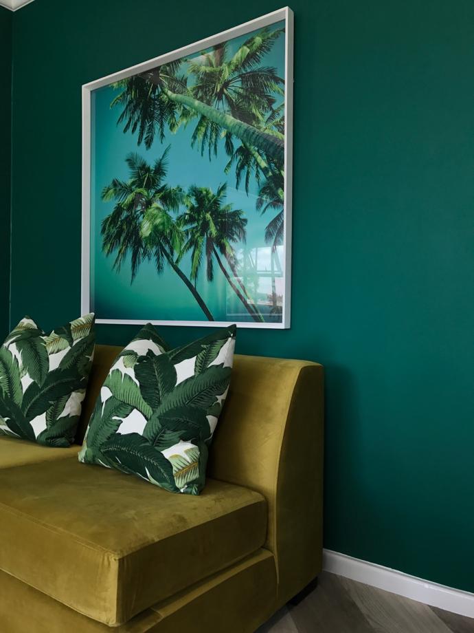
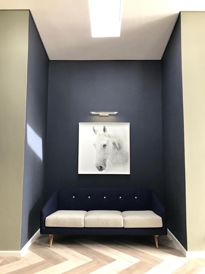
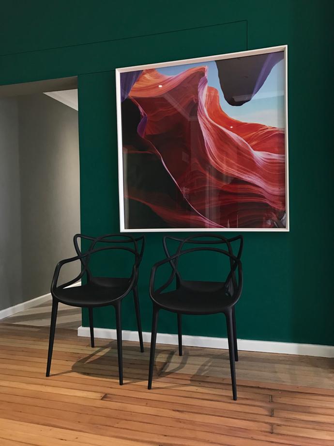
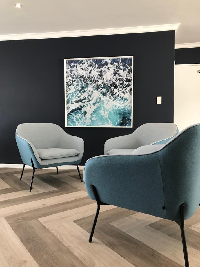
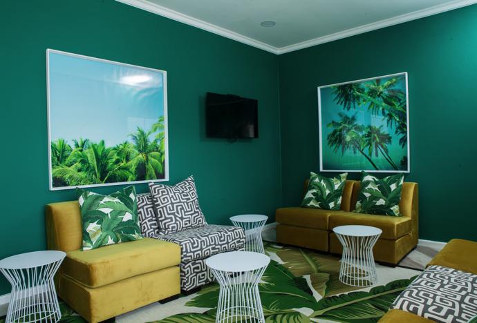
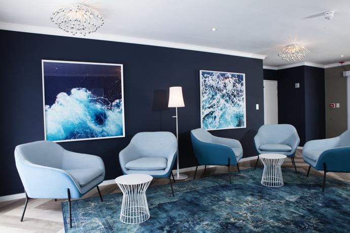
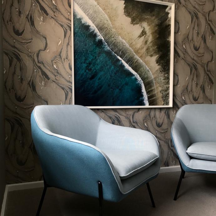
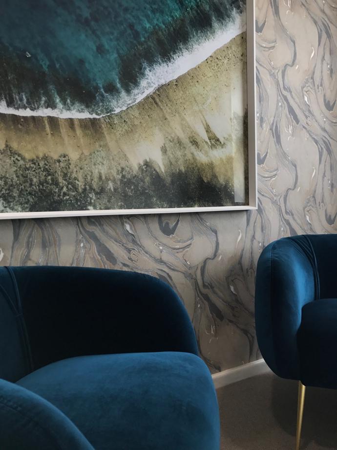
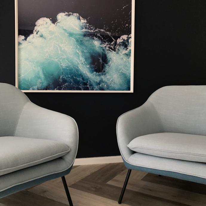
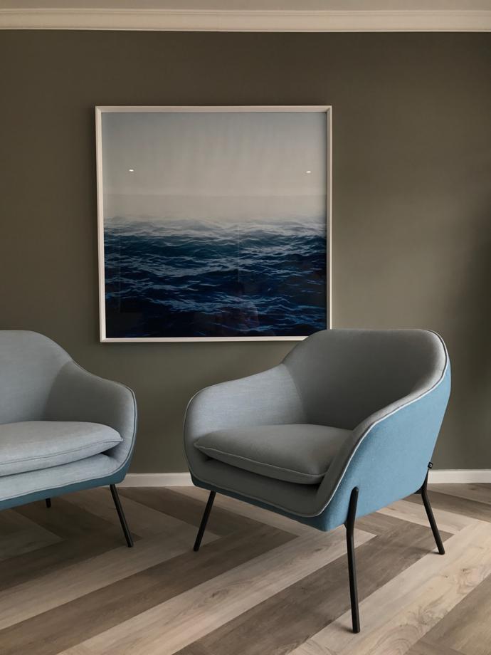
I chose a palette that would rejuvenate the body, mind and spirit. Colours at eye level should be neutral and the ceilings should imitate the sky. People feel most comfortable in spaces that follow nature, so I opted for blues, greens and earthy tones. I decided on hardwood-looking floors to imitate a forest floor. I deliberately avoided light monochromatic tones of yellow and beige, as I believe they can increase stress levels. Two intense dark greens and navy tones anchored with a mid-tone earthy green khaki were the main themes in my palette.
Tell us more about the furniture you chose?
Due to budget and time constraints, most of the furniture was sourced online. I chose pieces that are functional, modular and easy to reconfigure in a multifunctional space. I also looked at shape and colour in order to create an organic feel of nature in the general seating areas and consultation rooms.
What inspired your selection of artworks?
I looked for scenes from nature. The artworks range from abstract to tranquil and calming. It’s been proven that images of real or simulated nature can improve recovery time and help to alleviate stress. Long distance views with sun and sky are relaxing, because instinctively they relate back to our primal selves.
What did you learn from this project?
I think we as designers have a lot to learn about the effect a space can have on people who’ve suffered trauma. I was at the dentist the other day and the space was painted light yellow-beige and had brown laminate floors. Why would you choose this colour scheme for an institution that places such importance on healthy pinks and crisp whites?