Inspired by the essence of natural elements, Smeg reveals its vision of matt: a finish capable of transforming interiors into authentic sensory landscapes.
In contemporary design, surfaces have become a language and materials a mode of expression. With Total Mattness, Smeg explores the matt finish as an aesthetic expression of contemporary living – one that transforms light into atmosphere, colour into character and everyday spaces into deeply sensory experiences. By absorbing and softly diffusing reflections, matt surfaces reveal depth of colour while gently emphasising form, volume and geometry. Their tactile quality brings warmth, intimacy and a sense of enveloping comfort to the home.
At the heart of Total Mattness are three essential principles: nature as a universal visual reference, material as a tactile experience and colour as a generator of atmosphere. Each shade becomes a landscape in its own right – a harmonious composition of tones, textures and moods with the power to shape the identity of a space.
Colour and finish have long been central to Smeg’s design personality. By carrying the same matt language across small and large appliances, Total Mattness allows individual products to be read as part of an interior composition. No longer just functional additions, appliances become protagonists that can anchor a kitchen, shape its atmosphere and create a sense of visual coherence throughout the home. In dialogue with wood, stone, steel and textiles, Smeg’s matt finishes move effortlessly between minimalist, contemporary and more industrial interiors. Rich yet balanced, they add quiet sophistication to architectural lines and material contrasts.
Global Collection, Local Availability
Across the globe, Total Mattness brings a tactile colour language to much-loved small appliances and large-appliance designs, including the iconic retro refrigerator range. Soon, Smeg’s signature Portofino cooker will join the collection in all six matt shades, uniting technological prowess with colour, materiality and a commanding design presence at the heart of the kitchen. For those creating a kitchen without compromise, selected matt large appliances can also be sourced to order where possible. Visit smeg.com/za to view colours and products available in South Africa, including new arrivals and special-order possibilities.
6 Colours, 6 Design Worlds
From light and earth to sea and sky, six colour stories come together in one beautifully considered matt world. Each colour draws on its own visual landscape and defining characteristics, revealing the depth of the collection through natural inspiration, material character and a distinctive emotional atmosphere.
- Moonlight: A neutral matt shaped by natural light
- Storm Blue: A matt tribute to nature’s majesty
- Amber Clay: The warmth of earth, revealed in matt
- Emerald Green: A vibrant matt inspired by living nature
- Black Matt: A magnetic matt defined by pure darkness
- White Matt: A matt expression of natural balance
Choosing a shade is only the beginning. Colour, light and material come together to shape atmosphere, evoke emotion and give every space its own identity.
MOONLIGHT: A neutral matt shaped by natural light
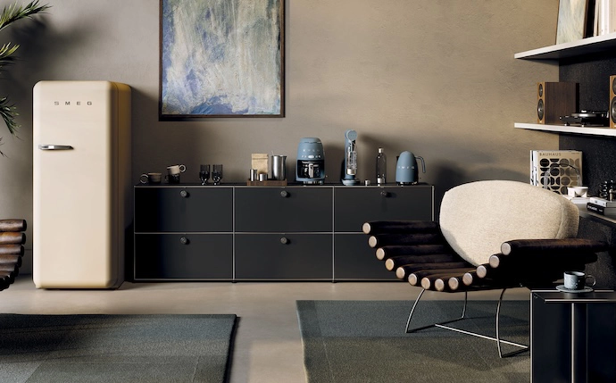
Moonlight is Smeg’s interpretation of the contemporary neutral – a matt yet luminous shade with a warm undertone, shaped by the gentle movement of natural light. Its soft, tactile finish brings a sense of lightness, revealing subtle depth without visual noise. Calm, versatile and quietly sophisticated, Moonlight allows light and surface to meet in a delicate balance that evokes serenity and harmony. All-embracing and highly adaptable, it moves effortlessly between materials, finishes and design choices, evoking luminous landscapes and surfaces shaped and softened by time, and creating environments that feel harmonious, continuous and designed to transcend passing seasons. In conversation with pale woods, natural stone, softly veined marble and tactile textiles, Moonlight creates an atmosphere that feels warm and grounded rather than stark – an effortless foundation for contemporary living.
Across Smeg’s small appliances – from the toaster and kettle to the filter coffee machine – Moonlight becomes part of a home’s daily rhythm. Present from the break of day, its calming palette transforms familiar morning routines into small rituals of comfort and wellbeing. Moonlight retro refrigerators bring the same seamless visual harmony to the kitchen, studio or office: distinctive yet understated, they shape the atmosphere with a sense of order, calm and familiar comfort.
MARC-ANTHONY HEWSON, interior designer and owner of LIM furniture and homeware store, on how warm matt neutrals or a soft matt white can create both a sense of stillness and tonal depth:
“The key is to work with the light rather than trying to compete with it. In South African homes, where the quality of natural light can change dramatically throughout the day, warm matt neutrals such as beige, tan and cream can create a sense of calm while still giving the eye something to explore. The matt finish is particularly important because it absorbs and softens light rather than reflecting it harshly. As the light moves through a space, those subtle undertones reveal themselves differently – warmer in direct sunlight; softer and more enveloping in shadow. That creates tonal depth without relying on strong contrast.
“For me, the real depth comes from layering texture and tone – pairing matt painted surfaces with timber, linen, stone, woven fabrics or ceramics. Even within a restrained, neutral palette, the different surfaces will respond differently to changing light. The result is a space that feels still and considered, but continues to evolve naturally throughout the day, rather than ever feeling sterile.”
EMERALD GREEN: A vibrant matt inspired by living nature
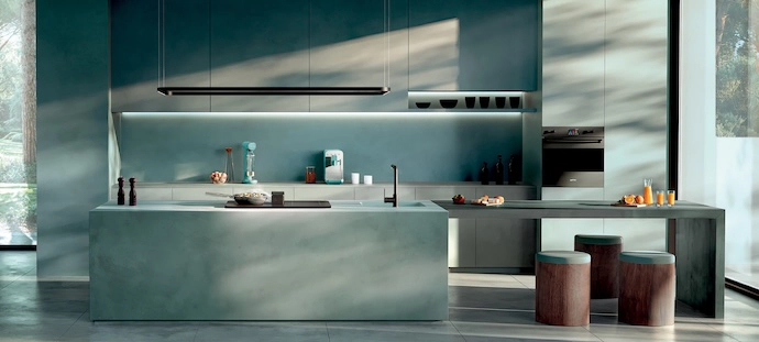
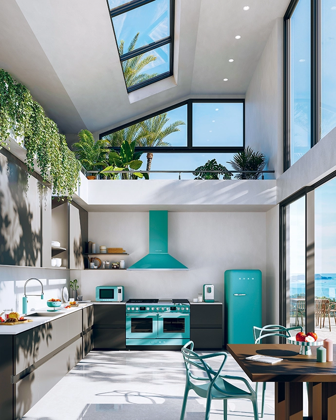
Emerald Green brings the vitality of nature into contemporary interiors. Rich tones and velvety textures shape spaces that feel immersive, elegant and alive. Inspired by forests, botanical shades and organic textures, its soft matt finish creates an enveloping depth of colour and a seamless connection between interior spaces and the living world beyond. Expressive and restorative in equal measure, Emerald Green creates an emotional atmosphere filled with depth and natural harmony. In dialogue with greenery, timber, natural stone and darker contrasting surfaces, it brings vibrant elegance and sensory depth to everyday spaces.
STORM BLUE: A matt tribute to nature’s majesty
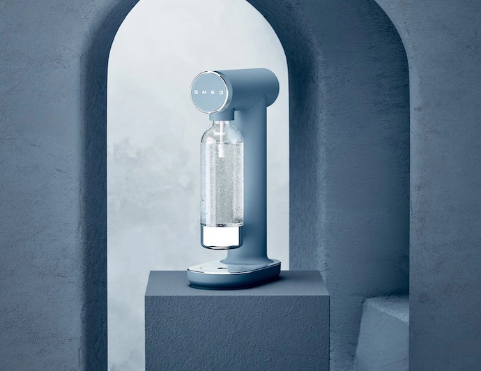
Inspired by the strength of the sea and the depth of the sky, Storm Blue brings the intensity of the natural world into contemporary interiors. Its matt surface absorbs light to reveal a rich, enveloping depth of colour, lending definition to architectural forms while retaining an unexpected softness. Intense but beautifully considered, Storm Blue achieves a balance between strength, softness and elegance. The shade introduces character without overwhelming a space, and when paired with stone, dark timber, brushed metal and lightly textured surfaces, it creates interiors with a strong visual identity – at once dramatic, atmospheric and composed.
MARIELISE VAN DER MERWE, architect known for bold design that’s also deeply attuned to its landscape and the natural environment:
“Colour should be a central point of consideration in design. I concur with Luis Barragán (the master when it comes to colour) that it shouldn’t be a decoration but as essential to the being of a space as the structural design and layout. Colour evokes emotions and perceptions that otherwise couldn’t be triggered. The use of blue, for instance, in the coastal houses I’ve designed subconsciously evokes a feeling of peace and tranquillity, hinting at the sky and the sea outside. The blue has a different intensity as the light moves through the building from morning to evening, and contributes to the mood of the day, shaping the experience of the space. In essence, colour is a powerful tool, giving the architect control over the space designed – but it is often overlooked and underutilised in interior spaces.”
AMBER CLAY: The warmth of earth, revealed in matt
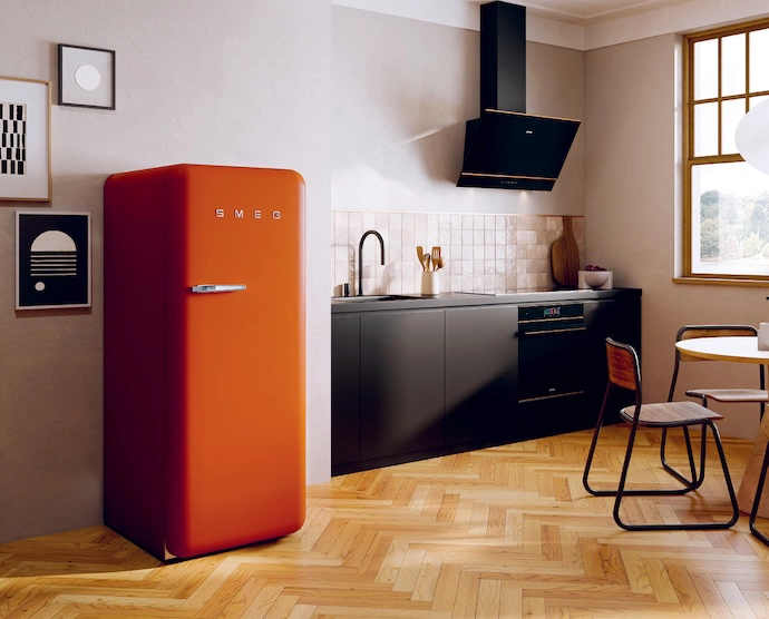
Inspired by red sands, sun-warmed landscapes and surfaces shaped by the elements, Amber Clay captures the raw beauty and material warmth of the earth. Its matt finish transforms surfaces into tactile landscapes of colour, light and matter. Soft, natural undertones give the shade a rich, enveloping depth, shaping spaces with balance, warmth and material character. Grounding yet expressive, Amber Clay creates a sensory world in which every surface contributes to a harmonious and atmospheric whole – where colour becomes emotion and material becomes experience. Set against timber, terracotta, stone and naturally textured finishes, it brings comfort, intimacy and a deeply considered dimension to contemporary interiors.
BLACK MATT: A magnetic matt defined by pure darkness
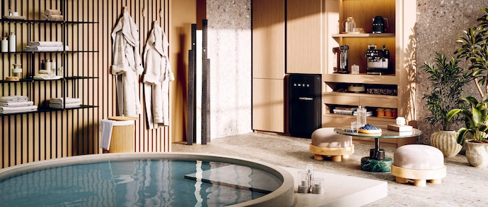
Black Matt expresses the most essential and sophisticated side of materiality. Deep surfaces and velvety textures give appliances a magnetic presence, bringing strength, clarity and visual purity to a space. Inspired by dark minerals and the striking contrasts found in nature, its matt surface absorbs light and sharpens form. Silhouettes and geometries emerge with sculptural intensity, creating a bold atmosphere in which light and materiality interact with timeless elegance. In dialogue with dark stone, elegant marble, light granite, steel and textured architectural surfaces, Black Matt introduces depth and definition to modern interiors. Bold without becoming overpowering, it transforms familiar appliances into a refined design statement.
HENDRE BLOEM, architectural and interior designer who drew on an earthy, tactile palette of terracotta, rust and clay tones, paired with black steel and bold Brutalist forms, for a home he designed in Prince Albert:
“The terracotta and clay tones bring warmth, and an earthiness that makes the spaces feel grounded and intimate. In a matt finish, these colours absorb light, giving them a softer, almost elemental quality. Deep black matt does the opposite: it adds weight, contrast and gravitas, reinforcing the Brutalist forms without feeling cold. This picks up on architectural details such as the steelwork and fenestration.
“Tactility is equally important. I love surfaces that reveal texture and imperfection, and invite you to touch them. When colour becomes part of a tactile surface, it moves beyond decoration – it becomes something you experience through light, shadow and touch.”
WHITE MATT: A matt expression of natural balance
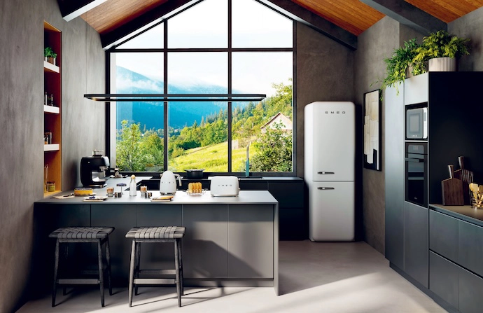
Inspired by light sands, soft clouds and the quiet luminosity of the natural world, White Matt is a shade defined by purity, balance and restraint. Its matt finish turns light into a harmonious sensory experience, allowing subtle volumes and contours to emerge. Pure surfaces and balanced tones bring brightness and visual calm to the home, creating an atmosphere of understated elegance. Informed by natural light and essential textures, White Matt reveals spaces in which simplicity becomes a design language. Combined with pale timber, natural stone, brushed metal and tonal surfaces, it creates interiors that feel open, timeless and sophisticated.